

 Check the
documentation
Check the
documentation Ask the
Community
Ask the
Community Take a look
at
Academy
Take a look
at
Academy Cognite
Status
Page
Cognite
Status
Page Contact
Cognite Support
Contact
Cognite Support
At our company, we frequently need to compare specific time‑series trends with historical data. For example, we may want to compare the temperature increase after a plant startup with the trend observed during a previous startup two years earlier.
Currently, the “Shift time series” function in Charts allows us to overlay the same tag with a time offset. However, to do so, we must expand the global time range to cover the entire historical span (for example, setting the range from 2023 to 2025), even when our actual analysis focus is limited to a single year such as 2025. This makes detailed analysis more difficult and reduces readability when working with a clearly defined target period.
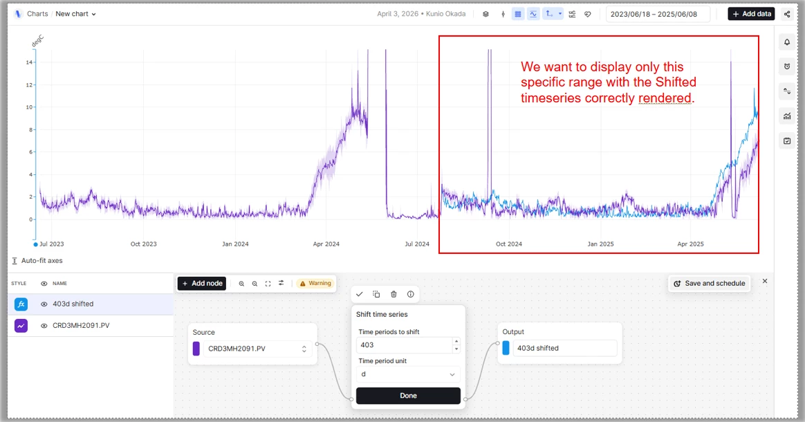
Ideally, we would like to set the display range only to the target time span, while still being able to retrieve and overlay historical data from earlier periods using a time shift.
This request has also been raised multiple times in the past, including by Mr. TAKASE , and we understand that many other users similarly recognize this as an important and widely needed feature.
While it is technically possible to address this requirement using a custom application, custom applications cannot be embedded into Canvas. Since our primary goal is to visualize and share these comparisons directly within Canvas, this limitation makes a custom‑app‑based solution impractical. For this reason, we strongly believe that this capability should be implemented directly within Charts.
We previously found a similar request in an earlier post (linked below), but given the importance and recurring nature of this requirement across users, we would like to submit this request again.
