

 Check the
documentation
Check the
documentation Ask the
Community
Ask the
Community Take a look
at
Academy
Take a look
at
Academy Cognite
Status
Page
Cognite
Status
Page Contact
Cognite Support
Contact
Cognite Support
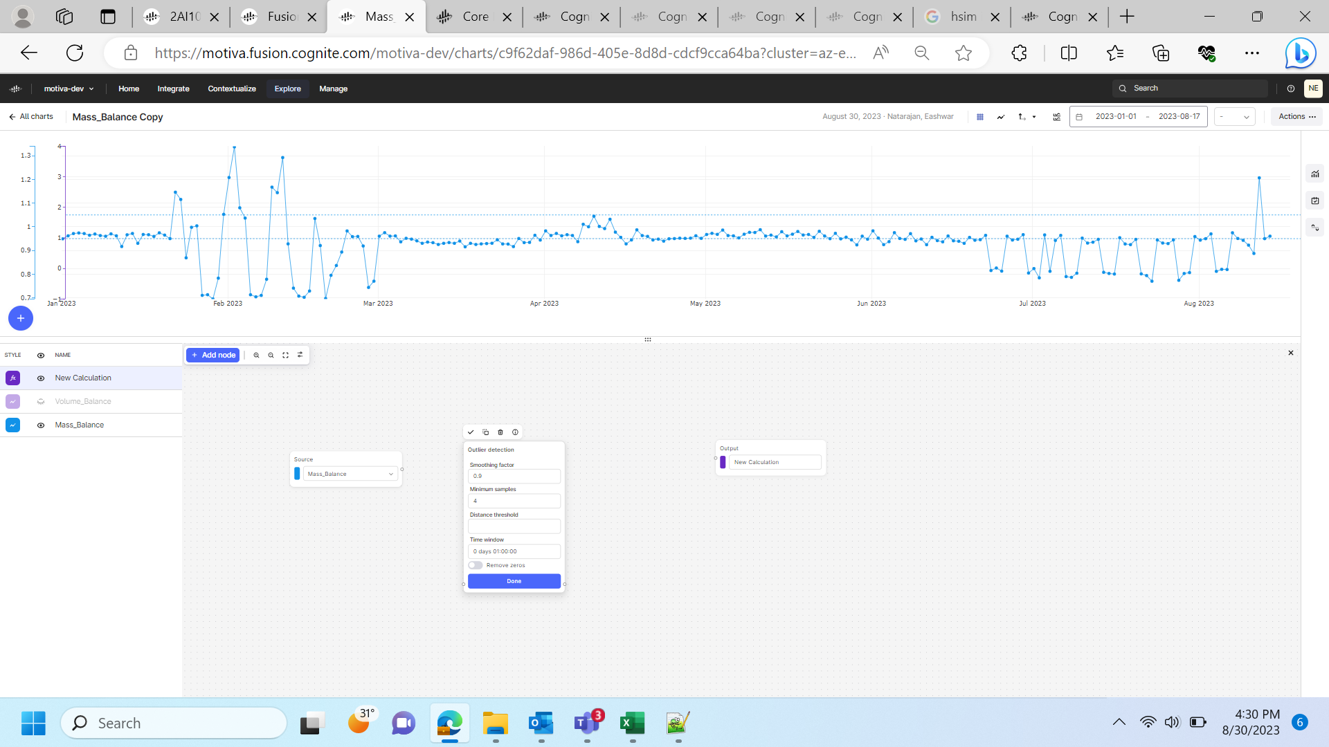
I have a CDF chart that is showing some output based on the timeseries associated with. I want to flag the points on the chart that are beyond some threshold. (say anything >0.5 and <-0.5 is abnormal and need to be flagged off in the chart) IS there a way to show that in the CDF charts visualization.
Solved
Cognite Charts - flag the far-off datapoints
 +2
+2Best answer by Knut Vidvei
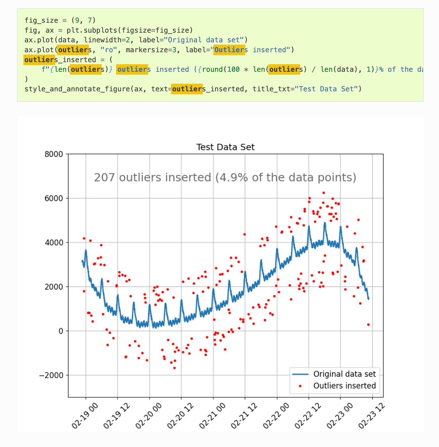
Using Python code and InDSL you will have the full freedom to customize your views. These preferences will vary from user to user, and customer to customer.
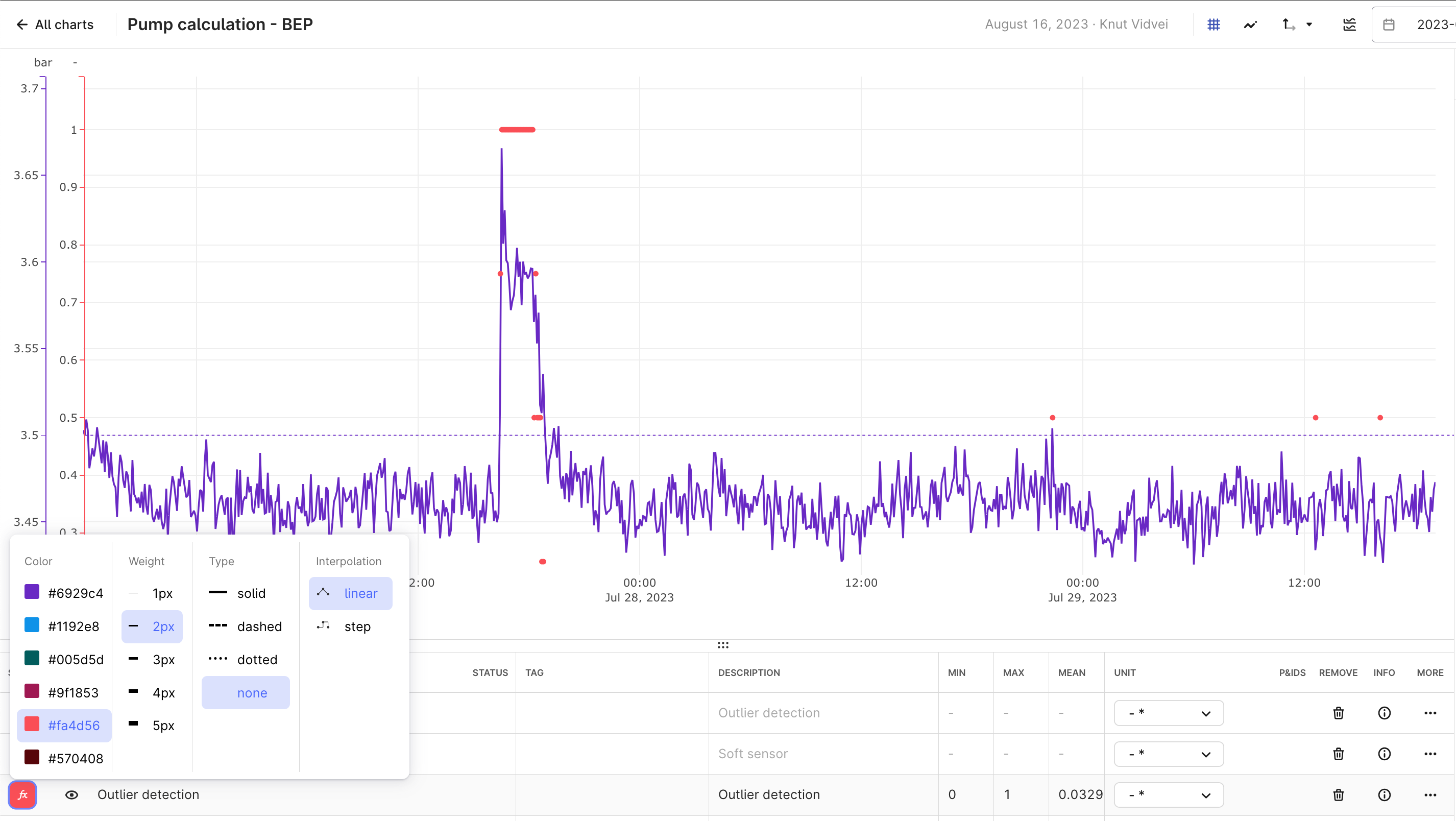
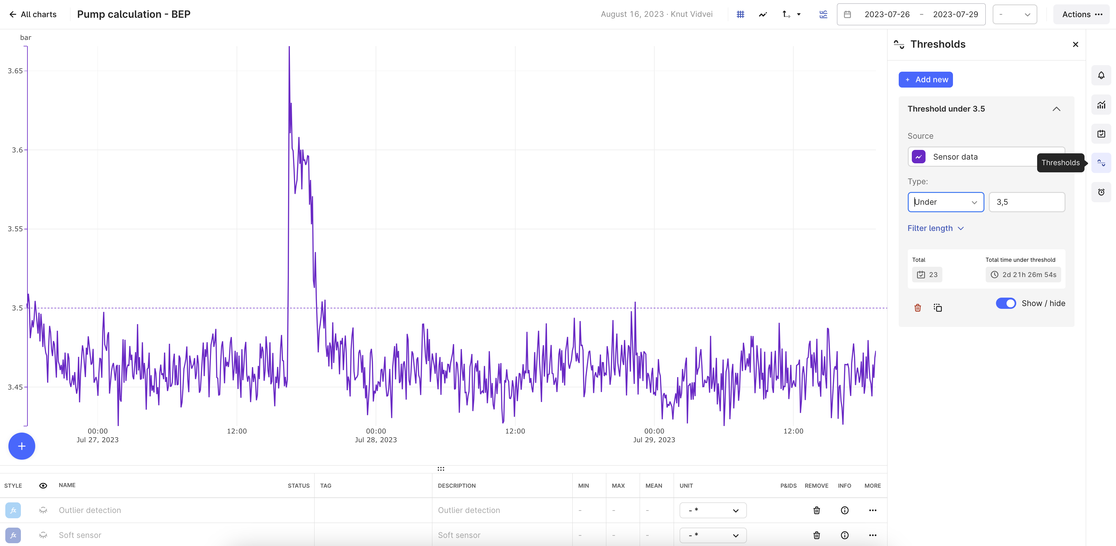
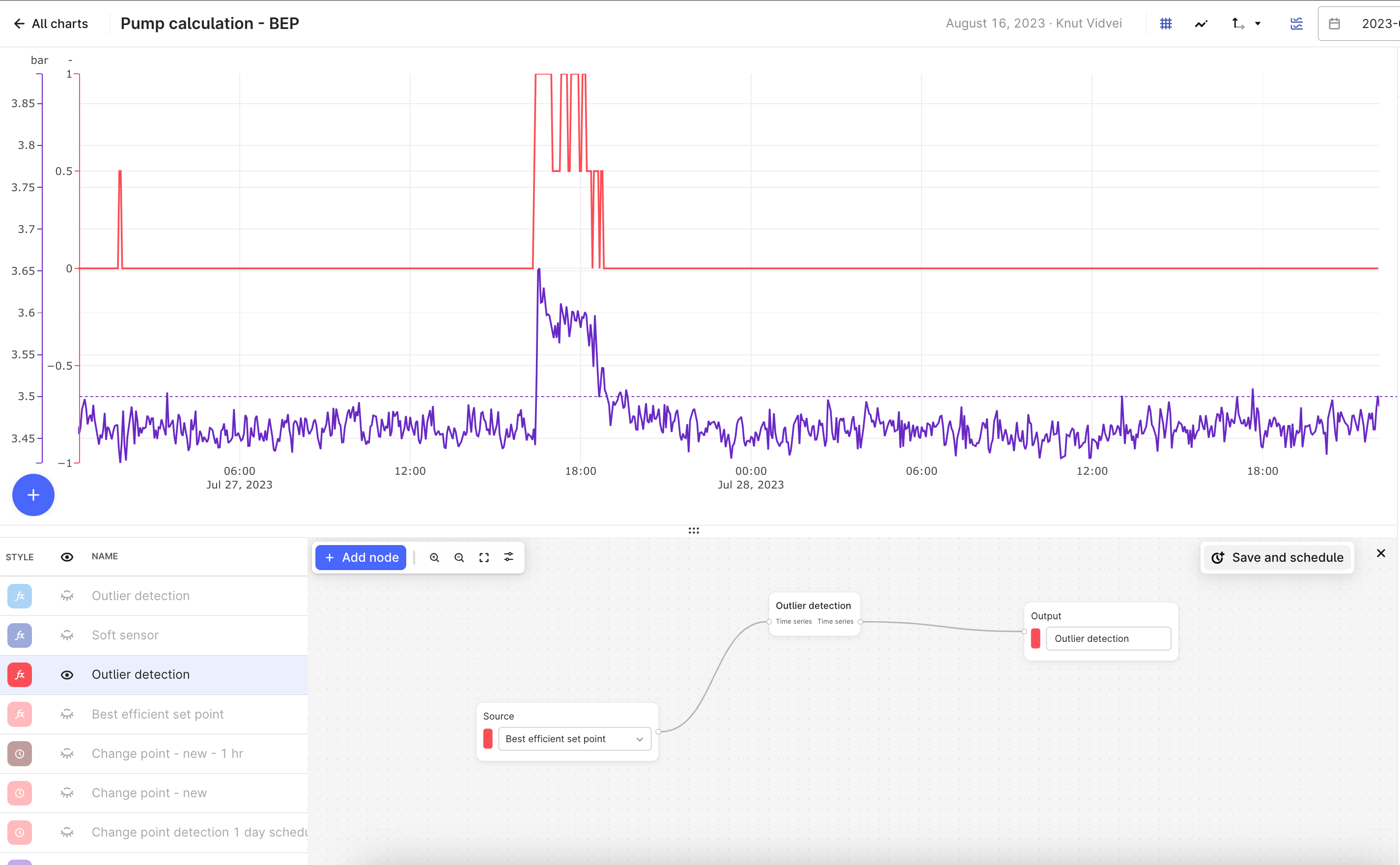
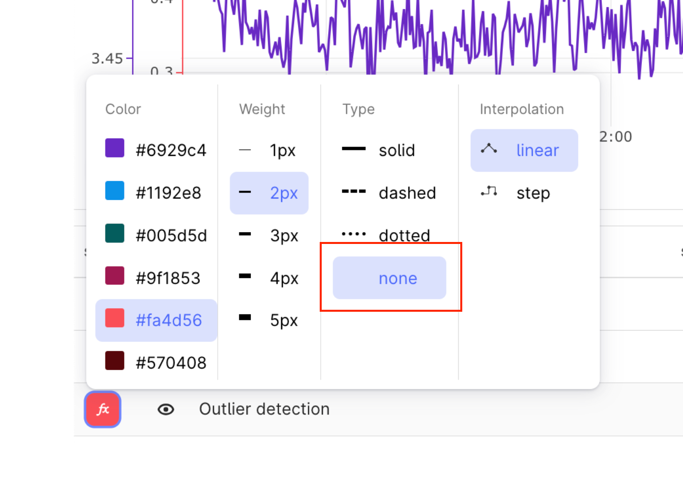
However, you can still do a lot in the fronted. if you use the visualization setting in the outlier detection time series, and set Type to “none”, it will show the dots as you have in your Python plot above. I scaled here the y-axis so that the results with 0 is below the view line.
Allowing full flexibility as you have in Python in a no-code frontend is a bigger challenge, as it would lead to an unmanageable number of settings and buttons.

Enter your E-mail address. We'll send you an e-mail with instructions to reset your password.