
 Check the
documentation
Check the
documentation Ask the
Community
Ask the
Community Take a look
at
Academy
Take a look
at
Academy Cognite
Status
Page
Cognite
Status
Page Contact
Cognite Support
Contact
Cognite Support

Bug in EOS: Two timeseries added to chart, but only one visible
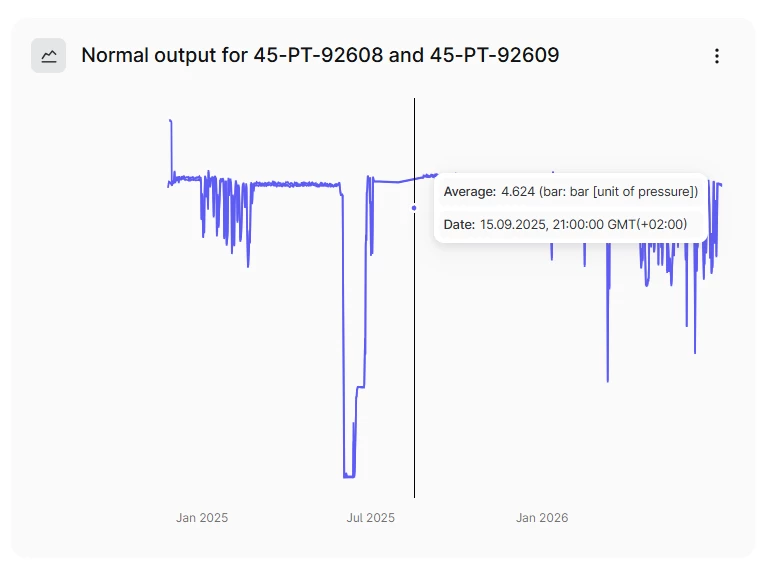
I used the Atlas AI agent (default) to locate two timeseries, and then clicked on the “add to dashboard” button.
The chart got added, and the title indicates both are added, but the chart only has a single visible line. If I move the mouse pointer down, it snaps to another value (notice the location of the blue point), but not sure if this is the other timeseries or if it is a spike from the raw data that is not shown due to downsampling on the chart.
Also, the time range selection do not change the timerange for the chart