
 Check the
documentation
Check the
documentation Ask the
Community
Ask the
Community Take a look
at
Academy
Take a look
at
Academy Cognite
Status
Page
Cognite
Status
Page Contact
Cognite Support
Contact
Cognite Support

Gathering Interest
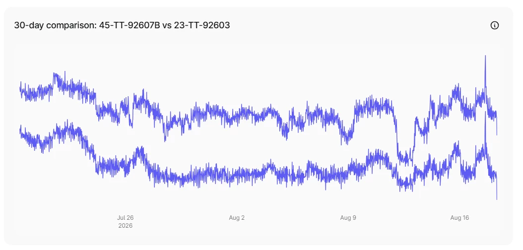
Missing legend when multiple timeseries are shown in a chart via embedded Atlas AI Agent
When asking the embedded Atlas AI Agent to eg show the difference between two timeseries, it display both timeseries in a chart inside the Chat window. However, both lines get the same color, and there is no legend, so unless you know the average value for those timeseries you do not know which is which. Also, there is no y-axis, so the only way of knowing the value is to hover over the different lines.
Legend and axis would help a lot on the user-friendliness