

 Check the
documentation
Check the
documentation Ask the
Community
Ask the
Community Take a look
at
Academy
Take a look
at
Academy Cognite
Status
Page
Cognite
Status
Page Contact
Cognite Support
Contact
Cognite Support
The “Compare trends” function in the trend view is a great functionality to compare different trends. Today the Y-axis of the graphs does not align when comparing multiple trends. For example in the trend view below, the Y-axis of the purple trend is way higher than the axis for the blue trend line. 45% and 100% is placed at the same position.
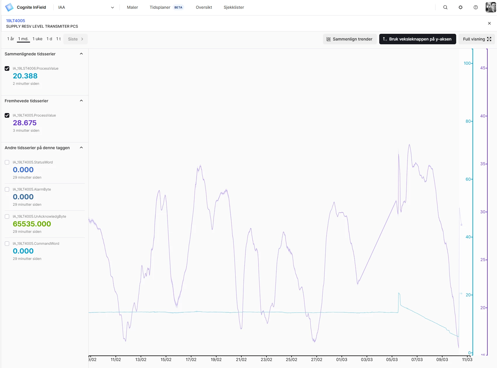
It is possible to manually zoom in and out on the Y-axis and then align but it would be better if there was a way of aligning Y-axis on a more user friendly way or alternatively that the axis are lined by default :-)
