
 Check the
documentation
 Ask the
Community
 Take a look
at
Academy
 Cognite
Status
Page
 Contact
Cognite Support


New
【Charts】Adjustable axis label font size in Charts (on Canvas and in PNG export)
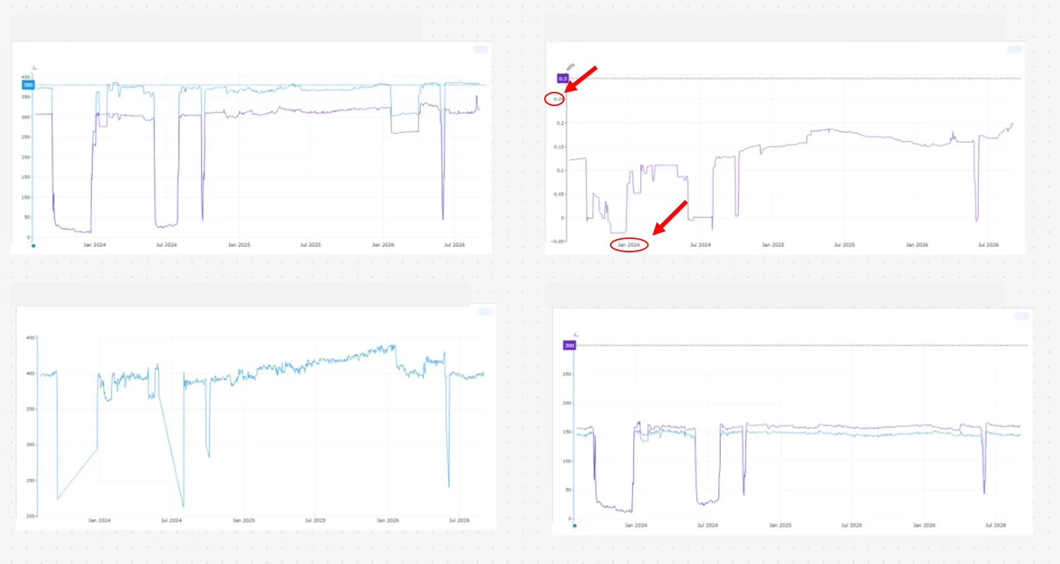
When we place multiple Charts side by side on Cognite Canvas, the X-axis and Y-axis labels become very small and hard to read (see the attached screenshot).
The same problem occurs when we export a chart as a PNG file and paste it into Excel. The axis labels are too small to read clearly.
We would like to request the following improvements:
- The ability to change the font size of the X-axis and Y-axis labels for Charts placed on Canvas
- The ability to change the axis label font size when viewing a chart on its own in Charts, with the change also applied to PNG exports
I apologize for the many requests, and thank you very much for your consideration.
Best regards,
