

 Check the
documentation
Check the
documentation Ask the
Community
Ask the
Community Take a look
at
Academy
Take a look
at
Academy Cognite
Status
Page
Cognite
Status
Page Contact
Cognite Support
Contact
Cognite Support
Today is the December release of Cognite Data Fusion. As you might have seen in last week’s Product Tour or read in today’s release post, there are several new and exciting Charts-specific updates in the latest release, namely...
Charts is now an integral part of Cognite Data Fusion (fusion.cognite.com).
A long awaited improvement, charting and no-code analytics finally lives alongside all other industrial DataOps functionalities available in Cognite Data Fusion. No URL switching and additional sign-in required.
For those of you who have been using Charts before, all private and public charts that you and your colleagues have created will still be available via Cognite Data Fusion (fusion.cognite.com).
Note that charts.cogniteapp.com will still work and be available. This teams, for those of you who are linking to Charts in your third party applications, Microsoft Teams, etc., this will still function exactly as expected. We will be working on an automatic redirect for coming releases, however still recommend you update the hyperlinks to point to your-organization-name.fusion.cognite.com. If you have questions on this, don’t hesitate to reach out here on Cognite Hub.
As you might expect, we intend to retire this standalone Charts URL (charts.cogniteapp.com) in early 2023, although an exact deadline is still TBD. In the meantime, all new features and functionalities to Charts after this release will only be available in Cognite Data Fusion (fusion.cognite.com).
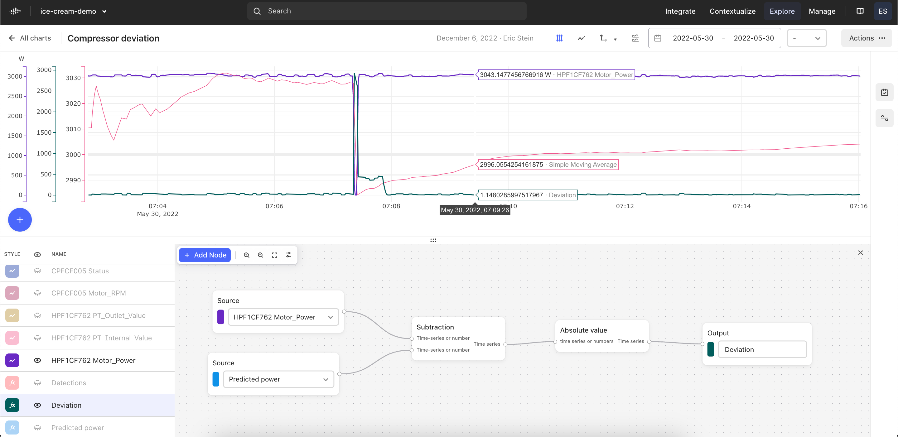
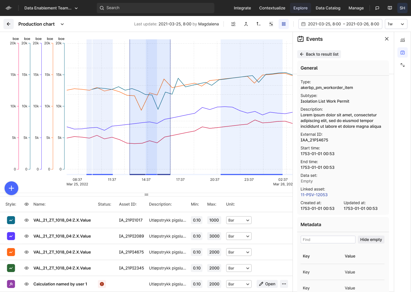
Display events simultaneously with time series
We’re also proud to introduce some valuable new functionality and a critical aspect performing contextual and root cause analysis — displaying events and time series data simultaneously in the chart plot.
Whether it's a work order on related equipment, a faulty shutdown, or an alert generated by a machine learning model, overlaying events in their charts provides another level of depth to industrial data analytics.
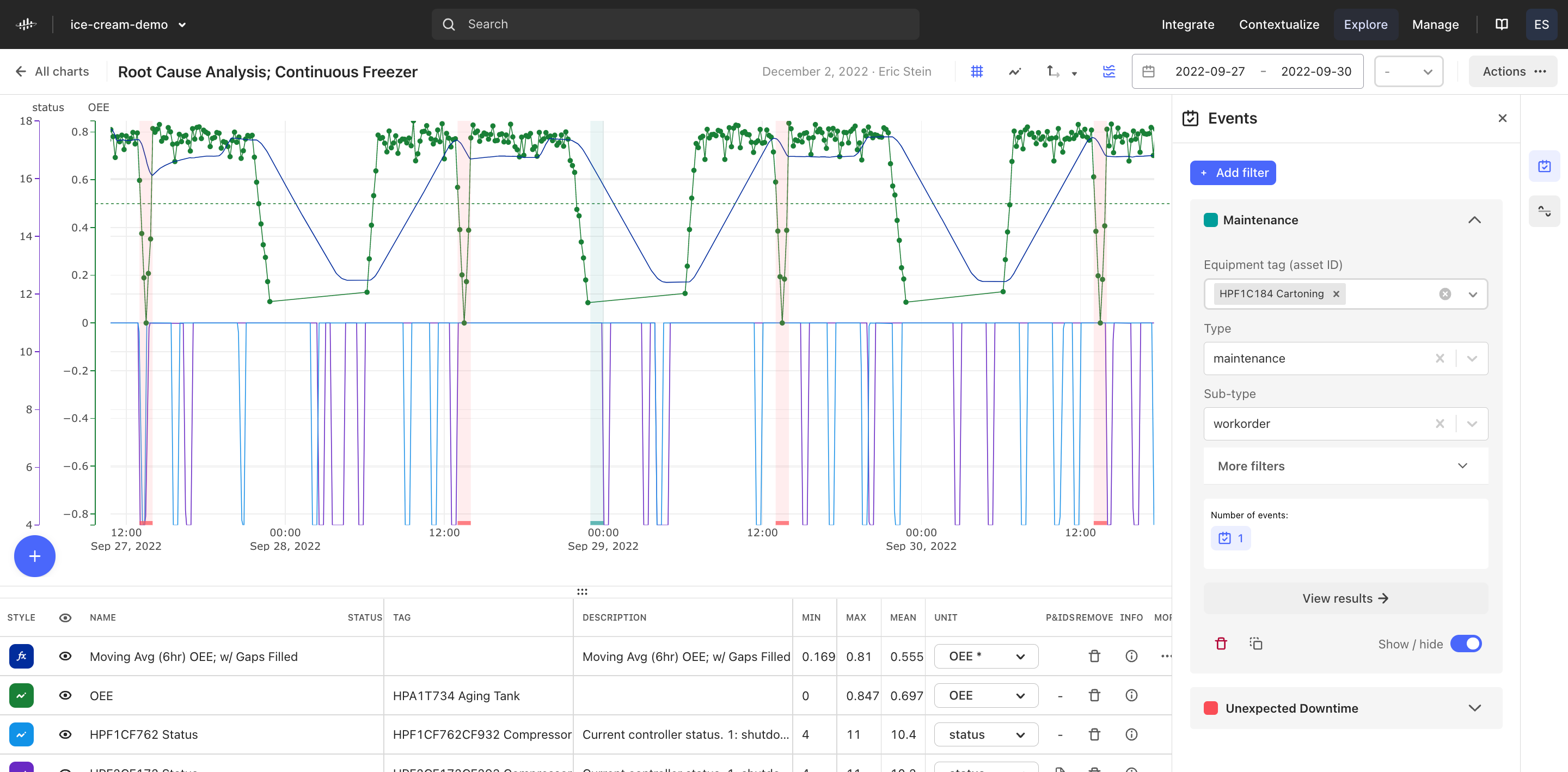
You now have the ability to create filter groups to toggle events on your plot that are of a particular type, subtype, equipment tag, and more. You can change the color of this display and drill down into the critical metadata to gain information about how a particular event explains or correlates with the time series trends.
We’d like to thank those of you who met with our product team to help us develop and test this functionality including
Since this is just the first iteration of this feature, there are several improvements features that are not a part of this current release. Some key improvements to this events display functionality will be released as soon as they are available, including…
- Full metadata information for each event
- We know easy access to event metadata information – which often contains critical context and details for each event – is an important feature. We are working on adding it ASAP and it will be released as soon as it’s available.
- We know easy access to event metadata information – which often contains critical context and details for each event – is an important feature. We are working on adding it ASAP and it will be released as soon as it’s available.
- Events with the same start and end time are not being displayed on the plot.
-
You can click on the event in the list to be able to toggle the line on/off the plot to see its location via a vertical line, however this can and will be improved.
-
-
Interact with events via the plot interface
-
With this first iteration, you must click the event in the right-hand side “Event results” panel to highlight a particular event or view its details. However, it is a natural, and often more efficient, to click on the events in the plot to view its details. This is an important priority and something we will be working on in the coming weeks.
-
On behalf of the whole team, we hope you enjoy these important updates and we look forward to hearing your feedback!