

 Check the
documentation
Check the
documentation Ask the
Community
Ask the
Community Take a look
at
Academy
Take a look
at
Academy Cognite
Status
Page
Cognite
Status
Page Contact
Cognite Support
Contact
Cognite Support


New
【Charts】Improve Tag Name Visibility on Charts
When you hover your mouse over a chart in Charts, the tag names of the time-series data being plotted and the corresponding values are displayed. While this is a very useful feature, the information is displayed directly on top of the time-series data, which can sometimes obscure the data itself.
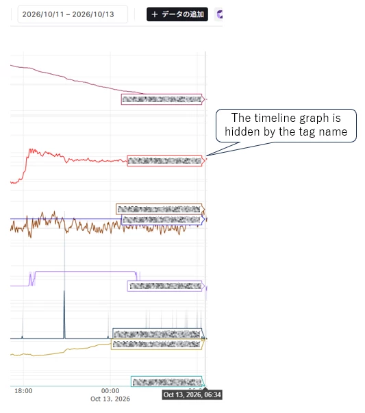
Although this can be avoided by moving the mouse pointer away from the chart, it does make the experience slightly less user-friendly.
Therefore, would it be possible to display the tag names in a way that minimizes overlap with the time-series data? We would appreciate it if you could look into this.
