
Committed ⭐️
October 12, 2022
Implemented

Cognite Infield - Increase size of status button

Related products:InField
  • October 12, 2022
  • 7 replies
  • 88 views

In Infield, if the line item has a quick link in the equipment name, its very easy to select the equipment and not the status button, which takes you to the information page where you have to navigate back to the checklist.  About 98% of our checklist items have a quick link in the title.  If there were some space between them or if the status button were larger, either way.
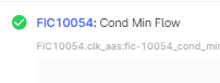
This is an example.  


7 replies

Anita Hæhre
Expert ⭐️⭐️⭐️⭐️
Head of Community
October 12, 2022
NewGathering Interest
Anita Hæhre
Ibrahim Al-Syed
Practitioner ⭐️
Practitioner ⭐️
October 12, 2022

@Kristoffer Knudsen please make this a prioritu

Anita Hæhre
Expert ⭐️⭐️⭐️⭐️
Head of Community
October 12, 2022

@Hud remember to upvote on your idea:)

Anita Hæhre
Nicklas  Lind
Expert ⭐️⭐️⭐️⭐️
Expert ⭐️⭐️⭐️⭐️
October 12, 2022

Great feedback – I have some ideas for improvements and I can follow up with Hud on this. 

Designer @ InField
Anita Hæhre
Expert ⭐️⭐️⭐️⭐️
Head of Community
October 27, 2022
Gathering InterestPlanned for development
Anita Hæhre
Expert ⭐️⭐️⭐️⭐️
November 17, 2022

Hi @Hud - please check out our latest release notes! 

Among other things, we have added more space between checklist status options so you avoid clicking the incorrect state. We hope this improves your experience, but please test it out and provide us with feedback 😀


Anita Hæhre
Expert ⭐️⭐️⭐️⭐️
Head of Community
June 8, 2023
Planned for developmentImplemented
Anita Hæhre