Check the
documentation
Check the
documentation Ask the
Community
Ask the
Community Take a look
at
Academy
Take a look
at
Academy Cognite
Status
Page
Cognite
Status
Page Contact
Cognite Support
Contact
Cognite Support

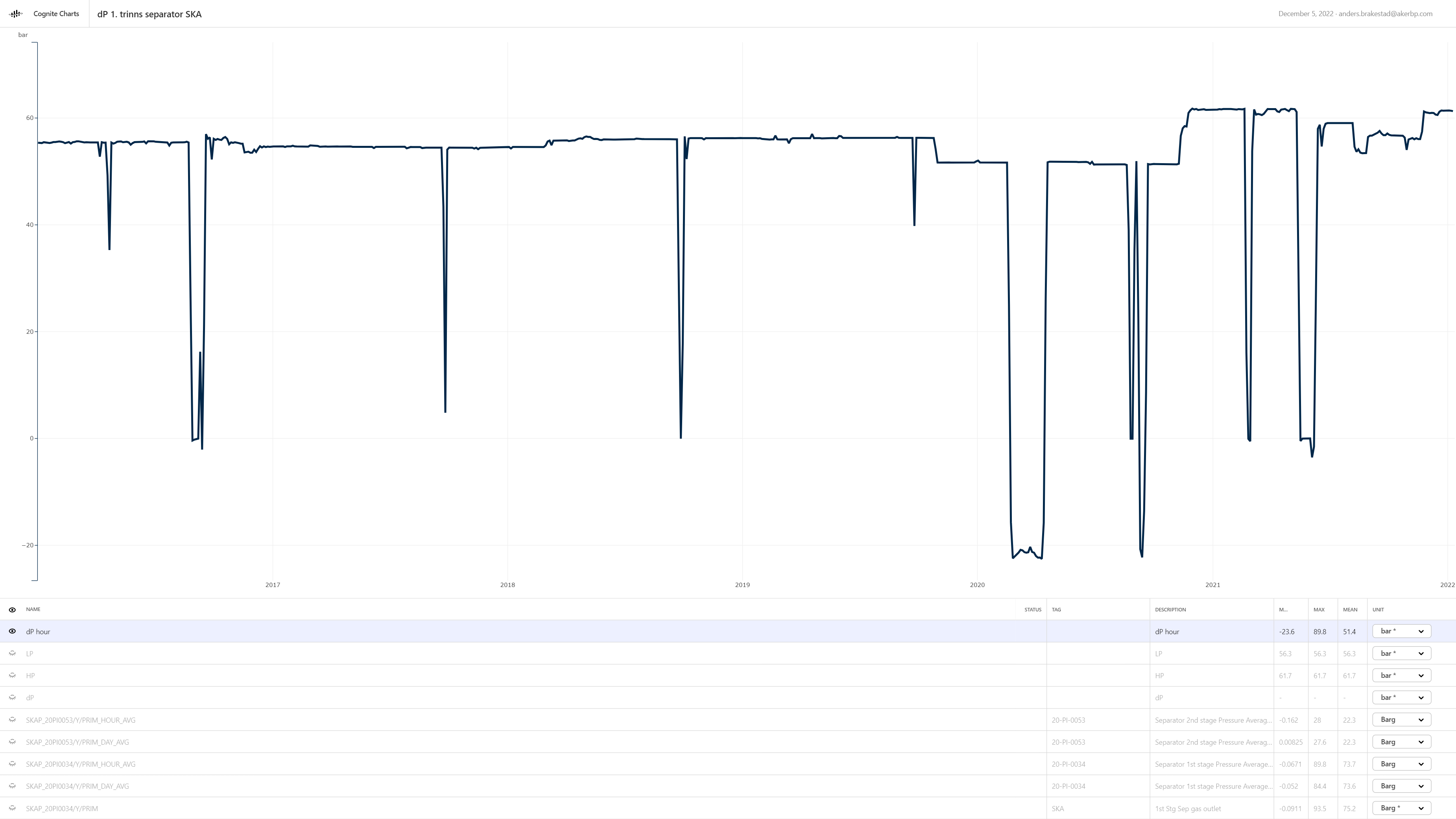
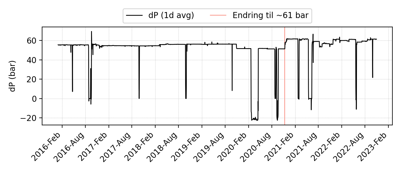
I have been involved in a root cause analysis lately, and we are not working on the final report. I have been asked to produce a couple of trends, and my go-to tool was Charts. While there is a PNG export functionality, I find it so limiting that I ended up in Python and matplotlib to produce a decent looking figure of a simple differential pressure time series.
Some of the things I am missing
- Possibility to set font sizes of x and y labels
- Set a figure title (displayed on top of the figure)
- How detailed the x ticks and x tick labels should be. The user should be able to set the time interval, either with a dropdown of preset choices, or a custom string formatting option for “pro” users (“%Y-”b”) to produce labels of the form “2021-Jan”.
- More colors to choose from, and to set the hex manually (I especially miss “black”).
- To change the figure aspect ratio and dpi.
- To set the background color to a dark color.
- A legend should be autogenerated based on the currently visible time series (name and formatting). The user should be allowed to set the position.
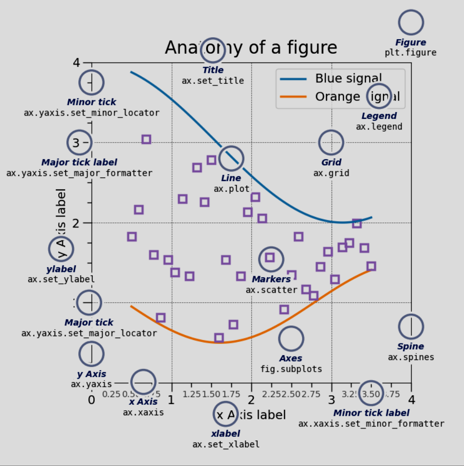
I have attached Matplotlib’s great figure “Anatomy of a figure” for reference :)
Regards,
Anders