
 Check the
documentation
Check the
documentation Ask the
Community
Ask the
Community Take a look
at
Academy
Take a look
at
Academy Cognite
Status
Page
Cognite
Status
Page Contact
Cognite Support
Contact
Cognite Support
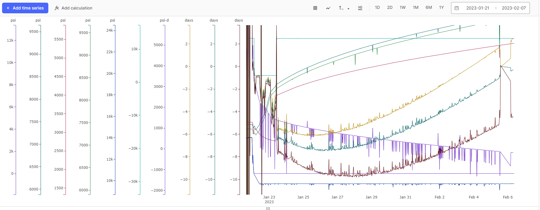
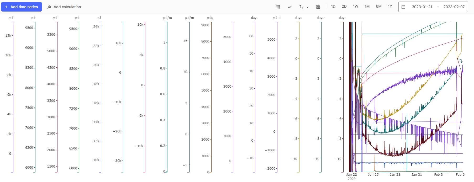
When looking at many time series (8+), the y-axis scales take up a lot of space on your screen horizontally, and adding more time series to the display continues reducing the x-axis space on the chart itself. Having the ability to compress the horizontal space occupied by the y-axis scales would be helpful, especially since there seems to be a lot of white space available to compress into. We have run into this challenge during real-time troubleshooting, and it becomes especially challenging when working off a smaller screen (e.g. using your laptop screen in a conference room). As you can see from the first image below, the white space around the y-axis scales/labels appears significant. The 2nd image below is a more aggressive shot of the same Chart.
Additionally, a feature where hovering your mouse above a particular y-axis would reveal the name of the time series that y-axis applies to would also be helpful when the y-axis units are not merged. This is really more useful when looking at many times series all at once. This is probably a complementary idea to another one already on this board about highlighting the time series in the chart when you hover the mouse over the y-axis.
Thank you!