

 Check the
documentation
Check the
documentation Ask the
Community
Ask the
Community Take a look
at
Academy
Take a look
at
Academy Cognite
Status
Page
Cognite
Status
Page Contact
Cognite Support
Contact
Cognite Support

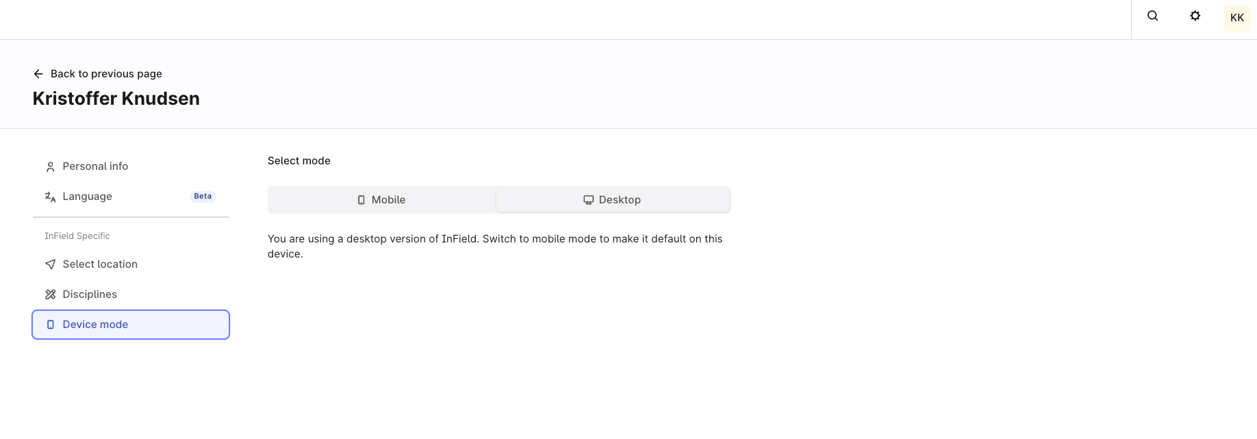
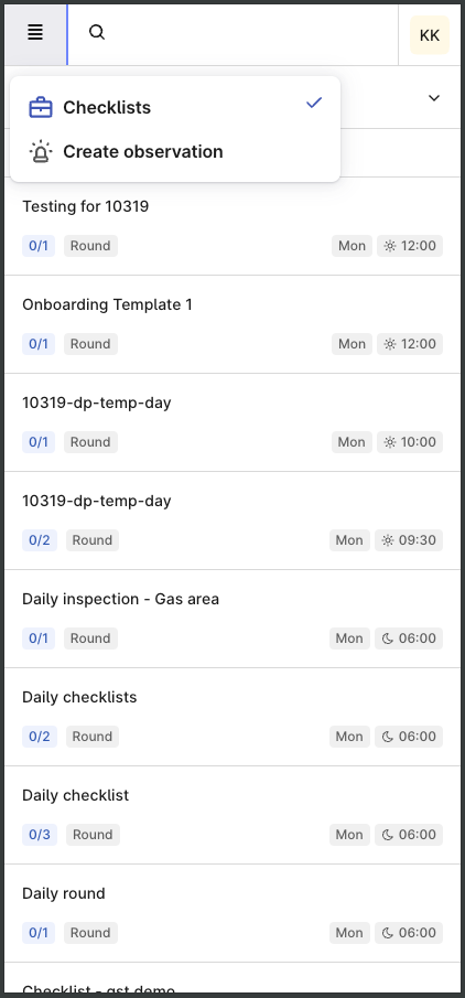
Using the Infield with the small screen of mobile devices can be a challenge with current layout of the Infield screen. The text are small and navigating left + right and up + down can be difficult with narrow width of the Checklists and Assets Explorer Section.
To begin with, Infield tries to put 3 section of information (All Checklists, Checklists, Assets Explorer) into the screen of mobile device the same way for potrait and landscape mode. While in Landcape mode, the adaptation seems ok but in Potrait mode, with example a 6 inch display, the assets explore section is only partially displayed on the screen. It is not possible to navigate left or right to see the rest of the Assets explore section because the sections are fixed. This arrangement also made the fonts smaller as the sections are squeezed and scrolling up and down difficult.
There are 2 methods to improve the UI for Potrait mode for the field people, 1) To arrange the sections in a vertical manner instead of horizontal. Disadvantage of this is there will be a lot of scrolling up and down to get from 1 section to another. 2) To separate each section to a tab (refer to-be worksheet). This enlarges the font size, increases the width of each section and improves the scrolling and ease of data entry for the field workers.
Infield should be intelligent enough to identify between potrait mode and landscape mode and change the UI according to the display mode as field users can use mobile devices and also tablets in either modes.