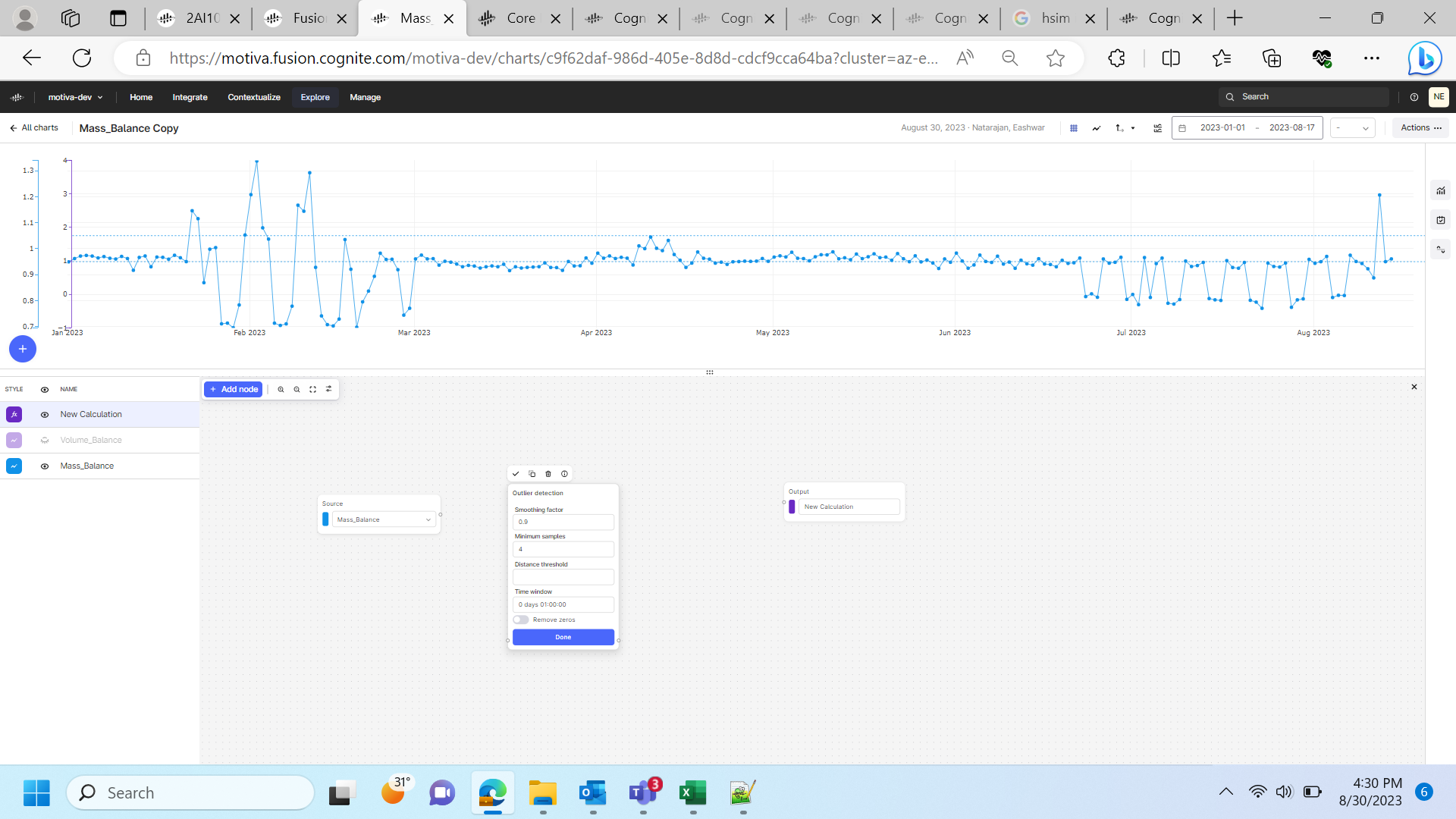
I have a CDF chart that is showing some output based on the timeseries associated with. I want to flag the points on the chart that are beyond some threshold. (say anything >0.5 and <-0.5 is abnormal and need to be flagged off in the chart) IS there a way to show that in the CDF charts visualization.
Hello,
This is a great question. You have two options based on if you need to evaluate historic thresholds, or be alerted on future thresholds.
- Future thresholds. In the right hand menu, choose Monitoring and create a monitoring-job to evaluate the threshold for future incoming data. You will receive an email when it is breached, and alerts are available in Charts under menu “Alerts”
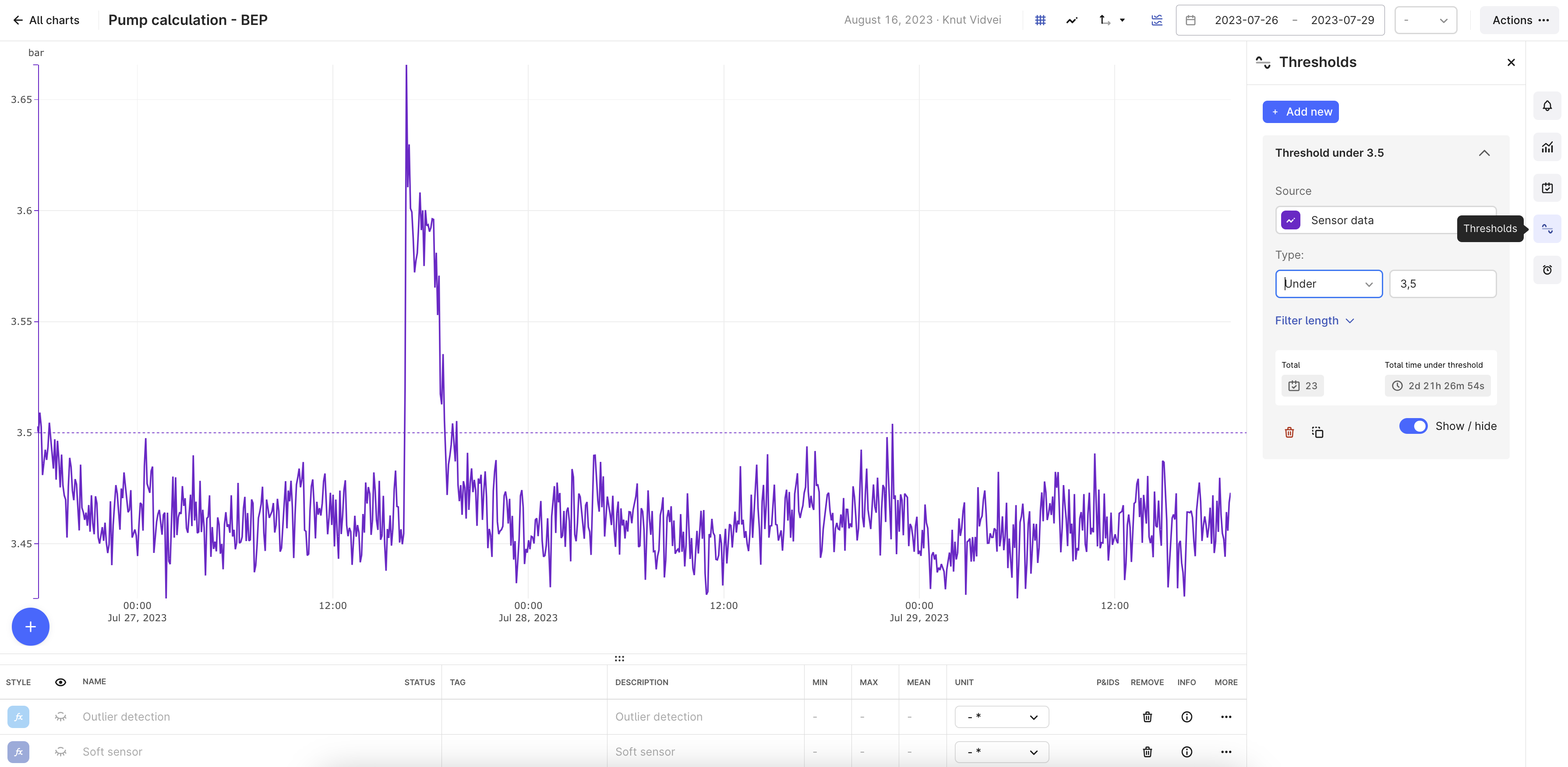
- Historic threshold breaches. Use the right hand menu “Thresholds”, and select Over or Under or Between. The breaches and the total duration is shown. It is however not “flagged” or highlighted in the Chart beyond showing the threshold line as if now.
Knut
Thanks
I am not able to understand and use that in CDF charts.
Actually, It must look like the box plots and must show all the normal points and the outliers in a different color.
Hi,
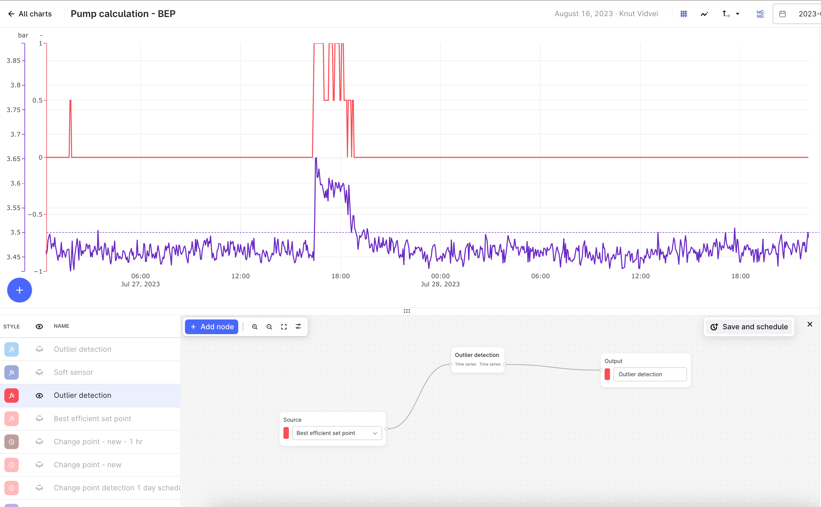
The outlier detection gives you a new time series that based on your settings calculates whether the data points in the source time series are outliers or not.
The new time series will be 0 if no outliers are found and 1 if there are outliers that match your input settings.
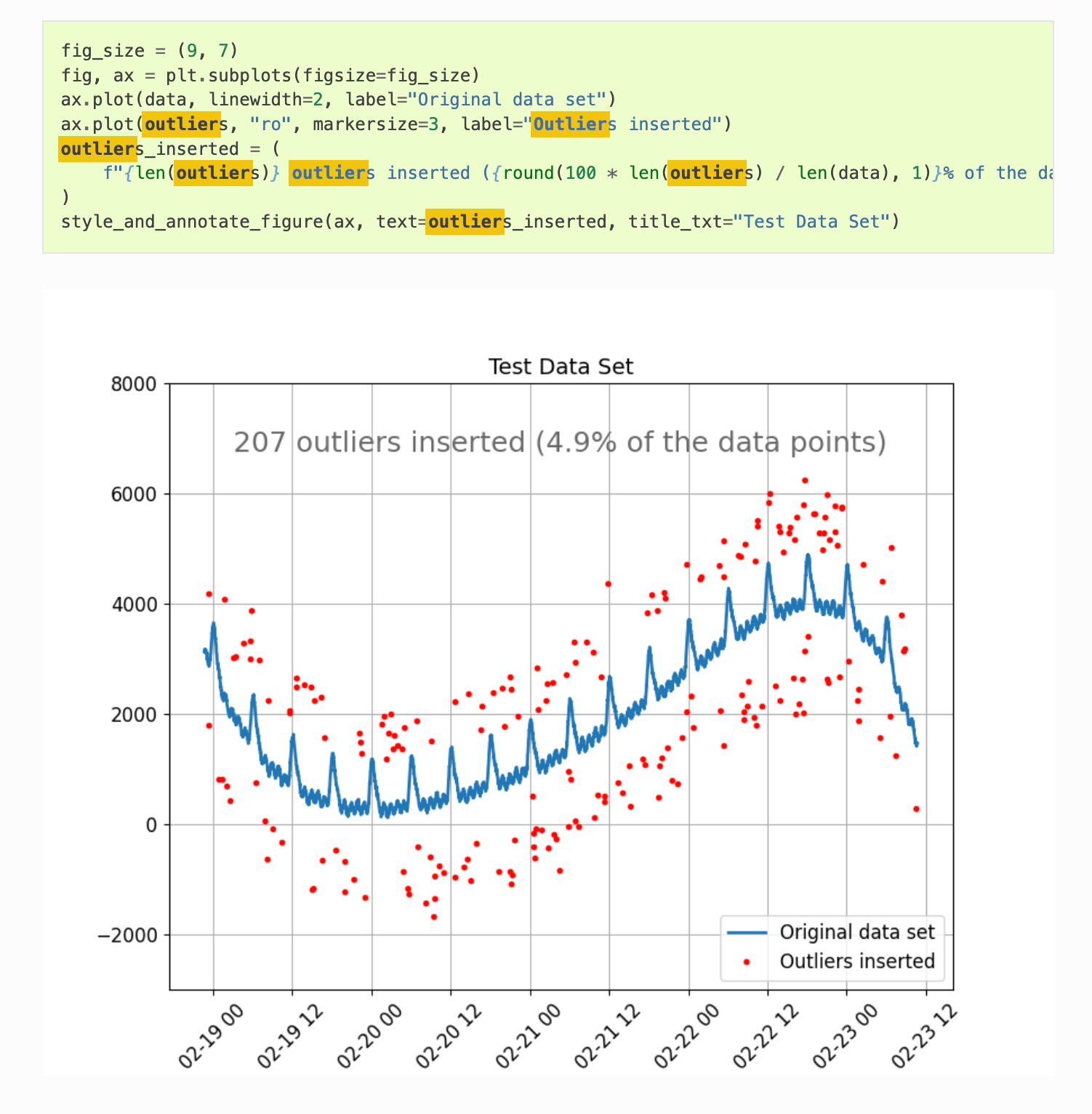
If you want to go deeper, and see Python code and examples using the underlying Industrial Data Science Library you can also see details here:
https://indsl.docs.cognite.com/auto_examples/data_quality/plot_out_of_range.html
Knut
Hi
I would want to show that in the same chart itself. That is what my customer is asking for. If I have to work outside charts, I can use core Python and other visualization tools to show that details.
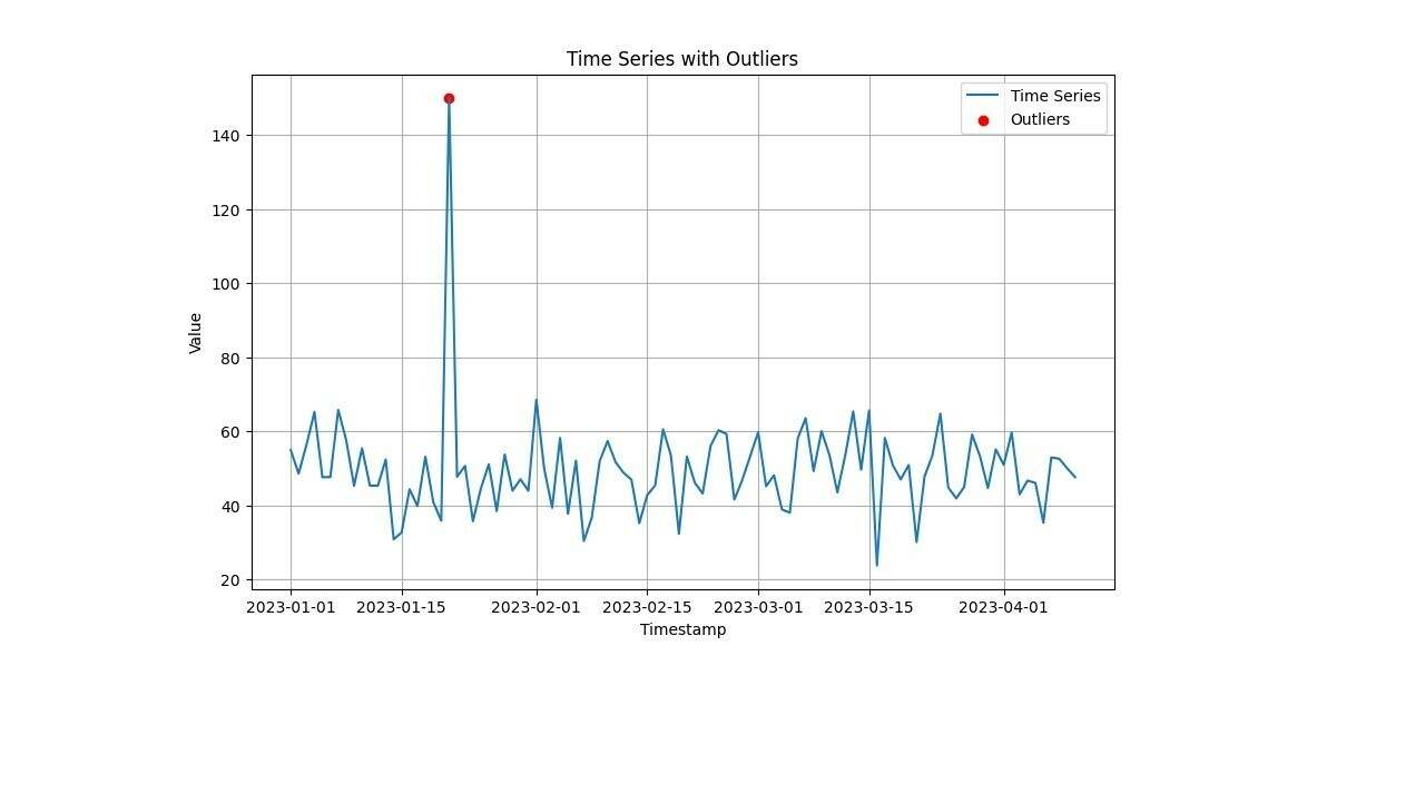
For ex: this code will show it pretty well using core Python.
import numpy as np
import pandas as pd
import matplotlib.pyplot as plt
# Generate example time series data
np.random.seed(42)
n_points = 100
timestamps = pd.date_range(start='2023-01-01', periods=n_points, freq='D')
values = np.random.normal(loc=50, scale=10, size=n_points)
valuesu20] = 150 # Adding an outlier
data = pd.DataFrame({'Timestamp': timestamps, 'Value': values})
dataa'Z-Score'] = (dataa'Value'] - dataa'Value'].mean()) / dataa'Value'].std()
outlier_threshold = 2
outliers = dataadataa'Z-Score'].abs() > outlier_threshold]
# Plotting
plt.figure(figsize=(10, 6))
plt.plot(dataa'Timestamp'], dataa'Value'], label='Time Series')
plt.scatter(outlierse'Timestamp'], outlierse'Value'], color='red', label='Outliers')
plt.xlabel('Timestamp')
plt.ylabel('Value')
plt.title('Time Series with Outliers')
plt.legend()
plt.grid(True)
plt.show()
The output will look like this for the above standard-python code snippet.
Using Python code and InDSL you will have the full freedom to customize your views. These preferences will vary from user to user, and customer to customer.
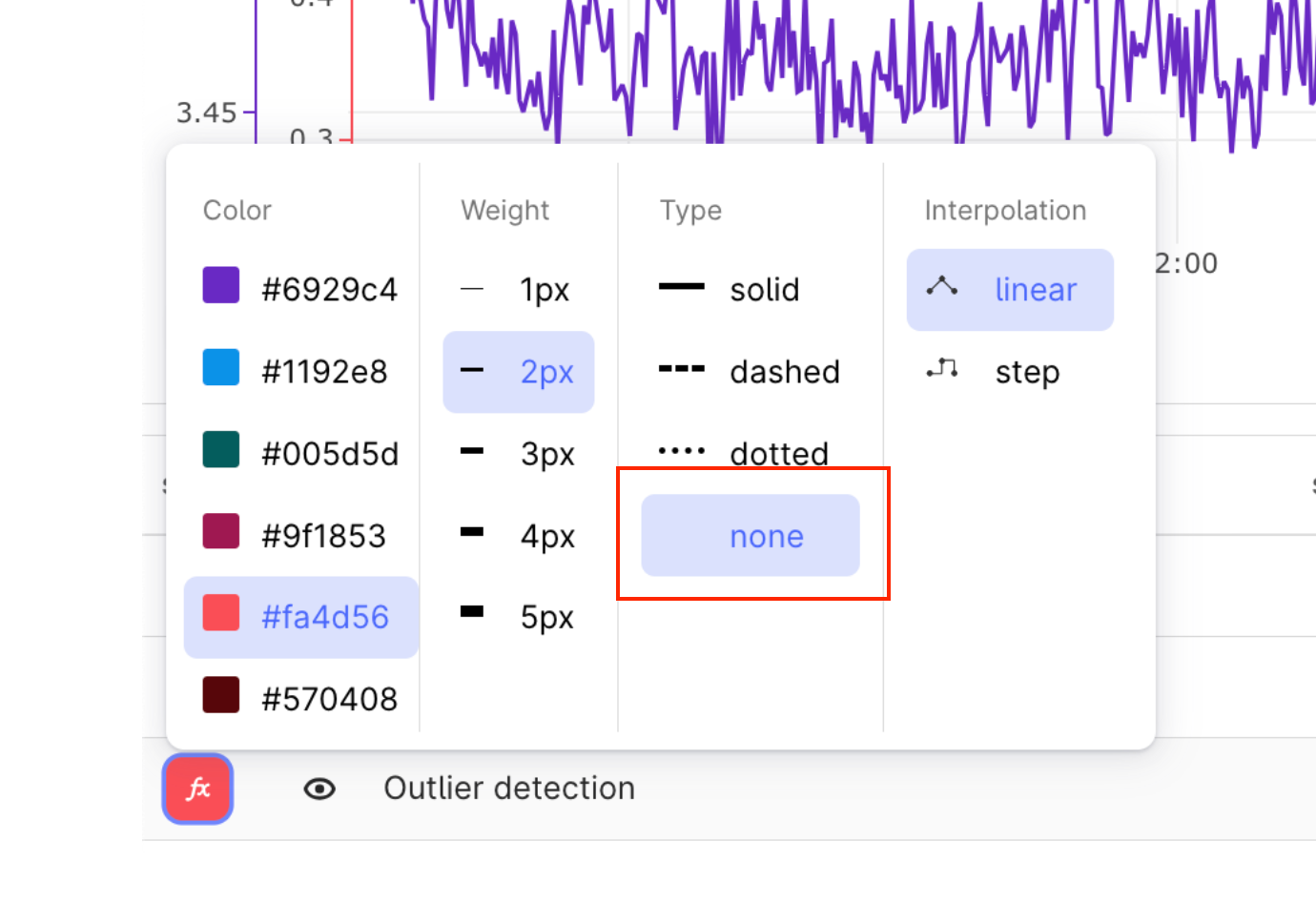
However, you can still do a lot in the fronted. if you use the visualization setting in the outlier detection time series, and set Type to “none”, it will show the dots as you have in your Python plot above. I scaled here the y-axis so that the results with 0 is below the view line.
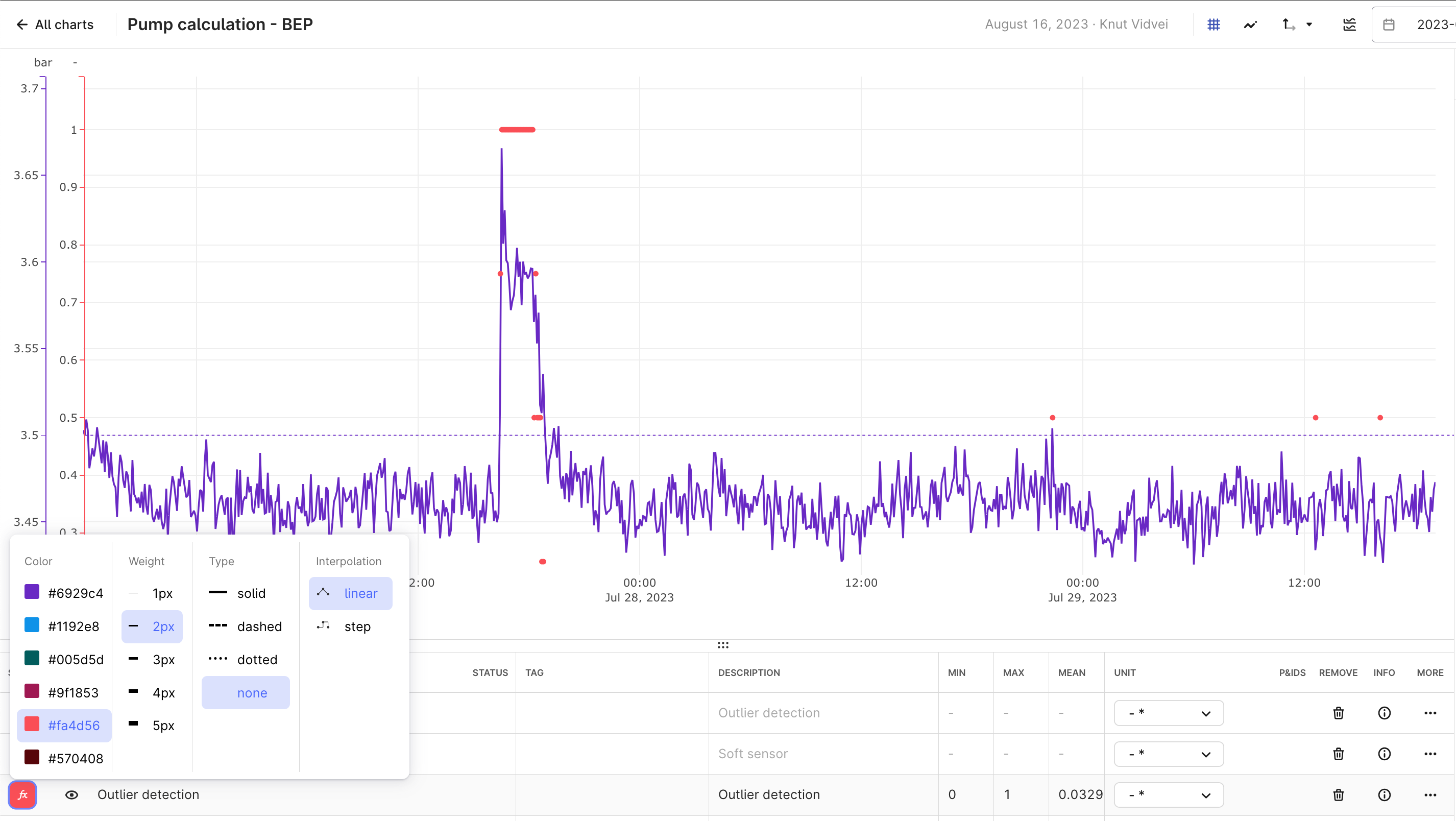
Allowing full flexibility as you have in Python in a no-code frontend is a bigger challenge, as it would lead to an unmanageable number of settings and buttons.
Please could you share a clear example with steps; I dont see any type or such setting in CDF charts in front-end.
Hi,
I zoomed in and highlighted the option with a red box here:
Hi
Reply
Enter your E-mail address. We'll send you an e-mail with instructions to reset your password.