Check the
documentation
Check the
documentation Ask the
Community
Ask the
Community Take a look
at
Academy
Take a look
at
Academy Cognite
Status
Page
Cognite
Status
Page Contact
Cognite Support
Contact
Cognite Support

Below we have outlined several frequently asked questions and their corresponding answers.
Don’t see the answer to your question? Post as a reply in this thread and we’ll be sure to answer and/or add it to the FAQ list below!
Protip: Use [cmd+f] or [cntrl+f] to search for keywords related to your question.
FAQs
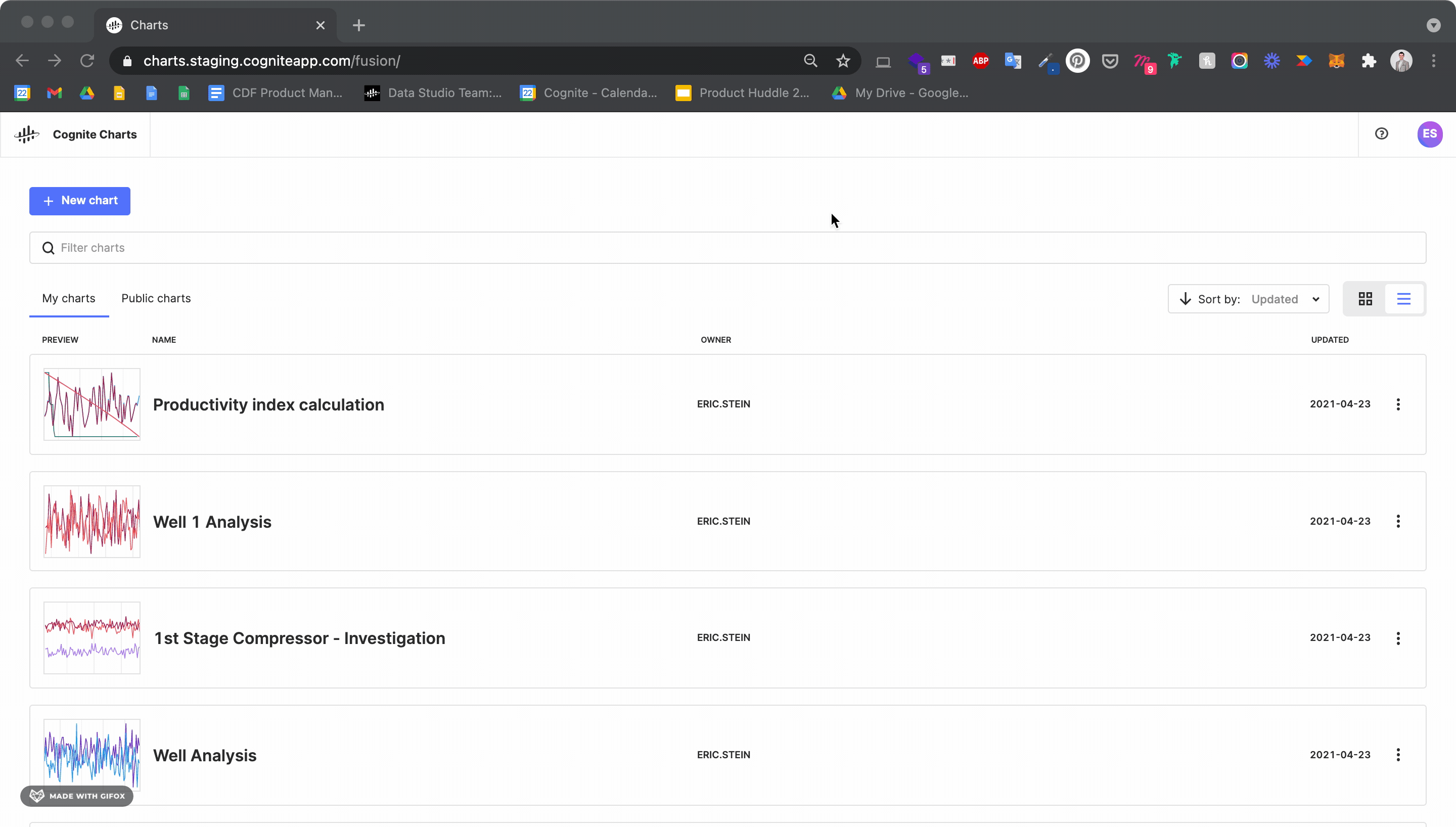
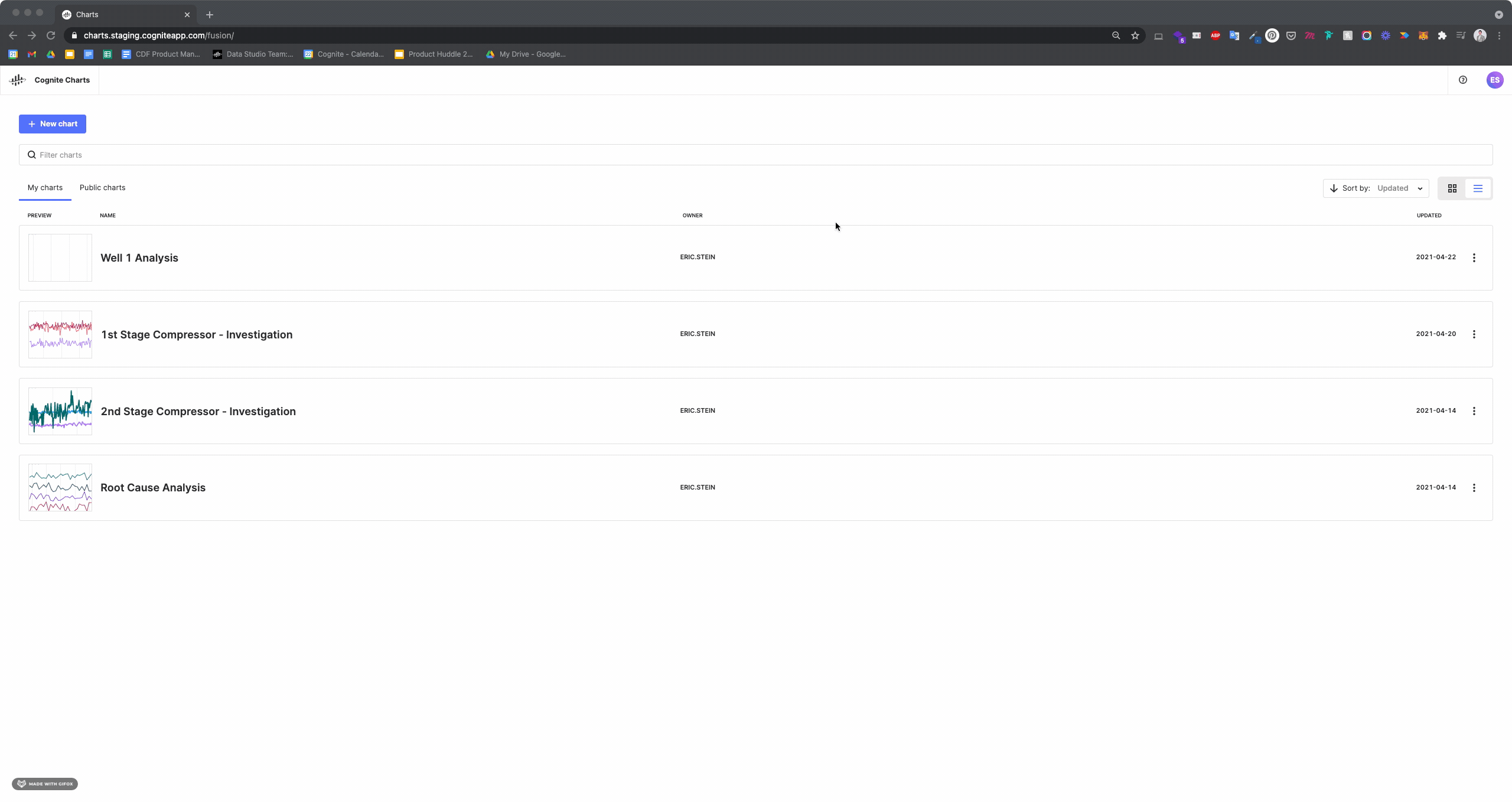
How do I create a new chart?
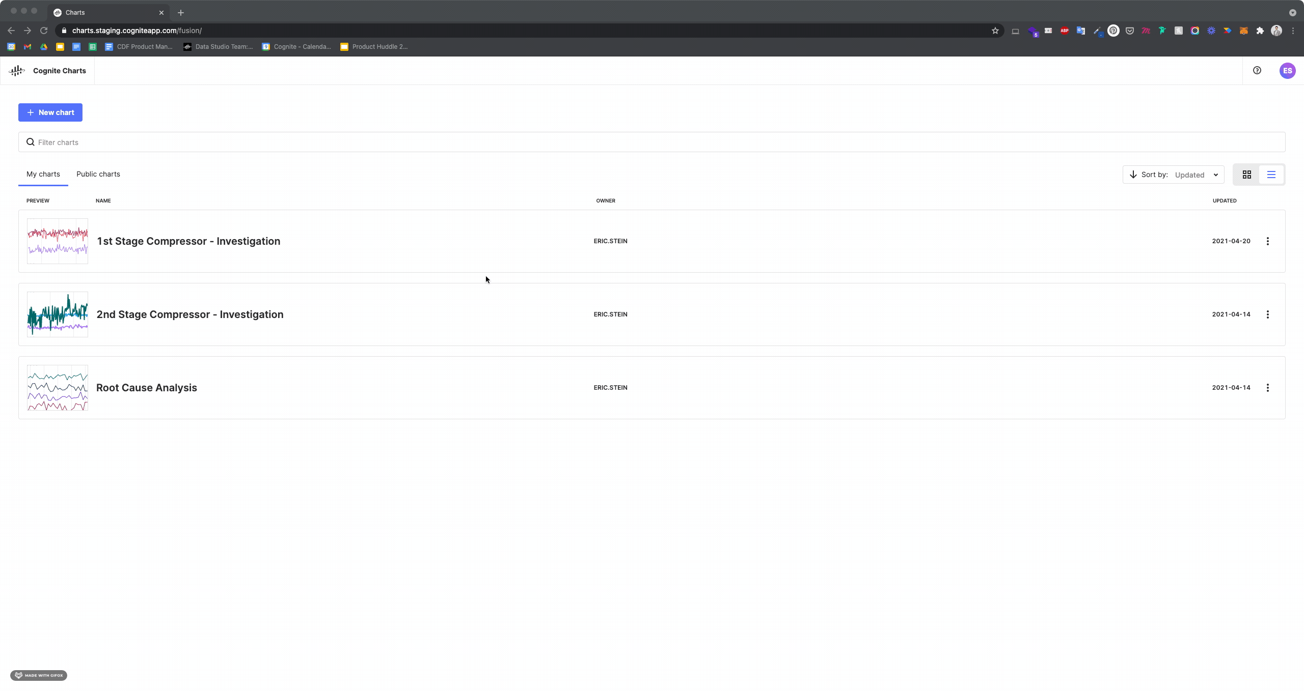
You can easily create a new chart by clicking the + New Chart button on the landing page after entering
How do I edit the name of my chart?
From the landing page, click the vertical “•••” to the right of the chart’s current name to reveal a drop-down options menu. Click the “Rename” option to open the text box. When finished, you can save you change by clicking the “Ok” button or by pressing “enter” or “return” on your keyboard to save the name. To cancel, click the “Cancel” button or press “escape” on your keyboard.
While viewing the chart itself, mouse over the chart’s name in the top menu bar to reveal the ![]() icon.
icon.
Remember, it’s important to choose a clear and descriptive name for each chart so you (and your colleagues, if it’s a public chart) can easily understand what that chart is about or used for.
How do I duplicate a chart?
Duplicating a chart is a great way to quickly leverage the same data and/or calculations that you or a colleague have already used. There are two ways to duplicate a chart.
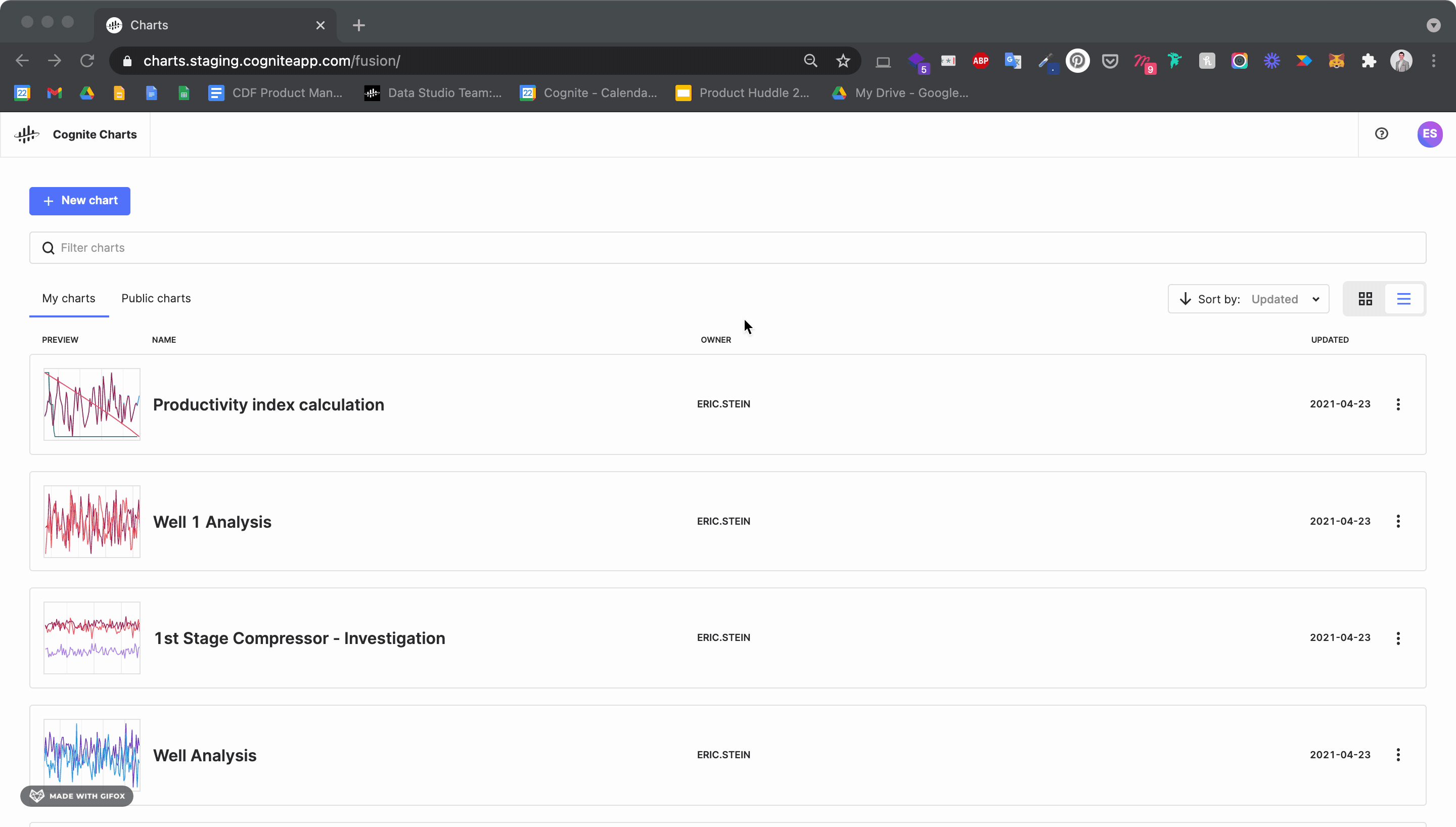
You can duplicate a chart from the “My charts” or “Public charts” tabs on the landing page. Click the vertical “•••” to the right of the chart’s current name to reveal a drop-down options menu. Click the “Duplicate” option. You’ll be taken directly to the duplicated chart, which has the original chart’s name with “Copy” added to the end of it. Of course, you are welcome to rename this new chart to whatever you’d like.
You can also duplicate a chart by pressing the “Duplicate” button in the righthand side of the top menu bar. After clicking, you will once again be taken directly to your new, duplicated chart.
You can easily create a new chart by clicking the + New Chart button on the landing page after entering
How do I find time series to add to my chart? How does the search work?
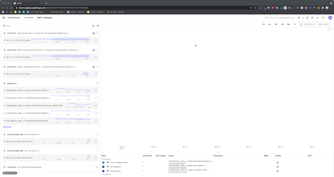
When you click the blue “Add time series” button in the top left of the Charts interface, a drawer with a search bar will slide out from the left-hand side of the screen.
Use the Tag number tab to search for the asset tag related to the time series you’re interested in. You can click on any tag name or the “View all” button (if a tag has more than 5 related time series) to view all related time series and filter among them.
Use the Time series ID tab to search for a specific time series.
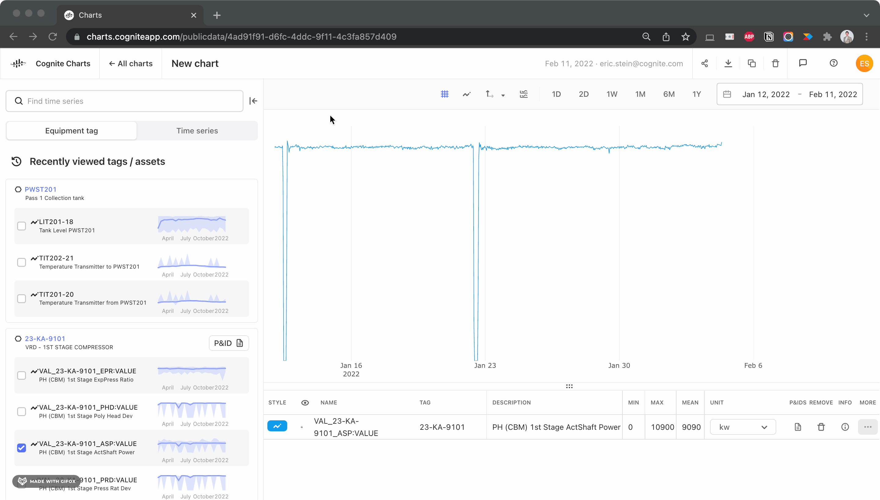
You can also search for an externalId (which may be different from the name) for a time series or asset/equipment tag in the search bar. Charts will automatically display the result at the top of the list. Note that externalId requires an exact match.
If an asset is found in one or more P&IDs, you can select the icon next to the result to open the P&ID.

You can also add time series data to your chart directly from the P&ID.
My organization is using templates in CDF. Can I search and filter for the data I need among existing templates in Charts to find the data I need?
Not yet, but soon! Adding templates to the “Add time series” experience is something our product team is working on. As soon as this is available, we will post an update in our community here in the Hub.
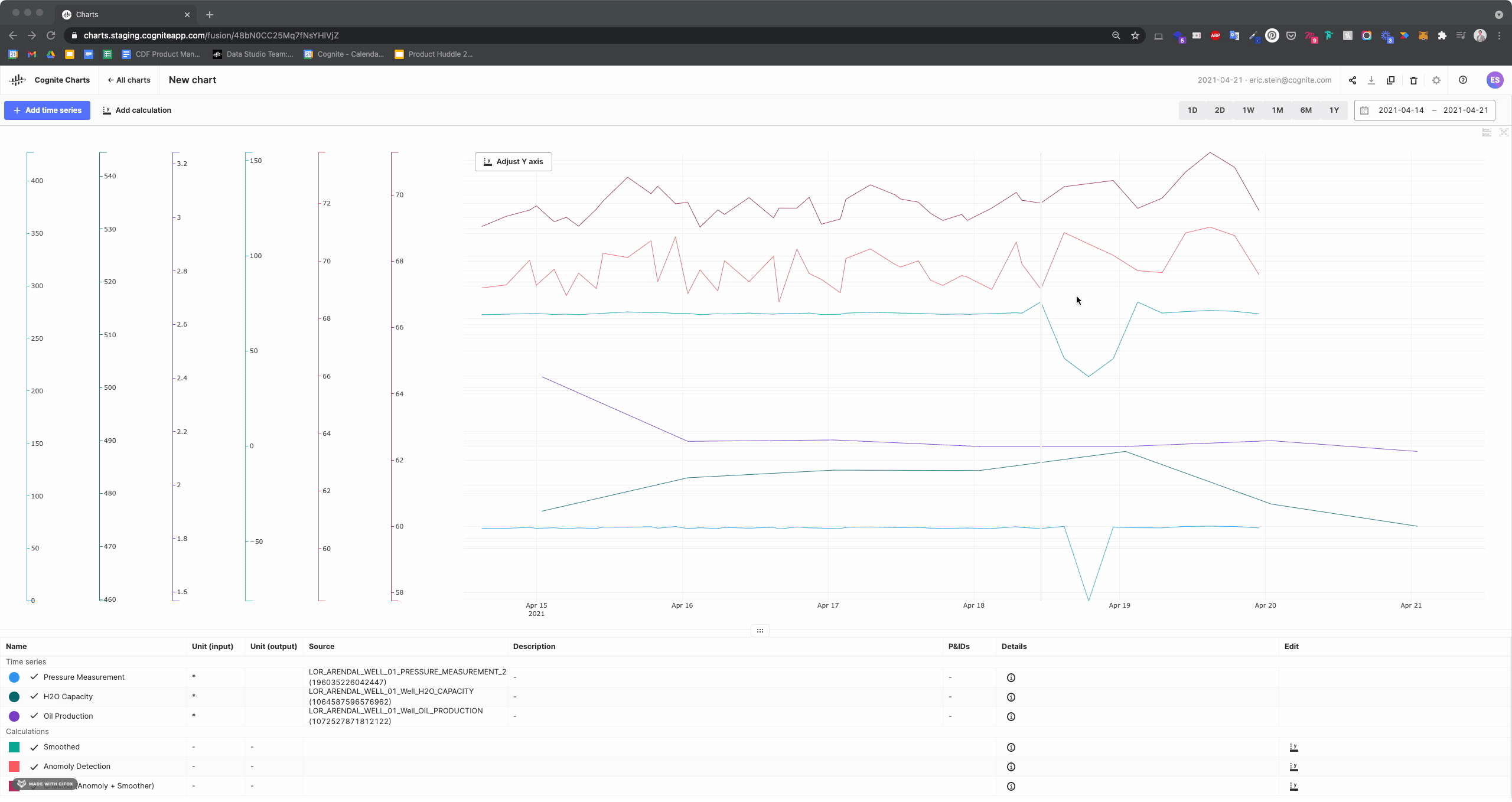
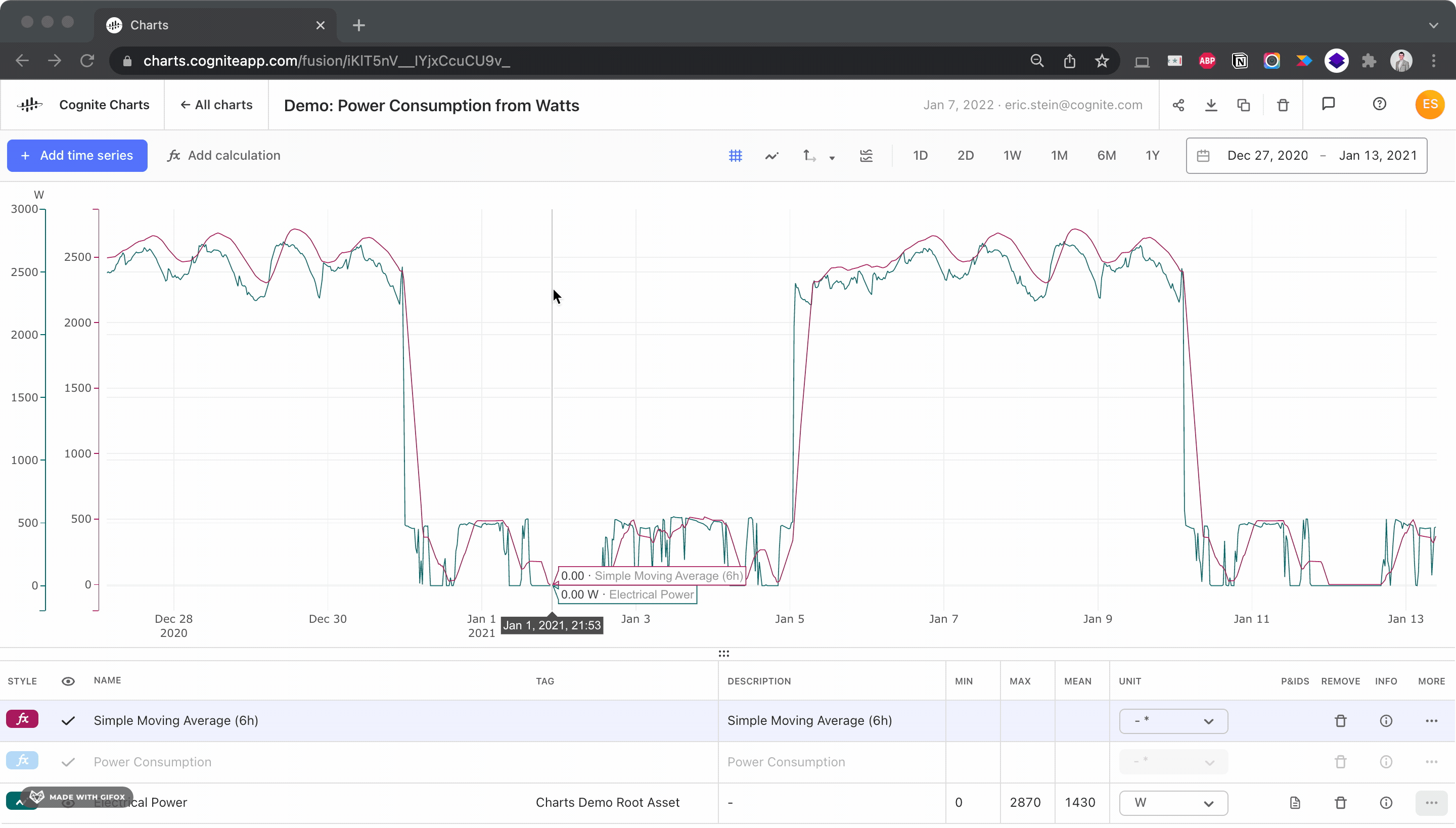
How do I enable / disable “stacking” of the time series in my chart?
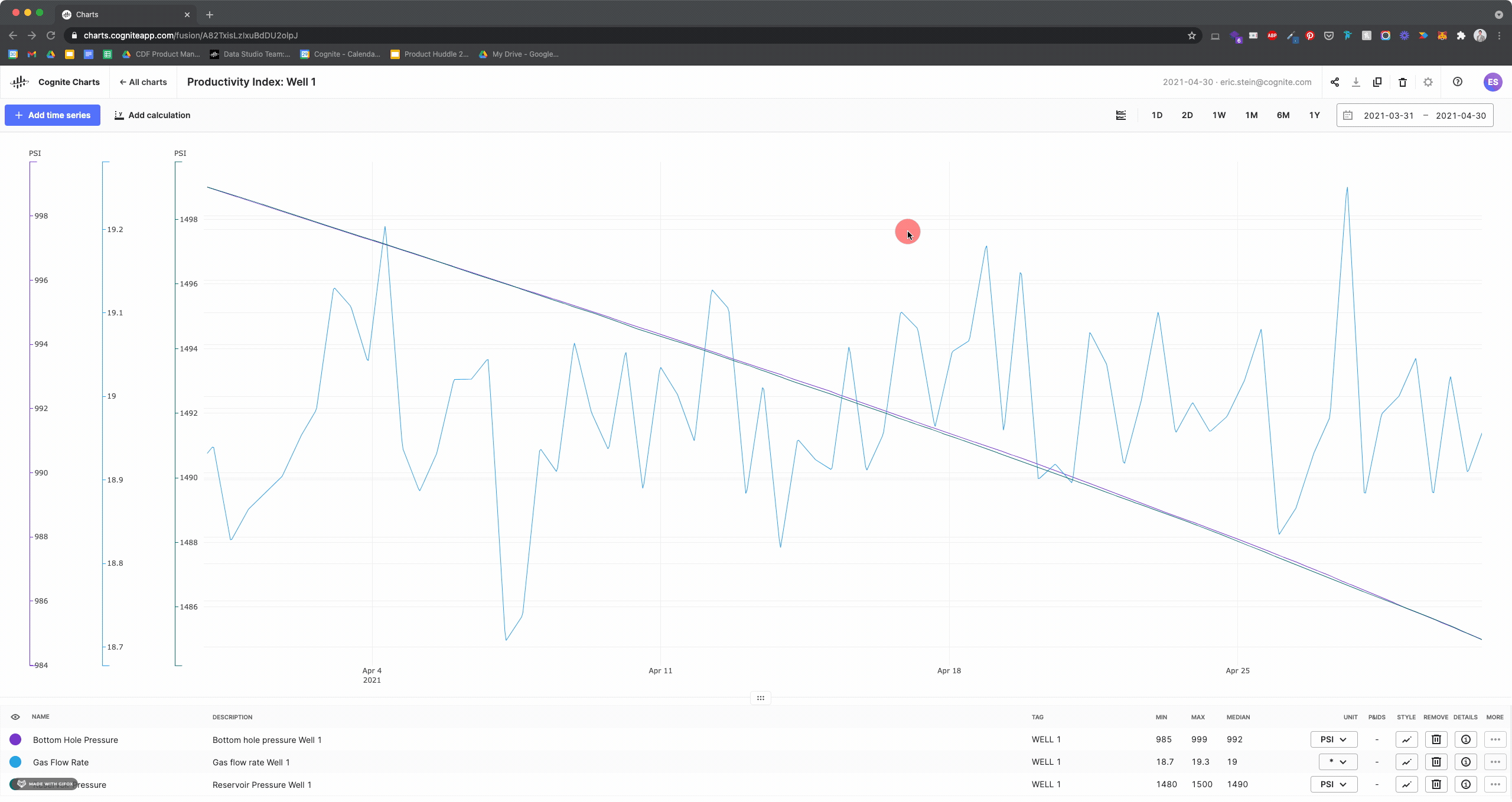
This smart stacking feature is a useful to quickly tidy up the time series in your chart for easy visual inspection and comparison. You can enable or disable this feature as needed by clicking the button in the menu bar to the left of the quick date range picker (see above GIF).
How do I rename time series and calculations in my chart? Are these name changes written back to CDF?
You can rename any time series or calculation in your list to make it more clear and understandable to you and your colleagues.
Mouse over a row in the table to reveal the ![]() icon. Upon clicking the icon, you’ll be able to edit the name of this time series or calculation in the text box. Once you’ve finished, simply press “enter” or “return” to save the name.
icon. Upon clicking the icon, you’ll be able to edit the name of this time series or calculation in the text box. Once you’ve finished, simply press “enter” or “return” to save the name.
For now, these names are not written back to Cognite Data Fusion. Any custom names are only available and visible in the chart where they have been renamed.
How do I change the appearance of time series in my chart?
You have the ability to change the color, weight (thickness) and type of line for any time series and calculation output in your chart.
Move your mouse over the colored time series or calculation icon for the line style you’d like to change. Click to open the style editor.
How do I remove a time series or calculation from my chart?
You can remove time series and calculations from your chart by clicking the remove (trash) icon underneath the “Remove” column of the data list.
Note: Charts does not currently have an undo/redo functionality. While this is something we’re working on, this means that any calculations that are deleted need to be re-built and time series need to be re-added from the search.
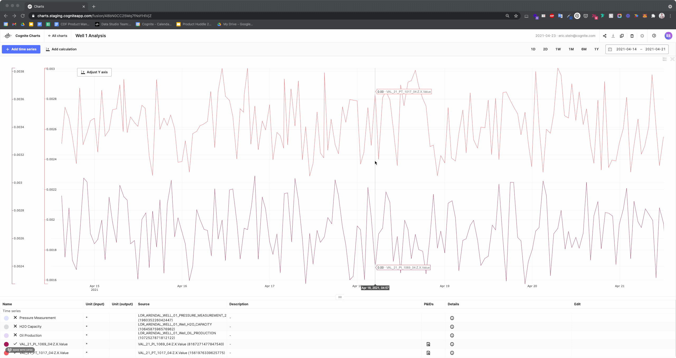
How do I see what date range I’m currently viewing in a chart? How do I change the date range?
The date range is displayed in the top right corner of the chart. It is displayed in YYYY-MM-DD format.
You can use the buttons to the left of the granular date and time picker to quickly toggle the chart between 1 day (1D), 2 days (2D), 1 week (1W), 1 month (1M), 6 months (6M), and 1 year (1Y).
For more granular date and time periods, you can use the drop down selector to choose the specific dates and/or times you are interested in.
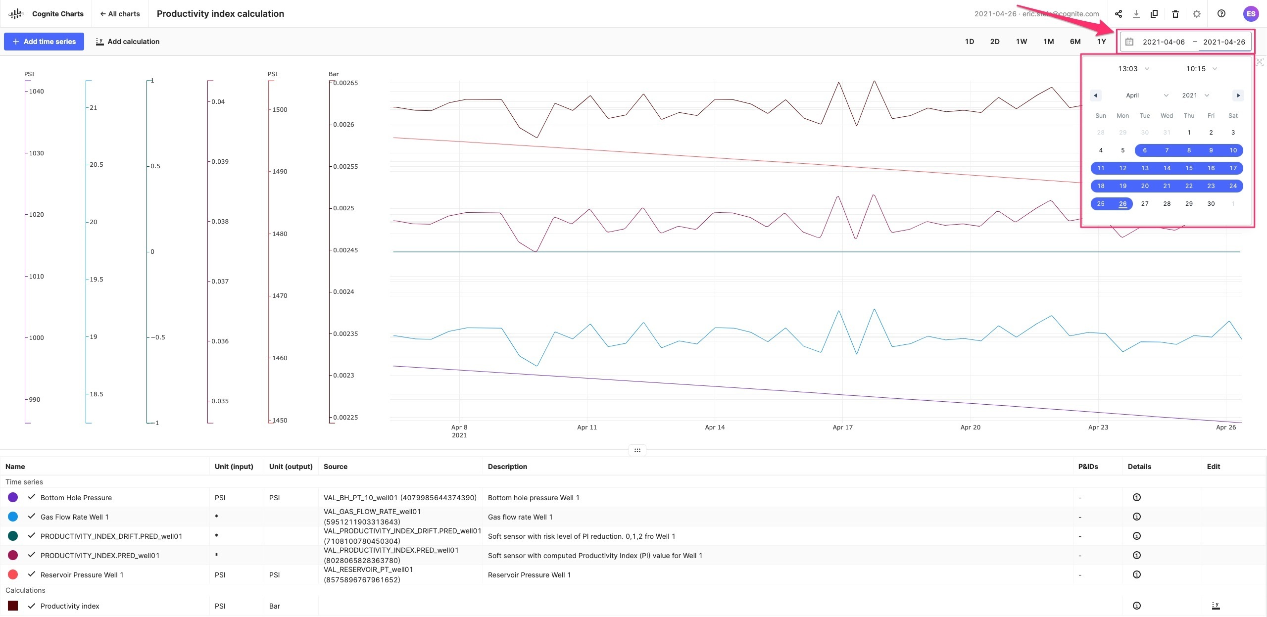
If you have any calculations in your chart, it may take a few seconds before they are updated and appear on your chart for the new date range you have selected.
How do I find and use interactive P&IDs in Charts?
If an asset (tag) has been found on an interactive, contextualized P&ID*, then you will see the icon informing you that one or more P&IDs is available for a given asset (tag). If this icon does not appear alongside an asset (tag) name, then there are currently no contextualized P&IDs containing that particular tag (see image, below).
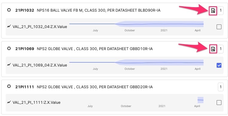
After clicking on this P&ID icon, it will load a list of all contextualized P&IDs where this tag is found. You can move between documents by clicking on them in list on the left-hand side of your screen.
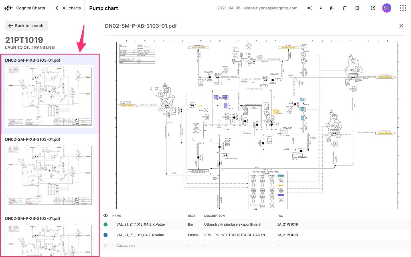
Asset tags will be highlighted in purple. Simply click on a tag to inspect the time series that are linked to that asset. You can add or remove them from your chart by clicking the checkbox ![]()
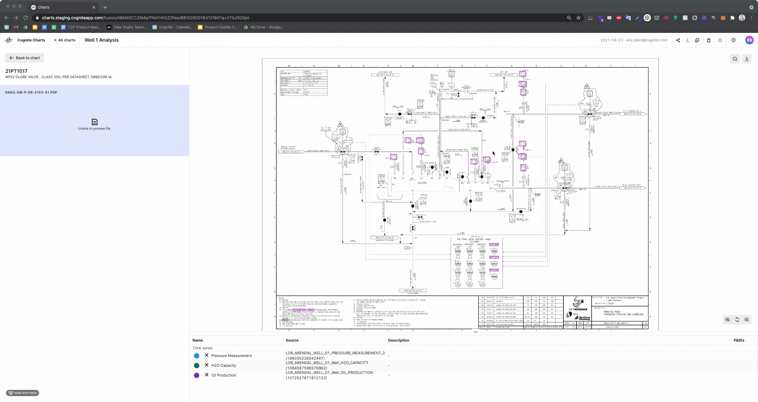
Note: In the example shown here, we are using a demo tenant with a limited set of data, so only a handful tags have been found on this P&ID.
You can zoom in or out using [cntrl + scroll] or the controls in the bottom right corner of the P&ID viewer window. You can also search for text within the P&ID you’re currently viewing by using the search in the top right corner of the viewer.
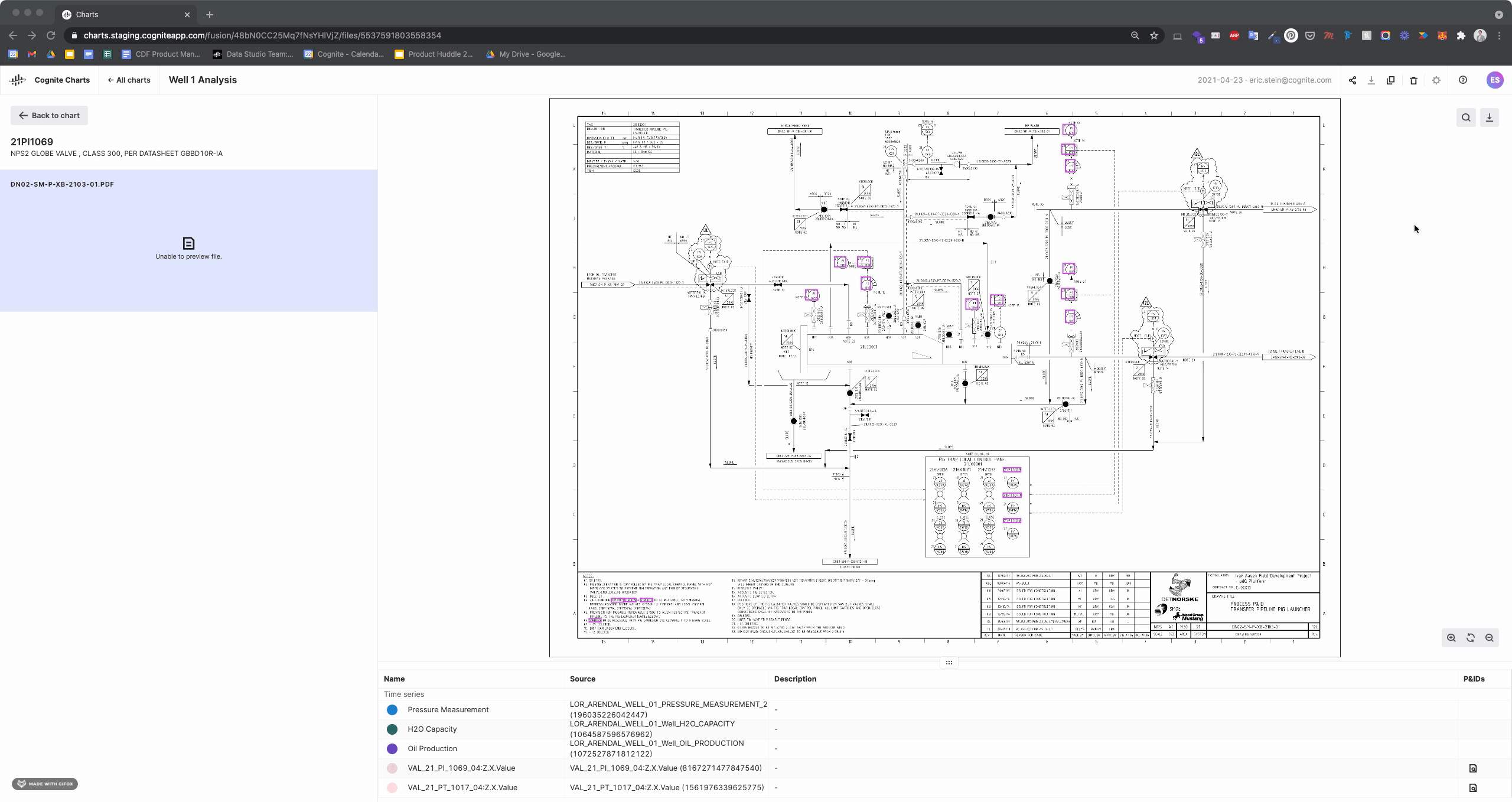
You can always re-open and view by clicking the icon in the “P&ID” column of the table below your chart.
*In order to use this feature in Charts, the P&IDs in the tenant must already be contextualized. To learn more about contextualizing P&IDs in Cognite Data Fusion, you can read about it on Docs by clicking here.
I’m ready to share my chart with my colleagues, what do I do?
In the right side of the top menu bar, click the “Share” icon. You’ll then see a dropdown that prompts you to toggle “Sharing on” to make your chart public. You will then be able to copy the unique link to your chart and share the link with any of your colleagues over email, Slack, Teams, etc.
After toggling the “Sharing on” your chart will appear in the list of public charts, which you can navigate to by clicking the “Public charts” tab on the landing page.

What happens when my chart is public? Will all my colleagues be able to see and/or edit my chart?
Once you toggle “Sharing on” then your chart will appear in the “Public charts” list. This means that any of your colleagues who use Charts will see your chart in the list. It’s important to give your chart a clear and descriptive name so your colleagues can understand what your chart is about and used for.
When your colleague clicks on one of your public charts, they will see the chart exactly as you left it. Your colleague will be able to interact with your chart to show/hide time series and calculations, adjust the axes, zoom, etc. However, any changes they make will not be saved and will not be available for others to see. If they leave the chart and come back or refresh the page, then it will reset to it’s original, owner-defined view.
Some functionalities, such as changing the sharing settings of the chart or deleting it, are unavailable to non-owners.
If you (the owner) make changes to your chart, then these changes will be reflected for anyone who also views your chart.
If your colleague wants to build upon your work or make lasting changes to a chart that you made, then they can “Duplicate” your public chart, which will make an exact copy with them as the chart owner.
Can I share my chart directly with only select individuals?
Not yet, but this is a feature we are working on in the product team. For the time being, all of your colleagues who use Charts will see the public charts you’ve shared.
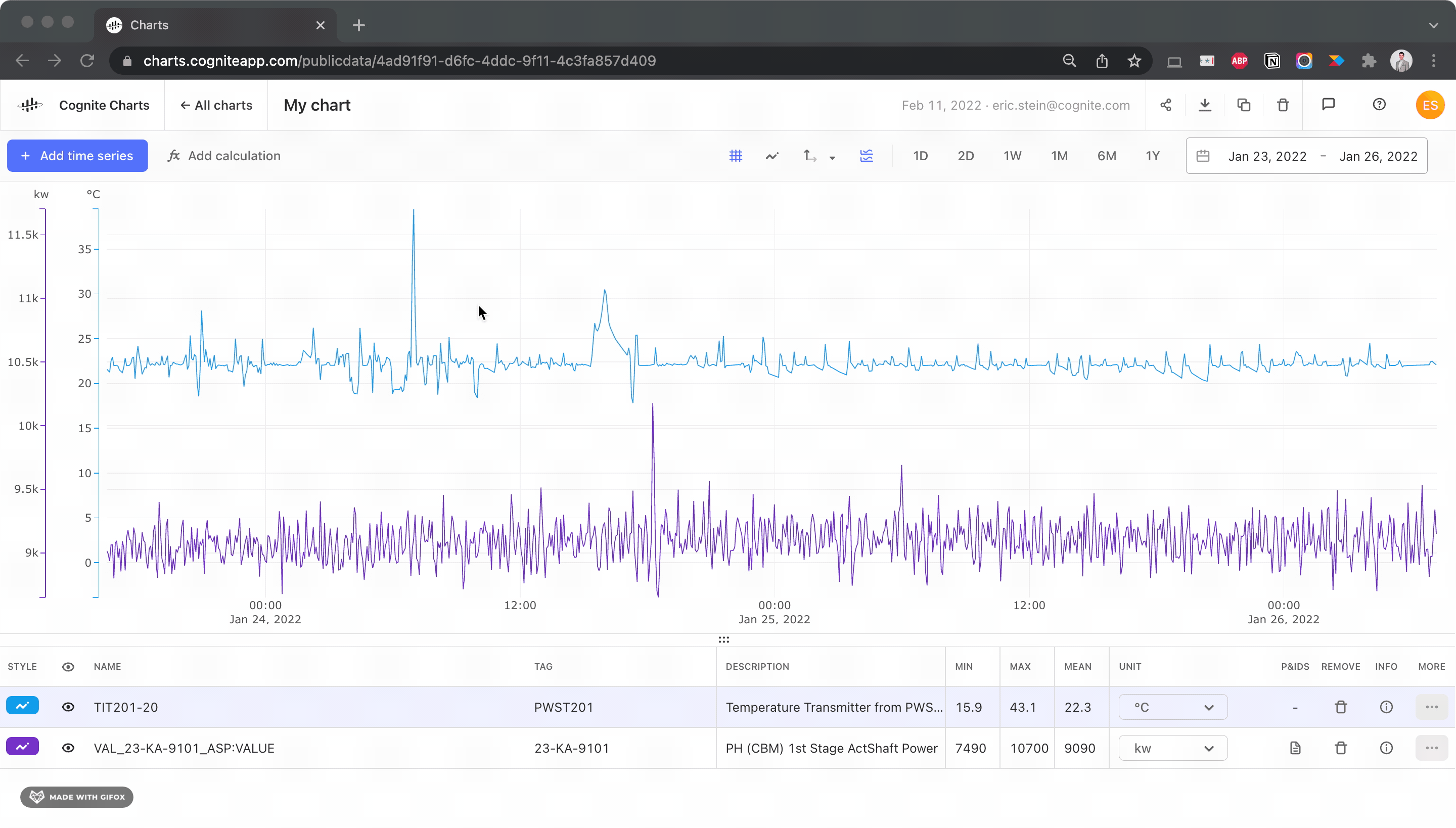
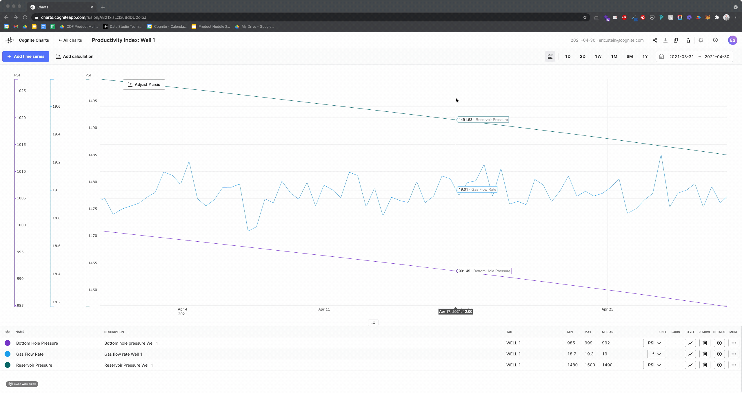
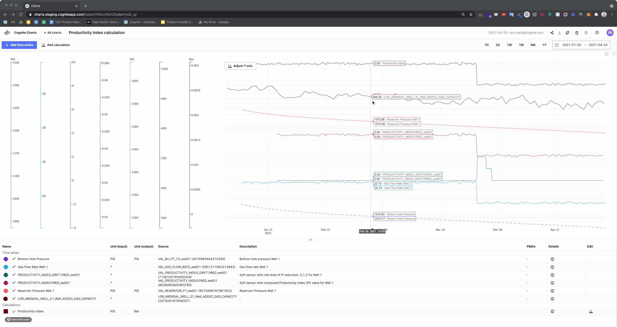
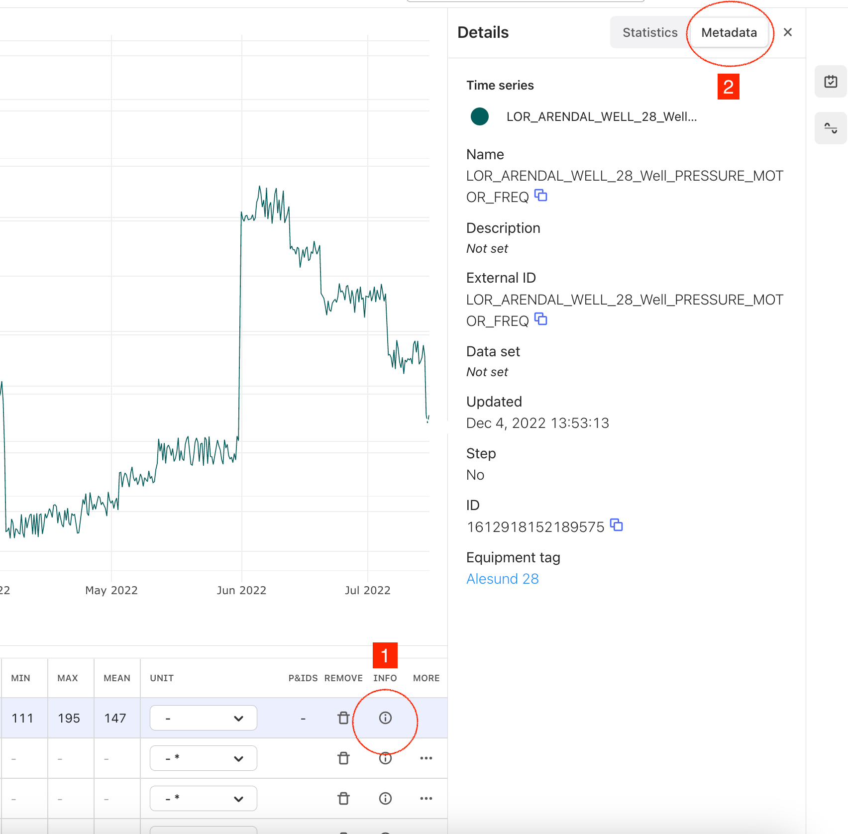
How do I view statistics for a given time series for the date range I’m viewing?
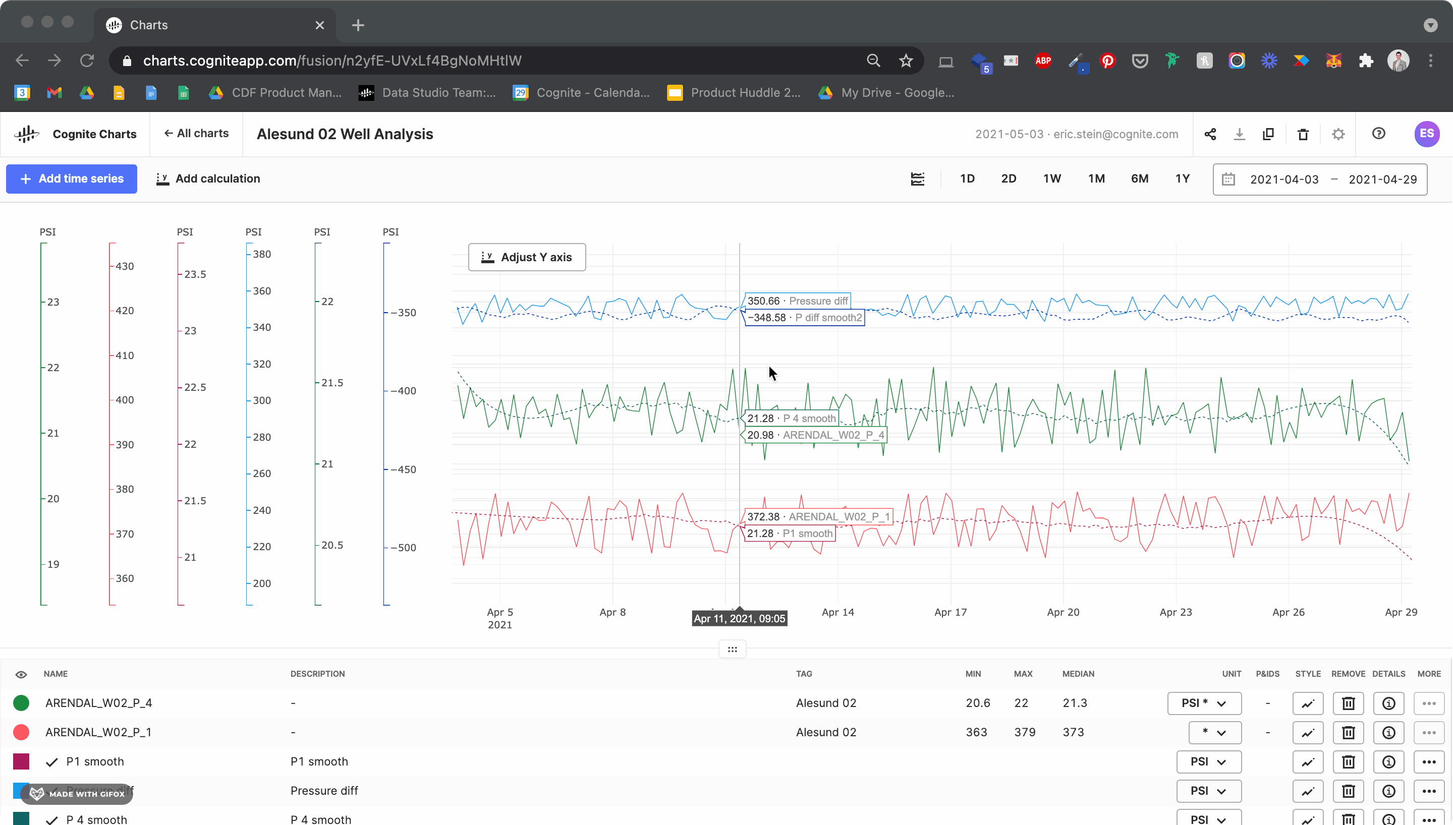
Charts automatically calculates a data profile of statistics for each time series in your chart for the given time window you’re currently viewing. You can quickly view the Min, Max, and Median values in the table below your chart. To view all statistics, click the details  icon.
icon.
Currently, the data profile includes:
-
Min
-
Max
-
Mean
-
Median
-
Standard Deviation
-
25th Percentile
-
50th Percentile
-
75th Percentile
-
Skewness
-
Kurtosis
Would you like additional statistics calculations to be added to this feature? Post a feature request or let us know in a comment below.
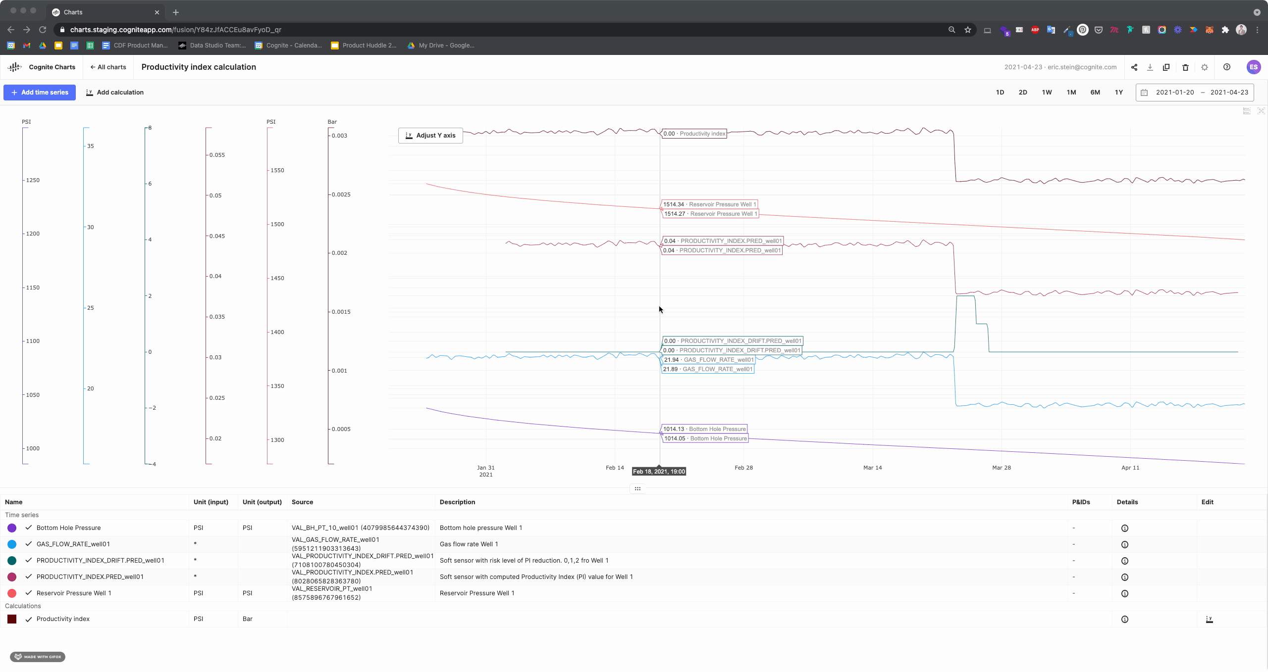
How do I create a new calculation?
To add a new calculation, click the “Add calculation” button in the top left portion of the screen (just to the right of the blue “+ Add time series” button).
Once clicked, you’ll see a new row has been added to the table below with the name, “New Calculation.” Of course, you can name this to whatever you’d like. Calculations can be identified by a  shape alongside their name (in their currently assigned color) while time series have a
  .
.
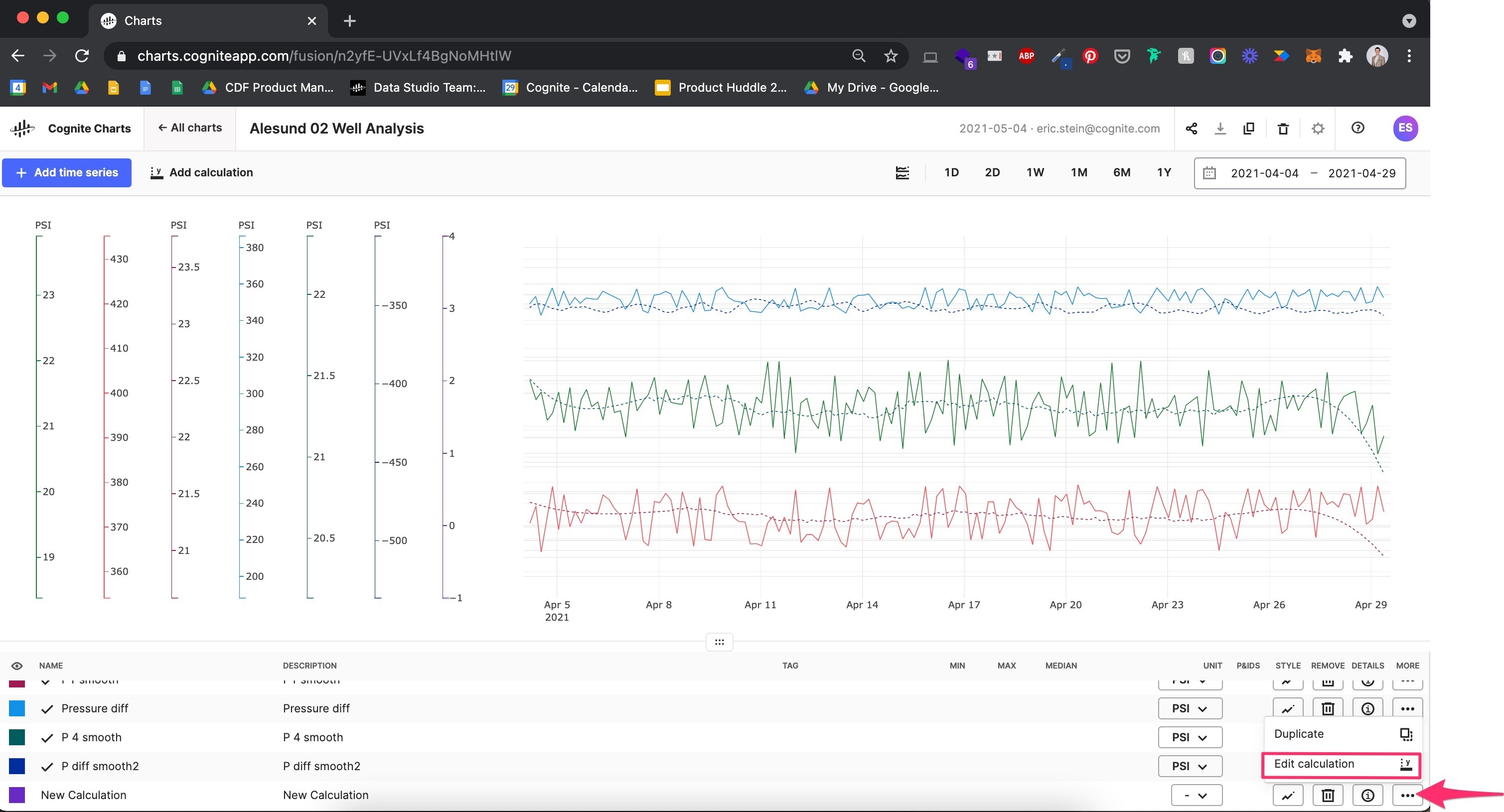
To edit a calculation, click the “...” button underneath the “More” column (see screenshot below):
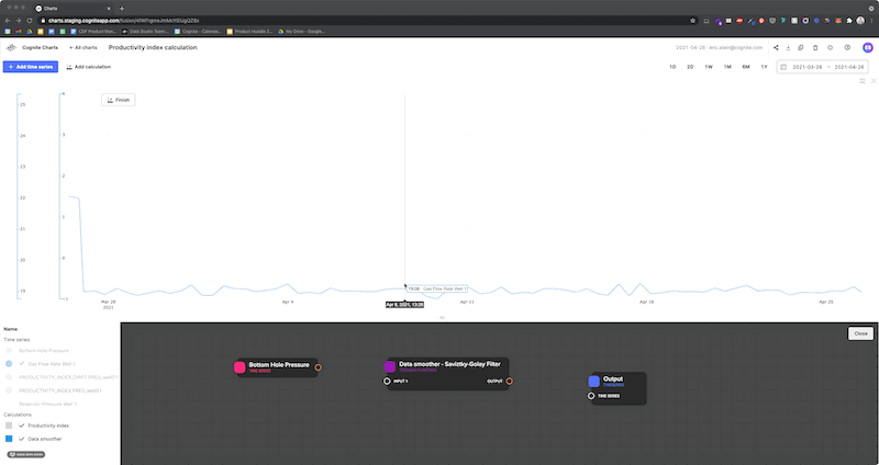
After opening the node editor for your calculation, you can add new elements by right clicking and choosing the relevant item. You can choose from:
- Time series: A time series you can use as an input(s) to your calculation. You choose a time series from the ones you have already added to your chart.
- Constant: A free-input constant (number) value. This is often used as an input to toolbox functions (e.g., [time_series_1] [divided by] [2] )
- Toolbox Function: A pre-made formula, algorithm, or mathematical transformation. There are several toolboxes available and the product team is constantly adding more functions and algorithms.
- Output time series: An output time series that is the end-result of your calculation. This is the time series result will show up in your chart. after your calculation runs.
To connect the nodes of your calculation together, click + drag to connect the inputs → toolbox function(s) → output time series. You can create complex calculations by connecting multiple toolbox functions together.
Your calculation will run automatically as you make changes.
My calculation does not seem to be running, what do I do?
First, double check that you have the correct access rights. Currently, you are required to have both read and write access to Cognite Functions.
There are a few things you can do to trigger your calculations to re-run...
- Refresh the page.
- Make a simple change to your calculation (e.g. remove and re-add the time series output), which will trigger the calculation to automatically re-run.
- Change the date range. This will also trigger your calculation to re-run.
- Double-check to make sure your calculation is not hidden. You may also try toggling the show/hide.
- Double-check the calculation has finished running. You can see this by looking for a
 to the left of the calculation’s name in the table.
 - Double-check that your input time series have data points for the time period you are currently looking at.
How do I duplicate a calculation?
Duplicating a calculation is a useful way to quickly iterate, re-use, and build upon calculations that have already been added to your chart.
Move your mouse over a calculation in the table to reveal the vertical “•••” button and click it to open the options menu. Click on “Duplicate.”
Can I copy time series and calculations from one chart to another?
Not yet, but this is a feature request we have received and have added to our backlog.
Can I use the output from one calculation as the input to another calculation?
Not yet, although this is a feature request that we’ve received and are working on.
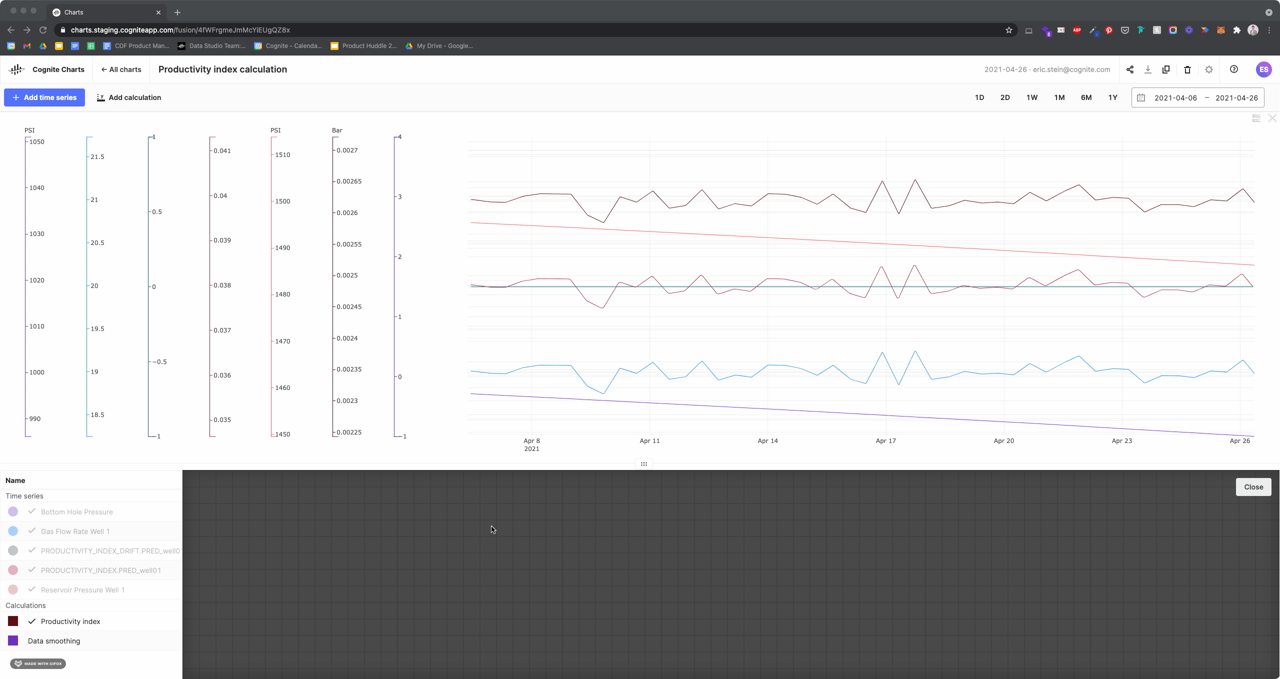
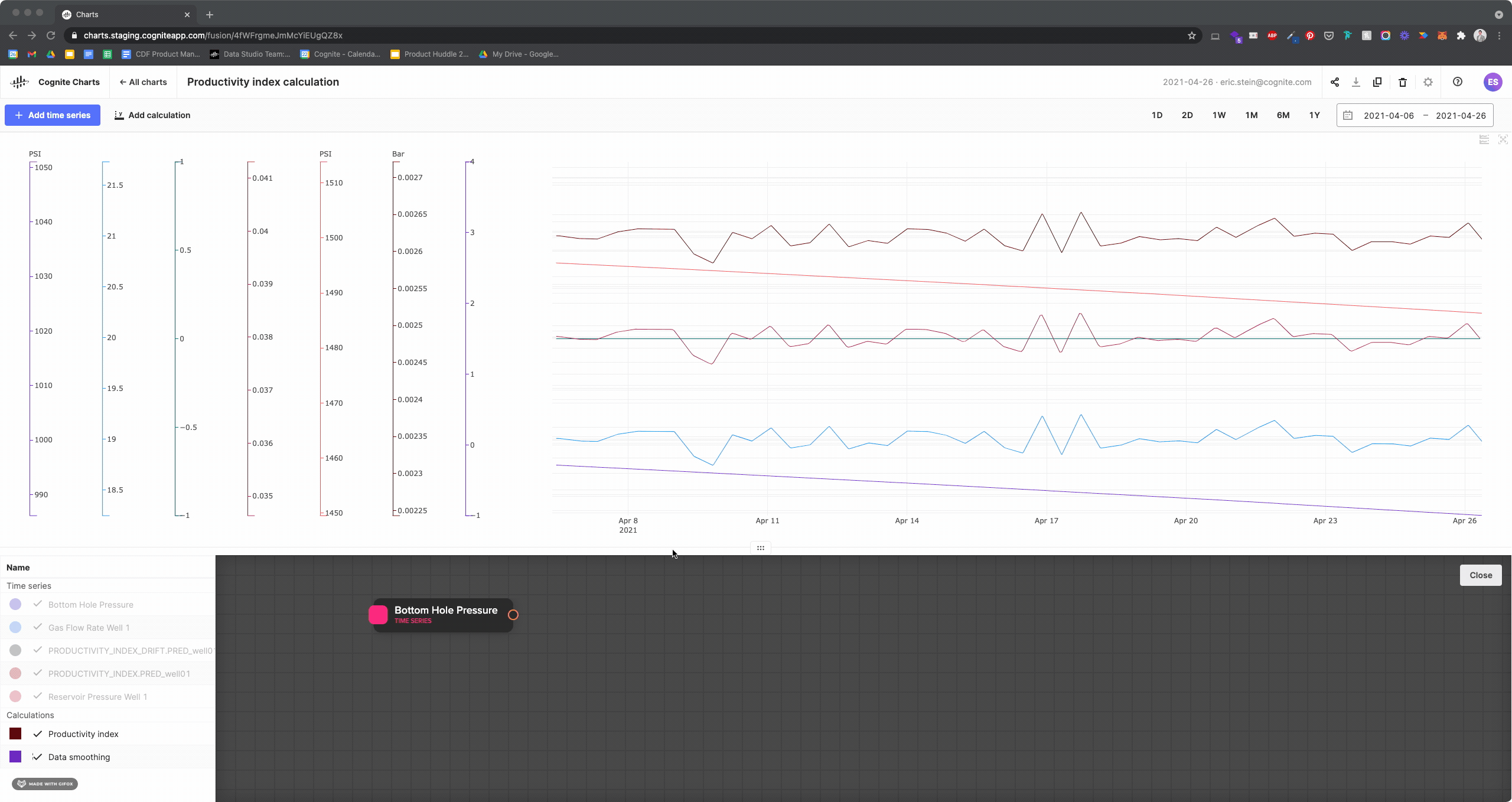
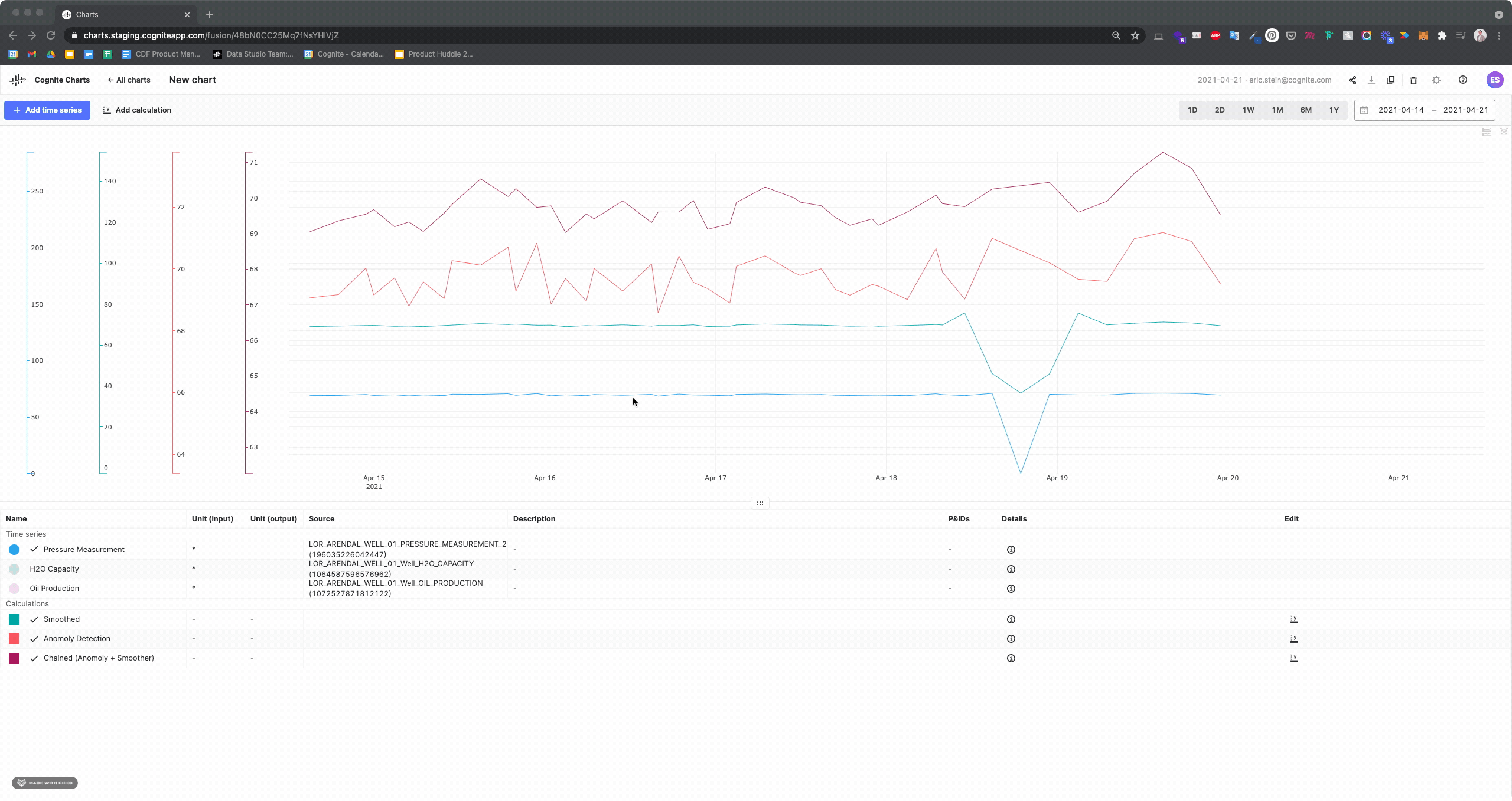
For now, you’ll have to create a single, “chained” calculation that uses a multiple of functions.
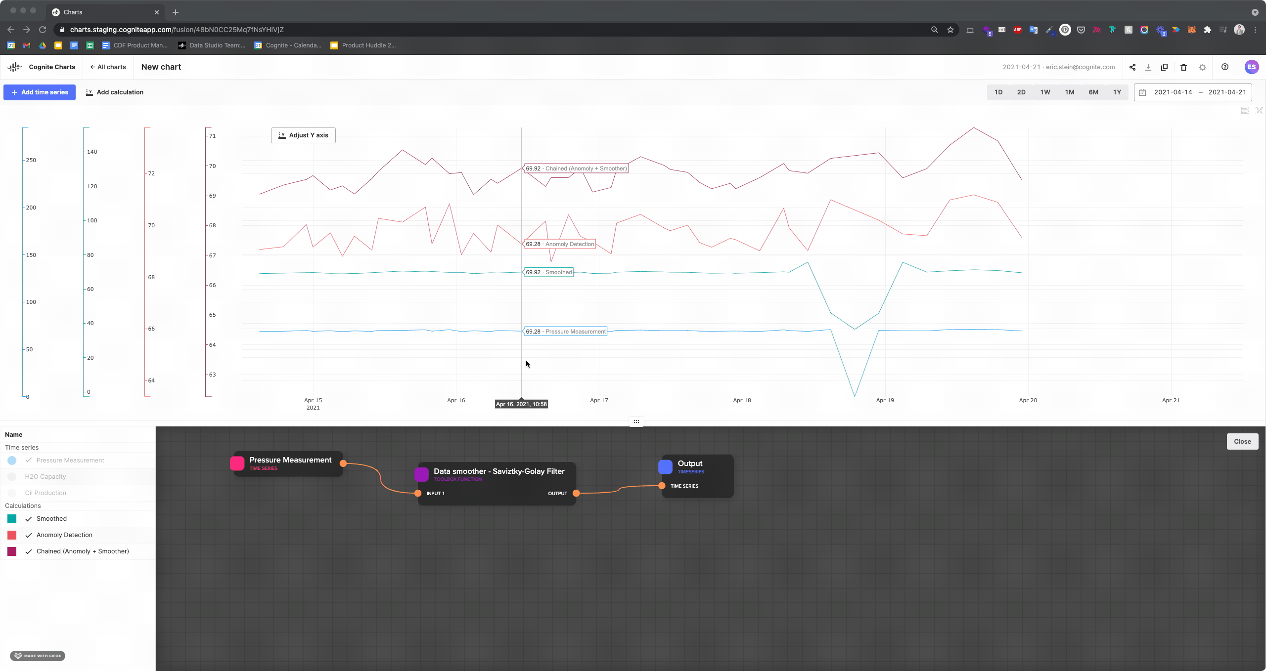
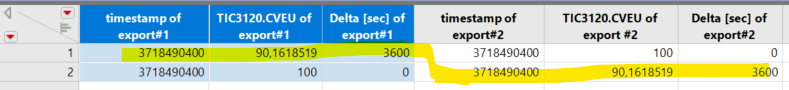
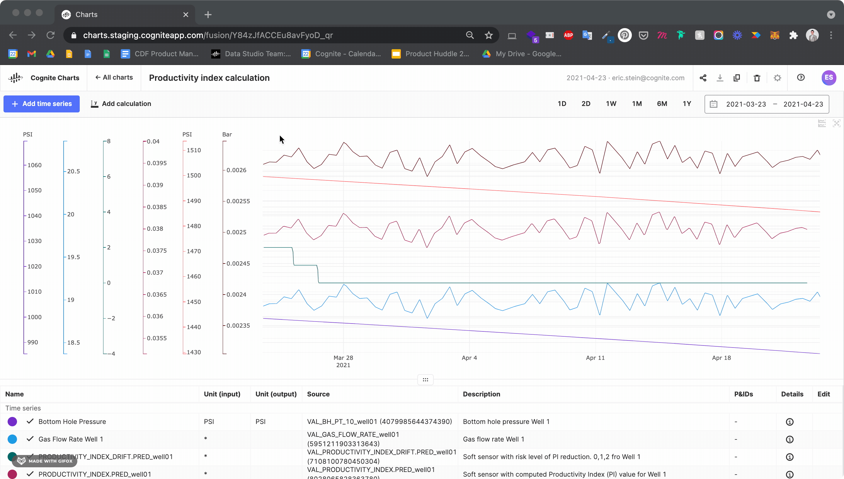
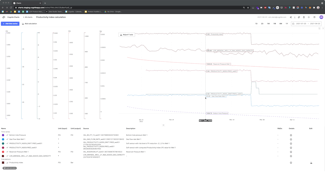
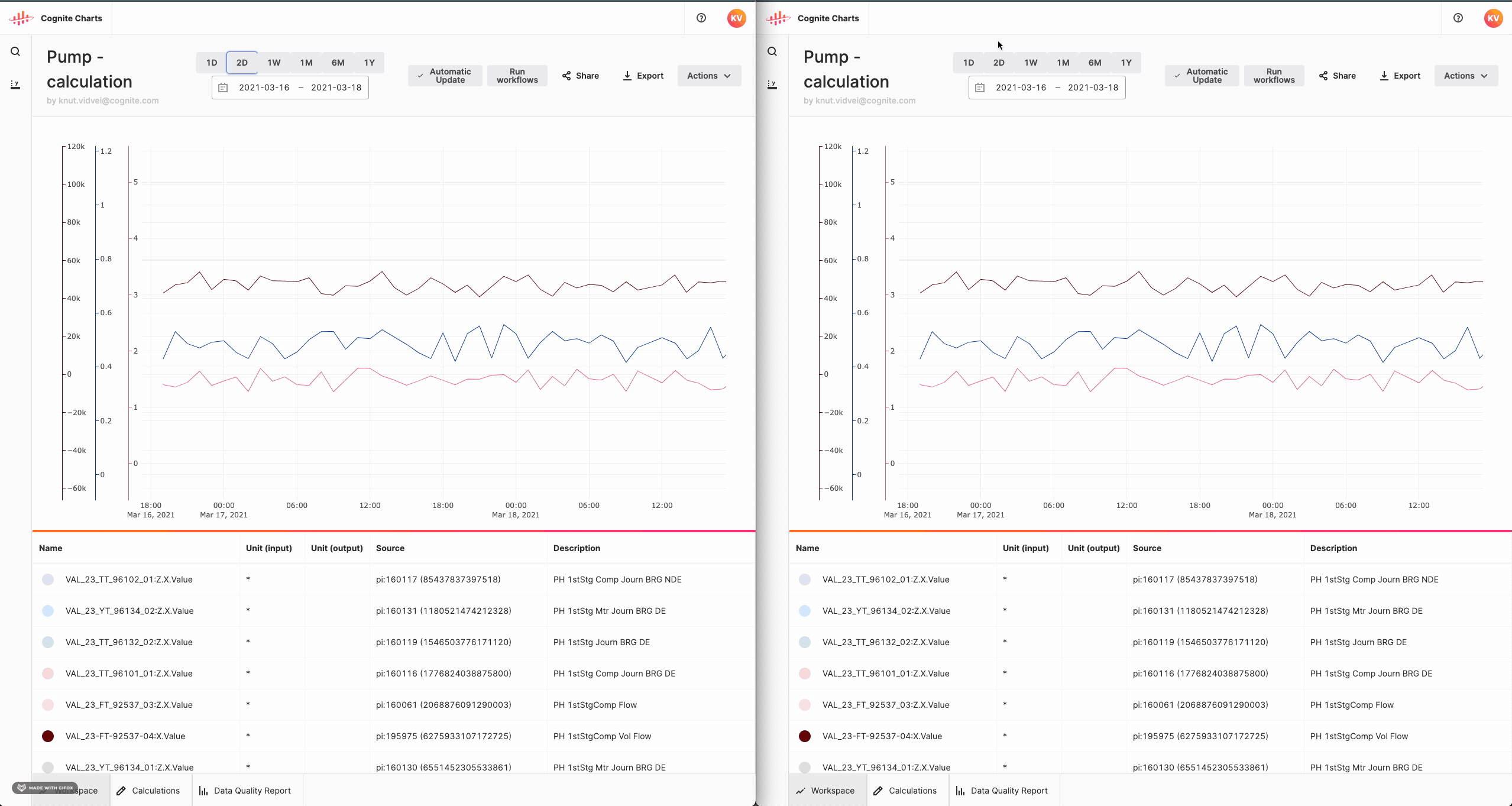
If you would like to view the output for each step of the chained calculation, then you should create one calculation for each step + one for the chained operation. You can then toggle these calculations on and off of your chart to compare how the the results change between the operations:
I know the unit for my calculation, but Charts does not have it as an available option from the unit selector dropdown – What should I do?
We’re currently working on a more robust unit conversion functionality, which will add many more units options to the available list in Charts.
In the meantime, the best solution is to manually set a minimum and maximum value on the relevant y-axes by clicking on the bottom or top of the y-axis, respectively (see below). This will ensure these time series and/or calculations are aligned on the same y-axis scales.


 (see screenshot below).