Charts: I have a feature request. What do I do?


Show first post

35 replies

Userlevel 1

@Brendan Buckbee interesting, this isn’t something I’ve heard about before. Couldn’t this produce difficult-to-read visualizations if the time series scales are very different? E.g. A single y-axis comparing a time series that fluctuates between 2-3 bar vs. another that fluctuates between 60-90°F?

Regardless, this is a simple extension of the y-axis settings we currently have in Charts and one I suspect would be quite trivial to implement. I’ll add it to our backlog. 

Yes, it can produce difficult to read visualizations. I’m personally not a big advocate of using it, but there are many people within our company who are highly accustomed to viewing things that way as it’s the default option in the historian.

Userlevel 5

The Merge Units functionality only merges like units into a single y-axis (ex. All time series with the unit “gpm” will be on the same axis). What I’m talking about is merging all axes into one, discarding units and having one scale for all time series on that chart. 


@Brendan Buckbee interesting, this isn’t something I’ve heard about before. Couldn’t this produce difficult-to-read visualizations if the time series scales are very different? E.g. A single y-axis comparing a time series that fluctuates between 2-3 bar vs. another that fluctuates between 60-90°F?

Regardless, this is a simple extension of the y-axis settings we currently have in Charts and one I suspect would be quite trivial to implement. I’ll add it to our backlog. 


Celanese - Feature Request - Important - Map “Bad” to “nan” on Data Ingress & Improved Replace

I have tried to use gap detection in order to replace bad values on transmitters as they come into cognite. However, I have encountered two issues. First, if the instrument is still bad, gap detection seems to return nothing. Secondly, threshold gap detection has been inconsistent depending on the time constant used for checking for the gap. For example, using 6hrs as the threshold has resulted in no gaps being detected while a 1day threshold detects gaps. This is counterintuitive because if I have a 1day gap, I certainly should have a 6hr gap. For Celanese, I think it would be much more efficient to just map “Bad” to nan. It is consistent across our site and other Celanese sites that when there is a transmitter issue, it will read “Bad” in PI. This will make the calculations simpler and more consistent as we could just use the Replace function. Coupled with a modification to the Replace function where we can link the desired number to replace “nan” with to another calculation or time series would give much easier and better functionality for us.

If the Gap detection, threshold function is finding gaps with a 1 day threshold, but can’t find the same gaps with a 6 day threshold, then this is definitely a bug. I’ve filed a ticket with the team and we’ll investigate. I’ll keep you posted about what we find.

As for storing instrument values as a value of bad in CDF, this is a time series API related feature and topic. @Thomas Sjølshagen, do you know whether this is something that can be done today? I’ve looked at one time series in the celanese project where I know there are these bad values in PI, but they don’t seem to be stored this way in CDF. These periods where the time series value is bad in PI is simply an empty gap in CDF.

The Replace function in Charts/InDSL does actually support replacing nan values today. However, it’ll only work if the time series values themselves are actually “not a number” in CDF, and again, this doesn’t appear to be the case with the various time series in the celanese project as per now. 

Userlevel 5

Celanese - Critical

The ability to overlay other transactions on time  series data or create time series from transactions is necessary when troubleshooting. For example, i might be analysing several time series tag and i would like to plot work order and notification dates and/or other events on the same plot. 

This will really help us do better Root Cause Analysis.

@ibrahim.alsyed 100% agree with and support this request. As I mentioned when we spoke over Teams this week, this is a high priority item on our roadmap. Based on the team’s capacity, I’m anticipating that we’ll implement and release in H2 2022.

Userlevel 1

Celanese - Feature Request - Important - Map “Bad” to “nan” on Data Ingress & Improved Replace

I have tried to use gap detection in order to replace bad values on transmitters as they come into cognite. However, I have encountered two issues. First, if the instrument is still bad, gap detection seems to return nothing. Secondly, threshold gap detection has been inconsistent depending on the time constant used for checking for the gap. For example, using 6hrs as the threshold has resulted in no gaps being detected while a 1day threshold detects gaps. This is counterintuitive because if I have a 1day gap, I certainly should have a 6hr gap. For Celanese, I think it would be much more efficient to just map “Bad” to nan. It is consistent across our site and other Celanese sites that when there is a transmitter issue, it will read “Bad” in PI. This will make the calculations simpler and more consistent as we could just use the Replace function. Coupled with a modification to the Replace function where we can link the desired number to replace “nan” with to another calculation or time series would give much easier and better functionality for us.

Userlevel 1


Feature Request - Nice to Have - Single Scale

This is technically a nice to have, however, it is the default option in PI and so many people are very accustomed to viewing unit data in this way. Having this functionality will help with adoption significantly. By default a PI chart has a single y-axis scaled based on the highest max and lowest min of all time series on the graph. This makes apples to apples comparisons between different time series easier as it becomes a simple visual check.


Just a clarifying question, how does a “single y-axis” work when you’re working with time series using different units? 

Or, do you mean there is a single y-axis single scale per unit?

When time series are added to a plot in Charts, the time series should auto-scale to the min and max values for a given range. If you want to return a time series’ y-axis scale to that min and max range, you can double click on that y-axis to quickly snap it into position. 

We do have the “Merge y-axis” functionality in Charts, but as you’ve definitely seen, it’s not enabled by default in each chart — a person needs to manually enable that option for each chart. Is this, combined with a clearer and more intuitive way of returning the y-axis to a time series’ min and max values, what you’re describing?


The Merge Units functionality only merges like units into a single y-axis (ex. All time series with the unit “gpm” will be on the same axis). What I’m talking about is merging all axes into one, discarding units and having one scale for all time series on that chart. 

As you can see, we’ll add more time selections with the ability to “auto-refresh” the chart as new data enters CDF (this refresh will also trigger your calculations to re-run). How often would you need the chart to refresh based on the time series data you’re working with? Every 1 minute? Every 1 second? Would you prefer to have the control to set this refresh rate for yourself?

I don’t think it’s critical to have control over the refresh rate. My general preference would be 15-30 seconds for a refresh rate.

Userlevel 3

Celanese - Critical

The ability to overlay other transactions on time  series data or create time series from transcations is necessary when troubleshooting. For example, i might be analysing several time series tag and i would like to plot work order and notification dates and/or other events on the same plot. 

This will really help us do better Root Cause Analaysis.

Userlevel 5

Thanks so much for all the requests here @Brendan Buckbee. To respond to each one:


Feature Request - Nice to Have - Time Range Entry

Especially with longer range charts, it would be nice to be able to easily enter the desired time range in number format (ex: 04/15/21). Currently I’m able to enter a range manually by typing in the 3 letters for the month name, but I think numerical is easier. In addition, there is an issue with manual entry as is (ex: Apr15,2021 interprets to Apr 5, 2021, as well as Apr25,2021). Using the calendar is slow and inefficient when using long time ranges.


Great points and completely agree with you. We’re using this date selection component from the Cognite Design System, and we’re working with them as they’re currently gathering input to improve it. I’ll make sure this input makes it their way.


Feature Request - Nice to Have - Single Scale

This is technically a nice to have, however, it is the default option in PI and so many people are very accustomed to viewing unit data in this way. Having this functionality will help with adoption significantly. By default a PI chart has a single y-axis scaled based on the highest max and lowest min of all time series on the graph. This makes apples to apples comparisons between different time series easier as it becomes a simple visual check.


Just a clarifying question, how does a “single y-axis” work when you’re working with time series using different units? 

Or, do you mean there is a single y-axis single scale per unit?

When time series are added to a plot in Charts, the time series should auto-scale to the min and max values for a given range. If you want to return a time series’ y-axis scale to that min and max range, you can double click on that y-axis to quickly snap it into position. 

We do have the “Merge y-axis” functionality in Charts, but as you’ve definitely seen, it’s not enabled by default in each chart — a person needs to manually enable that option for each chart. Is this, combined with a clearer and more intuitive way of returning the y-axis to a time series’ min and max values, what you’re describing?


Feature Request - Important - Time Ranges Relative to Current

This is a very useful feature for trending unit data. In PI, setting the end time to ‘*’ means that the trend will end at the current time and update its trends accordingly as new data comes in. Similarly, setting the start time to ‘* -xy’ means the trend will start at current time minus some offset where x is an integer and y is a string representing a time unit (ex: s, m, h, d, mo, y, sec, min, hour etc.). This feature makes monitoring the real time process a lot easier since the chart automatically updates to new data and removes old data. It doesn’t have to replicate the syntax of PI of course. I think it’s efficient syntax but the functionality however best implemented is what I’m after


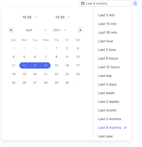
Again, completely agree with you and understand why this is so important. This is actually something we’ve already worked on from the design side and is awaiting frontend implementation. Here’s one sketch of the proposed design:

As you can see, we’ll add more time selections with the ability to “auto-refresh” the chart as new data enters CDF (this refresh will also trigger your calculations to re-run). How often would you need the chart to refresh based on the time series data you’re working with? Every 1 minute? Every 1 second? Would you prefer to have the control to set this refresh rate for yourself?

Note: The calendar date selector used in the above above is a copy/paste of the current one. As mentioned above, this updating this is a separate task from adding this auto-refresh functionality. 

Userlevel 1

Feature Request - Important - Time Ranges Relative to Current

This is a very useful feature for trending unit data. In PI, setting the end time to ‘*’ means that the trend will end at the current time and update its trends accordingly as new data comes in. Similarly, setting the start time to ‘* -xy’ means the trend will start at current time minus some offset where x is an integer and y is a string representing a time unit (ex: s, m, h, d, mo, y, sec, min, hour etc.). This feature makes monitoring the real time process a lot easier since the chart automatically updates to new data and removes old data. It doesn’t have to replicate the syntax of PI of course. I think it’s efficient syntax but the functionality however best implemented is what I’m after

Userlevel 1

Feature Request - Nice to Have - Single Scale

This is technically a nice to have, however, it is the default option in PI and so many people are very accustomed to viewing unit data in this way. Having this functionality will help with adoption significantly. By default a PI chart has a single y-axis scaled based on the highest max and lowest min of all time series on the graph. This makes apples to apples comparisons between different time series easier as it becomes a simple visual check.

Userlevel 1

Feature Request - Nice to Have - Time Range Entry

Especially with longer range charts, it would be nice to be able to easily enter the desired time range in number format (ex: 04/15/21). Currently I’m able to enter a range manually by typing in the 3 letters for the month name, but I think numerical is easier. In addition, there is an issue with manual entry as is (ex: Apr15,2021 interprets to Apr 5, 2021, as well as Apr25,2021). Using the calendar is slow and inefficient when using long time ranges.

Reply