Question

Using datapoints instead of aggregates

  • 7 March 2024
  • 7 replies
  • 58 views

Userlevel 2
Badge +4

Hello everyone!


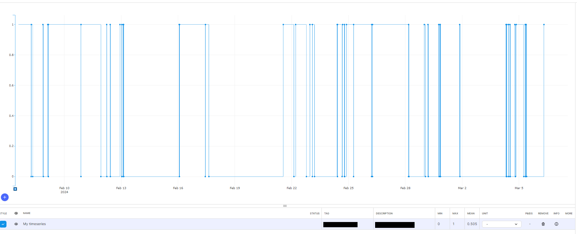
I have several binary timeseries that are displayed correctly when I ask for a short period of time:


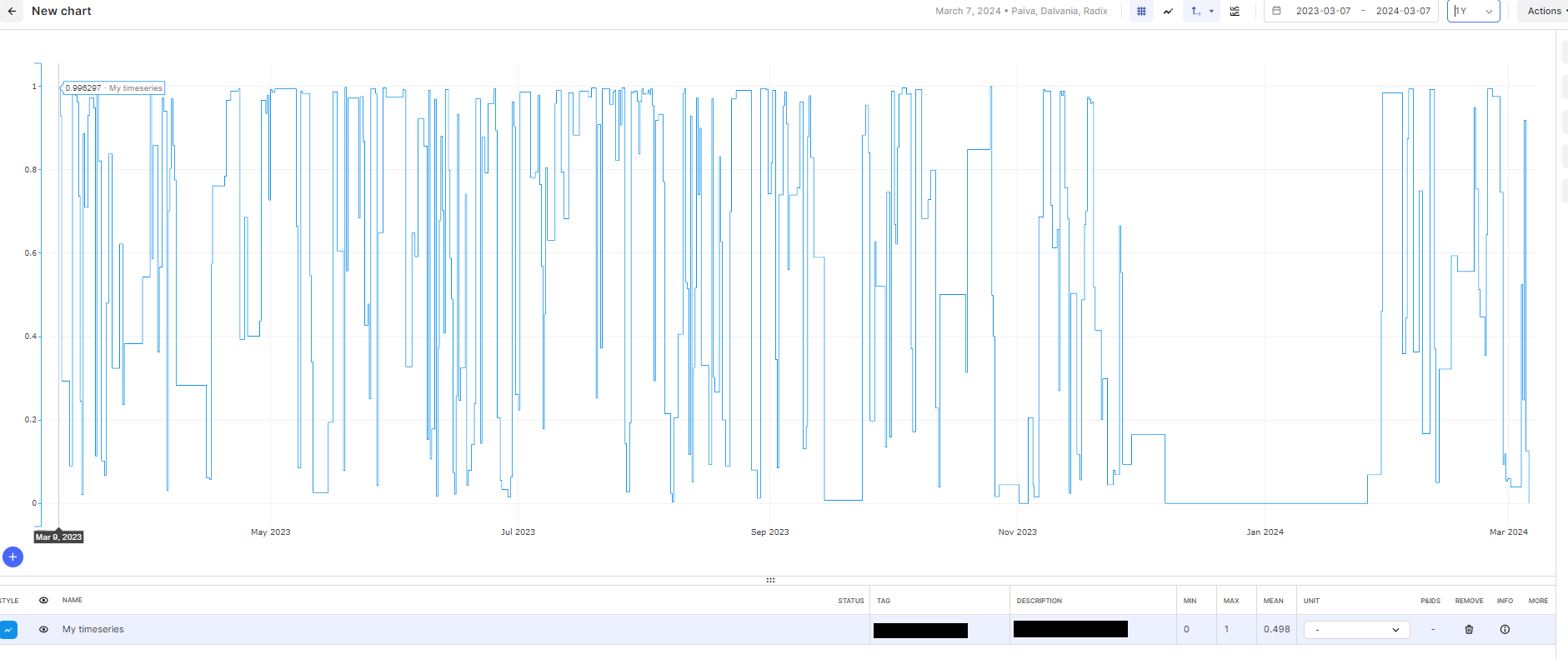
However, if I ask for a longer timespan, like a year, Charts gives me the aggregates, which I believe would be fine on some cases, but in this particular binary case, it does not make any sense. The final user cannot use this information to perform any analysis; any calculations, thresholds, or just “taking a look to see the trend” will not give an accurate result.


Is it possible to choose to disable the use of aggregates for cases like this?


Thank you in advance.


7 replies

Userlevel 3

Hi Dalvania!

I’m the time series API product manager.

Is the binary series a representation of a machine state (i.e. on/ off) or something else?  

We are planning to have support for machine state type time series in 2024, where aggregations such as this will not happen.  The work isn’t schedule yet but I expect it will be in the second half of 2024.

Kind Regards, Glen

Userlevel 2
Badge +4

Hello @Glen Sykes! That is exactly the case, the timeseries represents a machine state (on/off). Thank you for your response, we will wait for the new feature.

Badge +1

Hello @Glen Sykes!


Does the aggregation affect only the visualization, or it really affects the actual data? For example, if I download the raw data, would it be aggregated? 

Userlevel 3

If you download the data it will not be aggregated, you will get the raw data points.

The charts application is tuned for plotting the output of a sensor reading and so when you zoom out, it will always switch to aggregations.

When we introduce support for machine states, we will introduce a parameter in the API to designate it as such and when this parameter is true, we will not perform aggregations on the data (no point doing min, max, average etc on state representations). 

Userlevel 3

I’m curious now.  I see you’re with Radix.  Are you building your own application to plot the machine state, or are you depending on Charts for this?

Badge +1

Actually, we are encouraging Celanese plant users to use Charts to do their calculation, but they got confused when they saw different values on Charts, that's why we would like to know details to explain them.

Userlevel 3

Understood.  I’ve bookmarked this feature request and will respond here once we have plans set for the new feature.  Thank you for the awesome feedback!

Reply