The team and I are happy to announce that a new version of Charts (charts.cogniteapp.com) has now been released! You can read the specific details about this release below.
Please try these new features for yourself and share your feedback with the community here in the Charts EA group.
Remember to join our webinar on Wednesday, January 26th from 15:00-16:00 CET, where we'll be walking through the details of this release, discussing real use cases you’re facing, and giving you a sneak peak of some upcoming functionalities. For details and joining info, please visit this post.
Release Details
-
Search for time series related to a specific equipment tag
- Once you’ve found the equipment tag you’re looking for, click on the equipment tag name to perform a sub-search for time series related to that specific equipment.
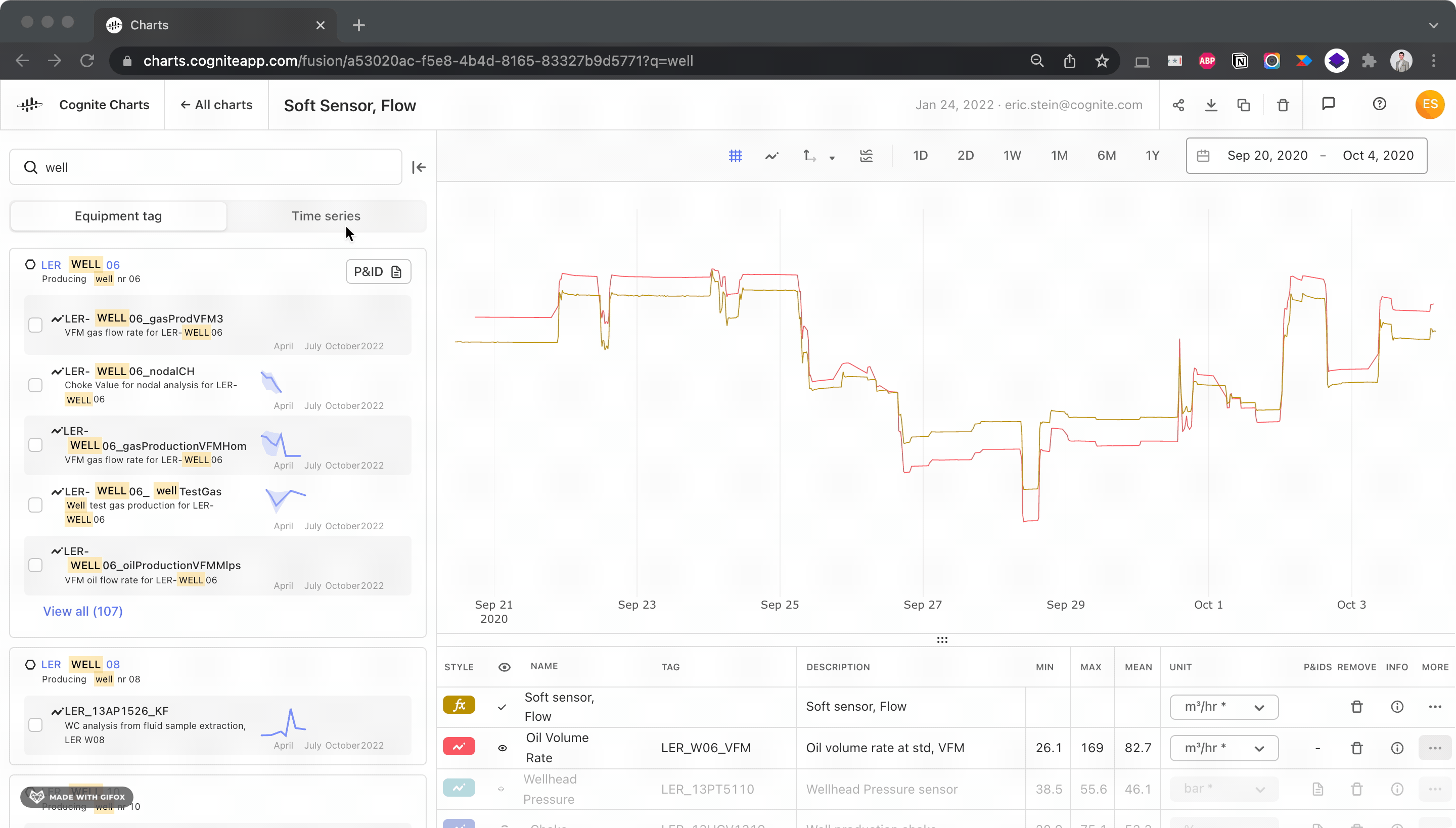
- Once you’ve found the equipment tag you’re looking for, click on the equipment tag name to perform a sub-search for time series related to that specific equipment.
- Better usability for y-axis zooming and scrolling
- Adjust the y-axis by simply clicking + dragging or by scrolling while hovering your cursor on the y-axis. No more “Adjust y-axis” button.
-
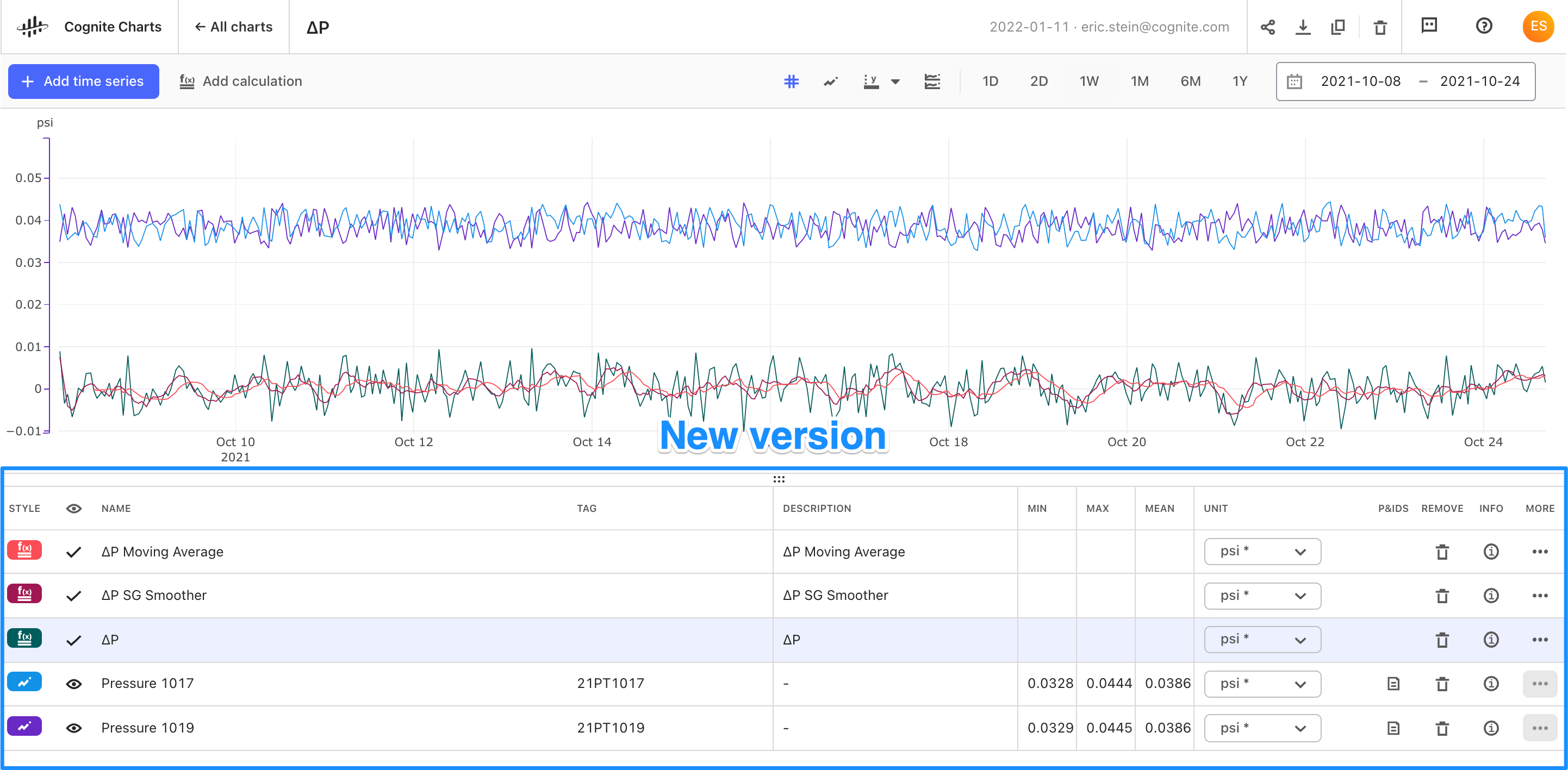
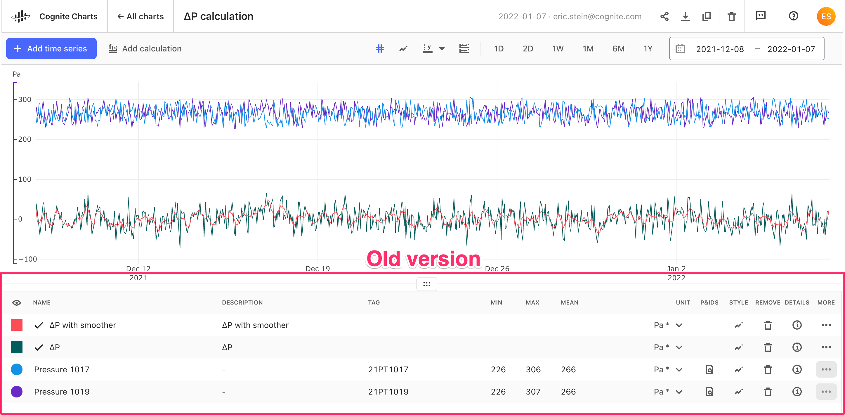
New and improved data table design
-
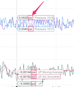
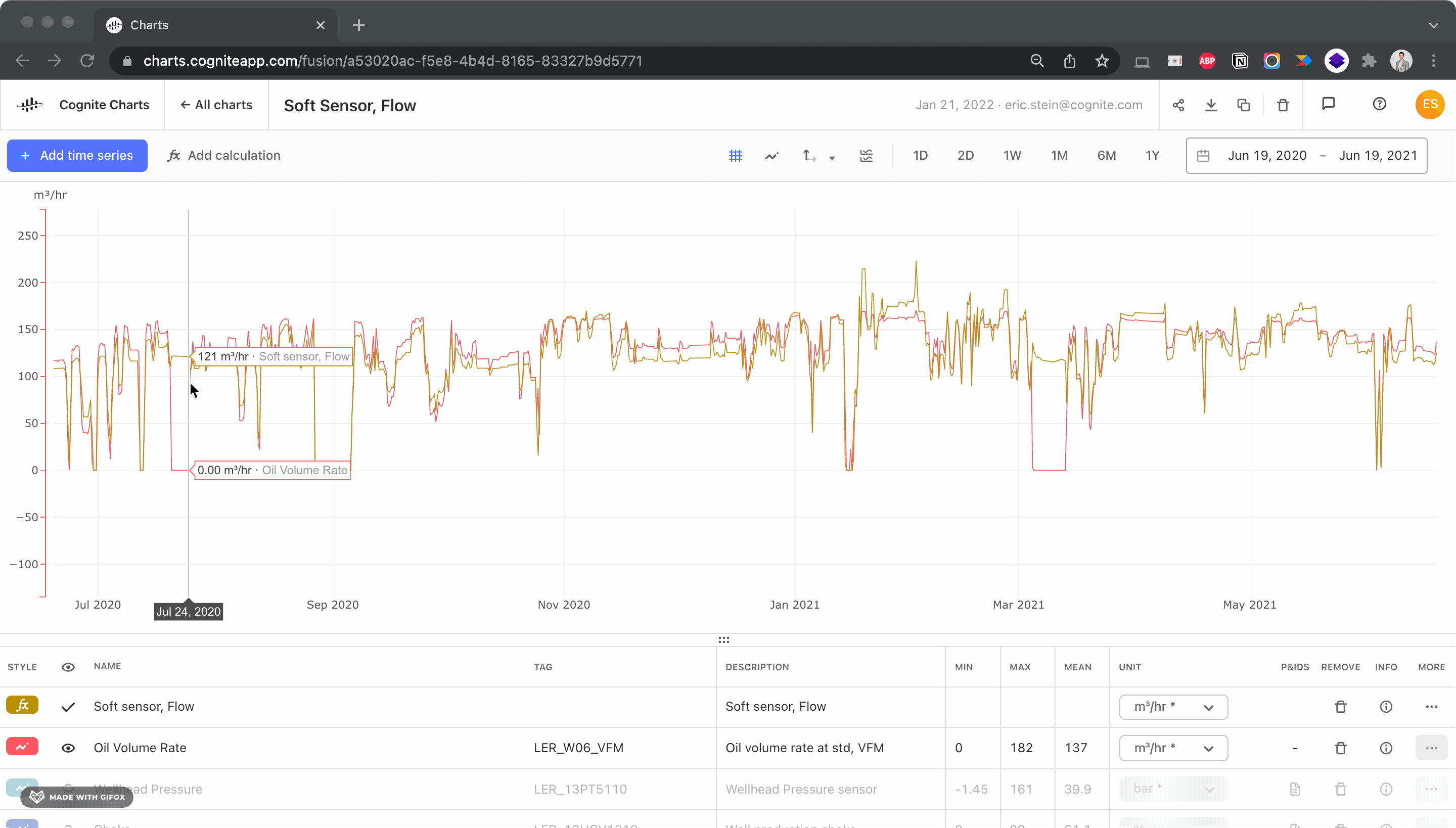
Units are now being displayed on tool tip while hovering over the chart
-
Dates are now presented in a consistent and more human-readable format
-
January 1, 2022as opposed to previously being displayed as2022-01-01
-
-
Updated icons
-
Lots of bug fixes + quality improvements, especially with no-code calculation builder
-
Fixed bug where constant node turned red when adding a decimal
-
Fixed bug where the function dropdown lists were cut off by the page
-
Fixed bug where 0 could not be used when manually setting y-axis values
- + much more
-
-
InDSL (Industrial Data Science Library) updates including…
-
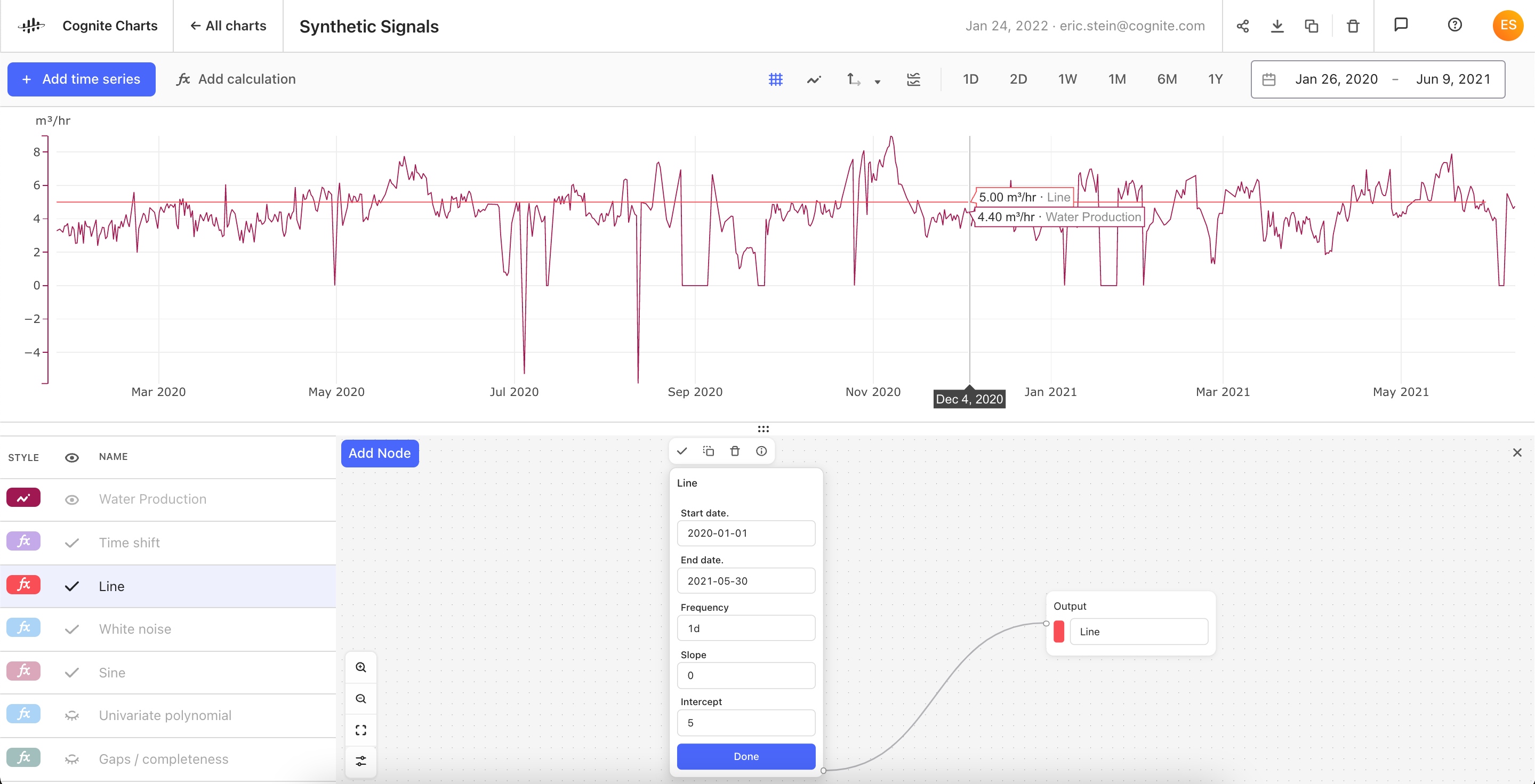
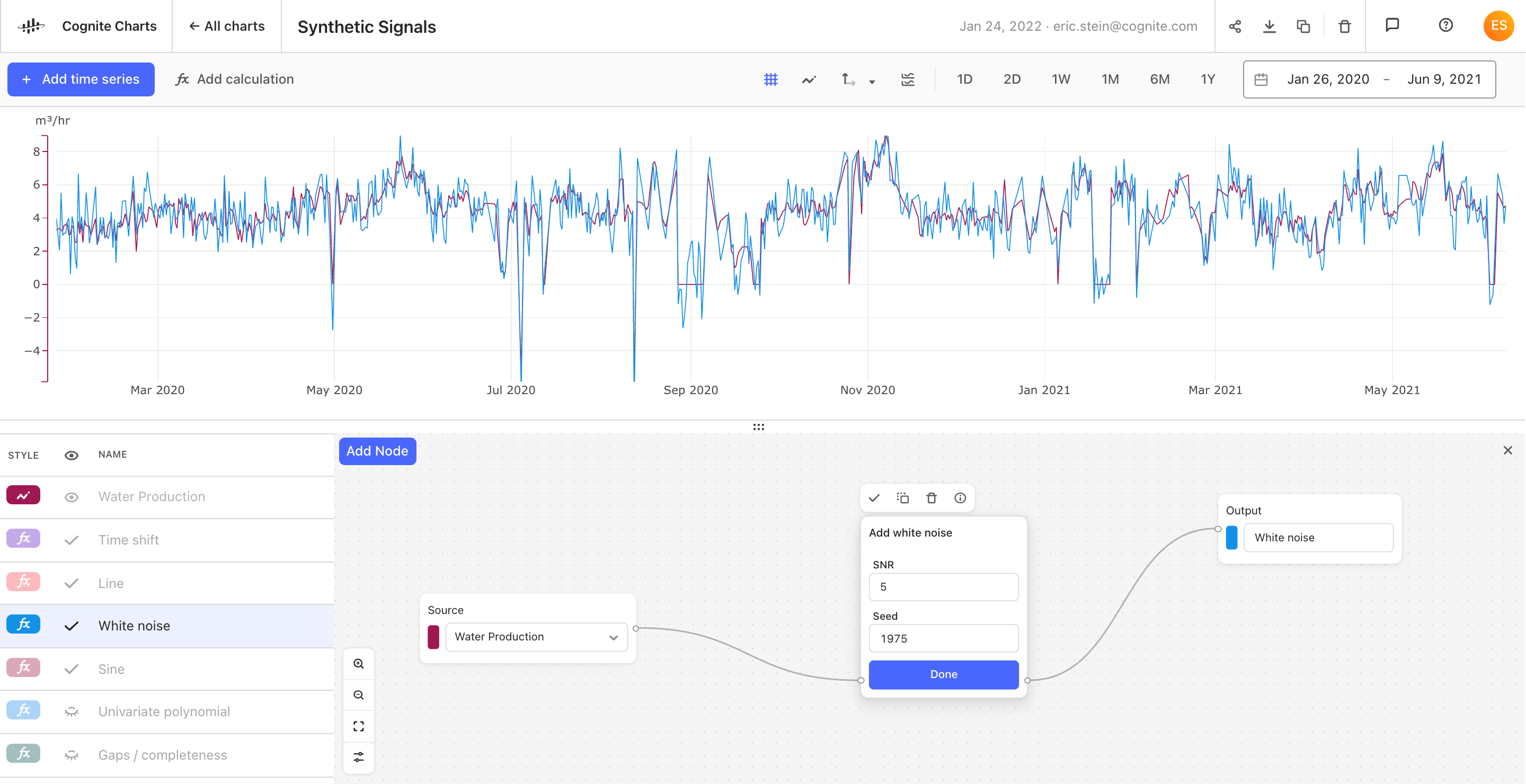
New functions have been added to the Synthetic Signals toolbox...
-
Insert data gaps: Method to synthetically remove data, i.e. generate data gaps in a time series. The amount of data points removed is defined by the given 'fraction' relative to the original time series.
-
Line: Generate a synthetic time series using the line equation with a duration, slope, and intercept of your choosing.
- Perturb timestamp: Perturb the date-time index (timestamp) of the original time series using a normal (Gaussian) distribution with a mean of zero and a given standard deviation (magnitude) in seconds.
-
Sine wave: Generate a time series for a sine wave with a given wave period, amplitude, phase and mean value.
-
Univariate polynomial: Creates a univariate polynomial y of degree n, from the time series x, and a list of coefficients a_2.
-
White noise: Adds white noise to the original data using a given signal-to-noise ratio (SNR).
-
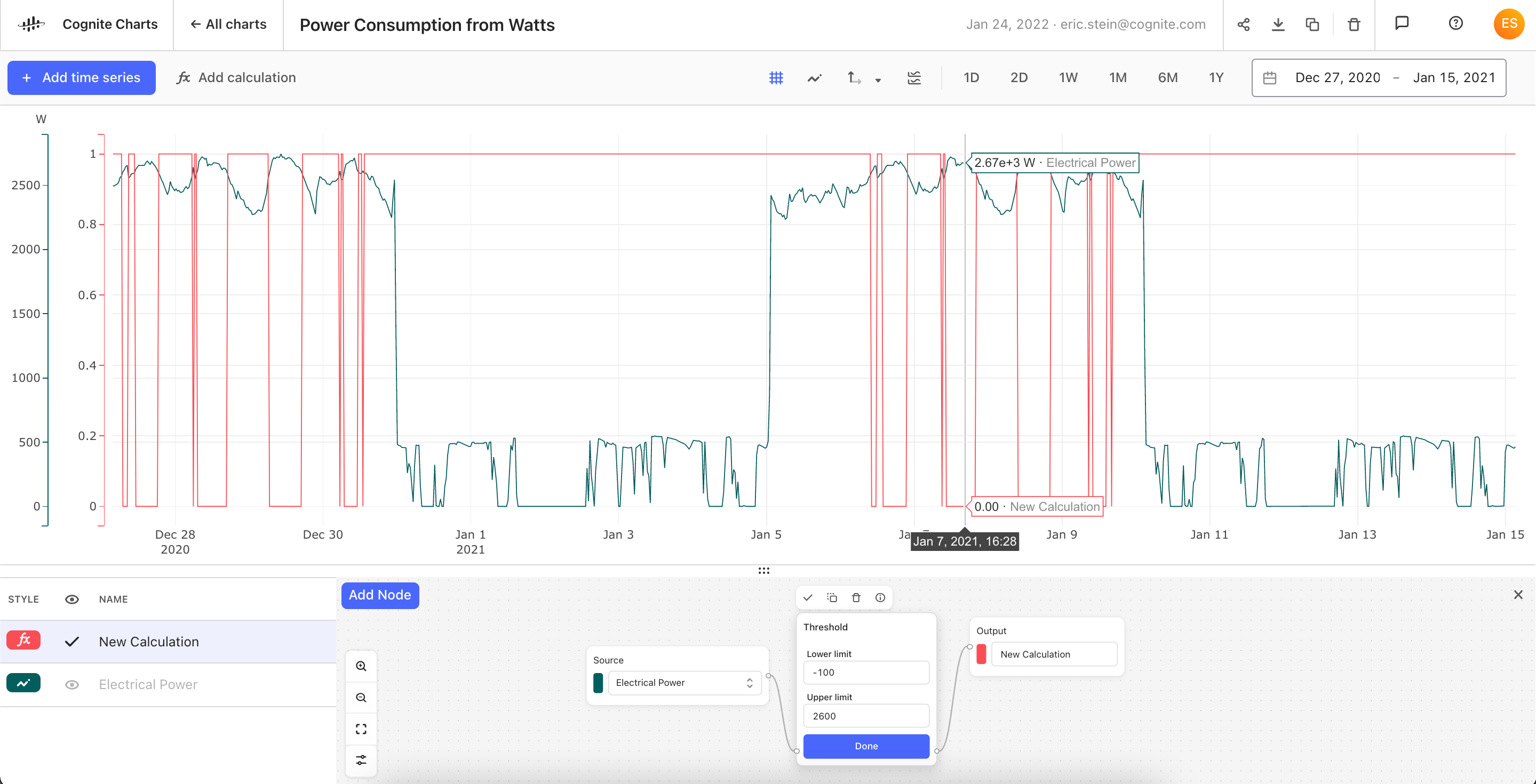
- New function added to the Operators toolbox:
- Threshold: Indicates if the input series exceeds the lower and higher limits. The output series is 1.0 if the input is between the (inclusive) limits, and 0.0 otherwise.
- Threshold: Indicates if the input series exceeds the lower and higher limits. The output series is 1.0 if the input is between the (inclusive) limits, and 0.0 otherwise.
- New functions added to the Forecast toolbox:
- Triple Exponential Smoothing - Holt-Winters Predictor: This technique (also known by Holt-Winters) can be used to forecast time series data which displays a trend and a seasonality. It works by utilizing exponential smoothing thrice - for the average value, the trend and the seasonality. Values are predicted by combining the effects of these influences.
- New functions added to the Data Quality toolbox:
- Negative Running Hours: Negative running hours model is created in order to automate data quality check for time series with values that shouldn’t be decreasing over time. One example would be Running Hours (or Hour Count) time series - a specific type of time series that is counting the number of running hours in a pump. Given that we expect the number of running hours to either stay the same (if the pump is not running) or increase with time (if the pump is running), the decrease in running hours value indicates bad data quality. Although the algorithm is originally created for Running Hours time series, it can be applied to all time series where the decrease in value is a sign of bad data quality.
-