Solved

Inquiry on Dynamic Visualization and Real-time Sensor Data Integration in Cognite Charts

  • 29 September 2023
  • 1 reply
  • 76 views

Userlevel 1
Badge

Dear Cognite Community,

I hope this message finds you well. Firstly, I'd like to acknowledge that I've been asking quite a few questions lately, and I sincerely appreciate the time and effort many of you have invested in guiding me. This community has evolved into a mentorship hub for me, and for that, I'm deeply grateful. :)

I've been working extensively with Cognite Charts to visualize my time-series data and have been greatly impressed by its capabilities. However, I have a couple of specific needs that I'd like to discuss, and I was hoping to get some insights from the experts in this community.

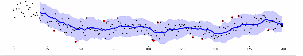
Dynamic Visualization of Actual vs. Predicted Model:

I'm looking for a way to dynamically visualize my actual data against the predicted model within Cognite Charts. I came across Data Point Subscriptions as a potentially relevant feature. While the documented use-cases don't exactly match my needs, they seem to be the closest match. Would this feature be applicable to my scenario or is there another approach you'd recommend?
As seen in the gif below. (The data need not be real-time, as it’s just a way to evaluate how the model is compared to actual data vs. a still image - so it’s just a matter of convenience). 


Real-time Sensor Data Integration:

Additionally, I'm interested in connecting to real-time sensor data and visualizing it alongside the predicted data for the same time period. This might be somewhat related to my first query but I felt it was distinct enough to merit separate consideration. (In this case, the data is real-time vs forecasts)

I must express my heartfelt gratitude for the prompt and insightful responses I've received thus far on my previous queries. This not only motivates me to delve deeper but also fuels my aspiration to someday contribute back to this community in a similar mentorship capacity.

Thank you very much in advance for any guidance or suggestions you can provide. Your assistance has been, and continues to be, invaluable to my progress.

icon

Best answer by Knut Vidvei 3 October 2023, 10:27

View original

1 reply

Userlevel 3
Badge

Hello, Vishnu.

Thank you for the detailed description, and your enthusiasm for Cognite Data Fusion and Charts. In order to understand better how to assist you here, may I ask some follow-up questions? 

First on comparing predicted data in a data model against actual sensor data, where is your predictive model running? If it is e.g. a Python model running on your local computer you could use Cognite Functions to run your Python code on demand or on a schedule. In your code you could then create a calculated time series with an externalID that can then be visualized in Charts. 

Read more about Cognite Functions in our documentation here: https://docs.cognite.com/cdf/functions/ and an online training course in Cognite Academy: https://learn.cognite.com/path/data-scientist-basics/cognite-functions


If you are working with Python and Cognite Data Fusion you are probably already working with: https://developer.cognite.com/sdks/python/ and you have reference code for creating and updating calculated time series here: https://cognite-sdk-python.readthedocs-hosted.com/en/latest/core_data_model.html#create-time-series

Could you please also add some more details on the need for “dynamically visualize” the results? Cognite Charts will load the time series in the time window you are viewing instantly, and you can compare calculated data and sensor data, but we do not animate it or gradually load the data as in your gif. For the best set of customized options here you have full freedom with the Python SDK.

Subscription to time series will allow you to request (on demand or on a schedule) new or updated data points from a time series since your last request. Cognite Charts require you to change either the time window you are viewing or change something in a calculation to update to newest data points.

Automatically updating charts with new time series as they come in for more “live” charts is an improvement we have heard from other users, and it would be great to hear your use cases as well.


Best regards,

Knut Vidvei


Reply