Hello Charts Early Adopter Community,
There have been several new features and functionalities released lately, with some being released just today. I’ve recorded a video (below) to explain several of these core features in detail, namely – calculations running on individual data points, not aggregates.
You can also scroll down to read the written details.
Please do leave comments below with questions and feedback!
Details
Charts UI/UX
-
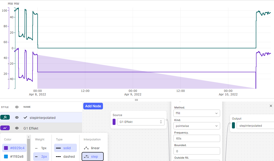
Calculations are now running on individual data points, not aggregates
- In the past, calculations have been running on time series aggregates. This meant that, although calculations were approximately calculations were often not correct his is a very important new feature that greatly increases the accuracy and trustworthiness of calculation results in Charts. Watch the above video or see the slides, below, for more info.
- If you receive a warning that looks like this (see image, below), then it means that the results of the data has been downsampled to perform the calculation. The benefit of this approach is that calculation results are returned more quickly. It also helps us to ensure that our calculations backend will remain stable and not crash with, e.g. one person requesting trillions of data points for a calculation spanning over decades.
- While downsampled calculation results are very good for quickly seeing trends and the overall shape of the data, it may not provide you with 100% accurate and precise results every time. If you zoom in to a shorter range of time (i.e. less data), then the warning will disappear once you are below the maximum threshold. If the warning does disappear, then it means you can trust the results of your calculation since it was performed on individual data points and not downsampled/aggregated data.
- Are you seeing this warning for a calculation where you need to be seeing exact and precise results? Please do let us know and we’ll schedule a time to speak. We set this maximum limit relatively low so we can gather feedback from the community on whether/how much we should increase this limit to solve a use case you may be facing.
- Please see the video recording (above) for an in-depth explanation with examples.
- This change also includes many bug fixes and improvements to calculations, thanks to upgrading to the newest version of our calculations backend.
-
Filter search results by facility (root asset)
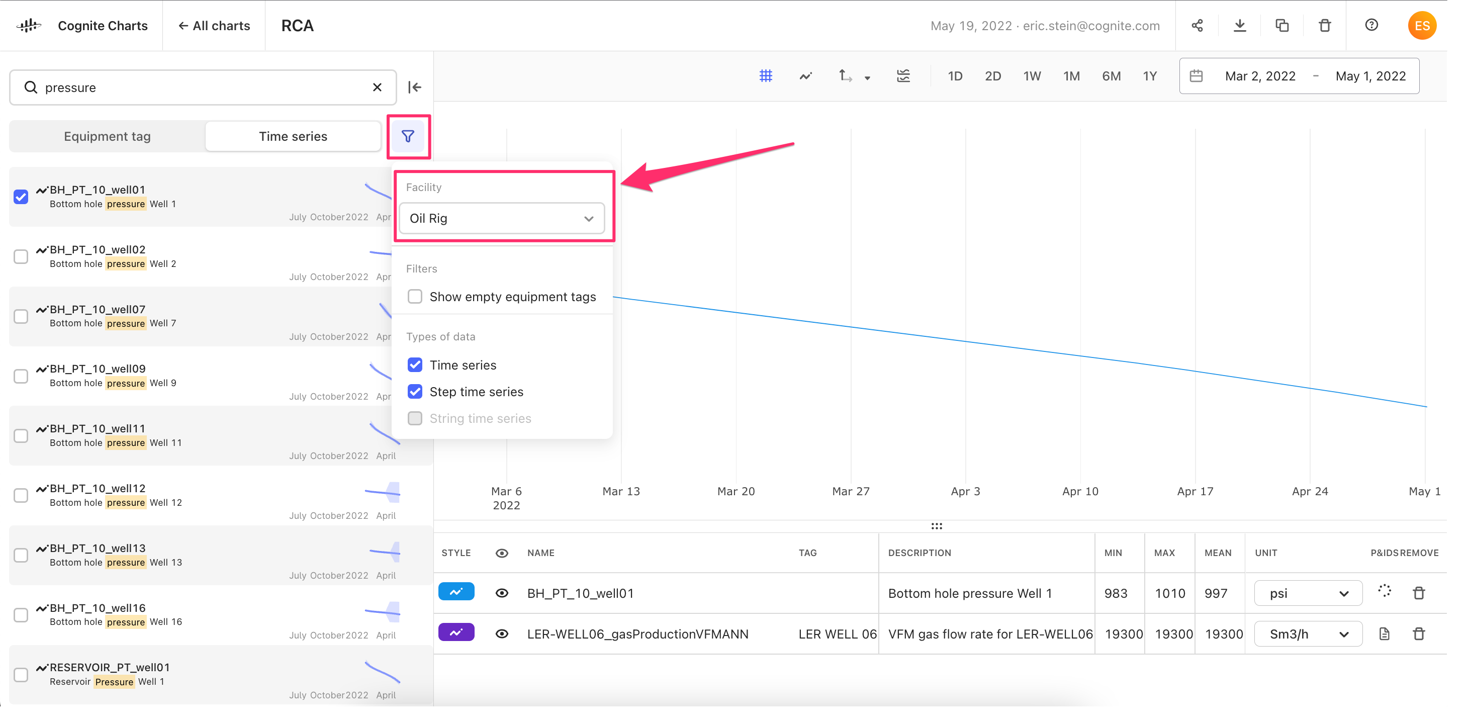
- We’ve received feedback that most of you are only working on one specific facility (also known as, “root asset”) at a time. It's not often that you’re working across multiple facilities.
- Therefore, we’ve added the option to filter by “Facility” in the filters menu, which will make it easier to find the equipment or time series tag that you’re looking for.
-
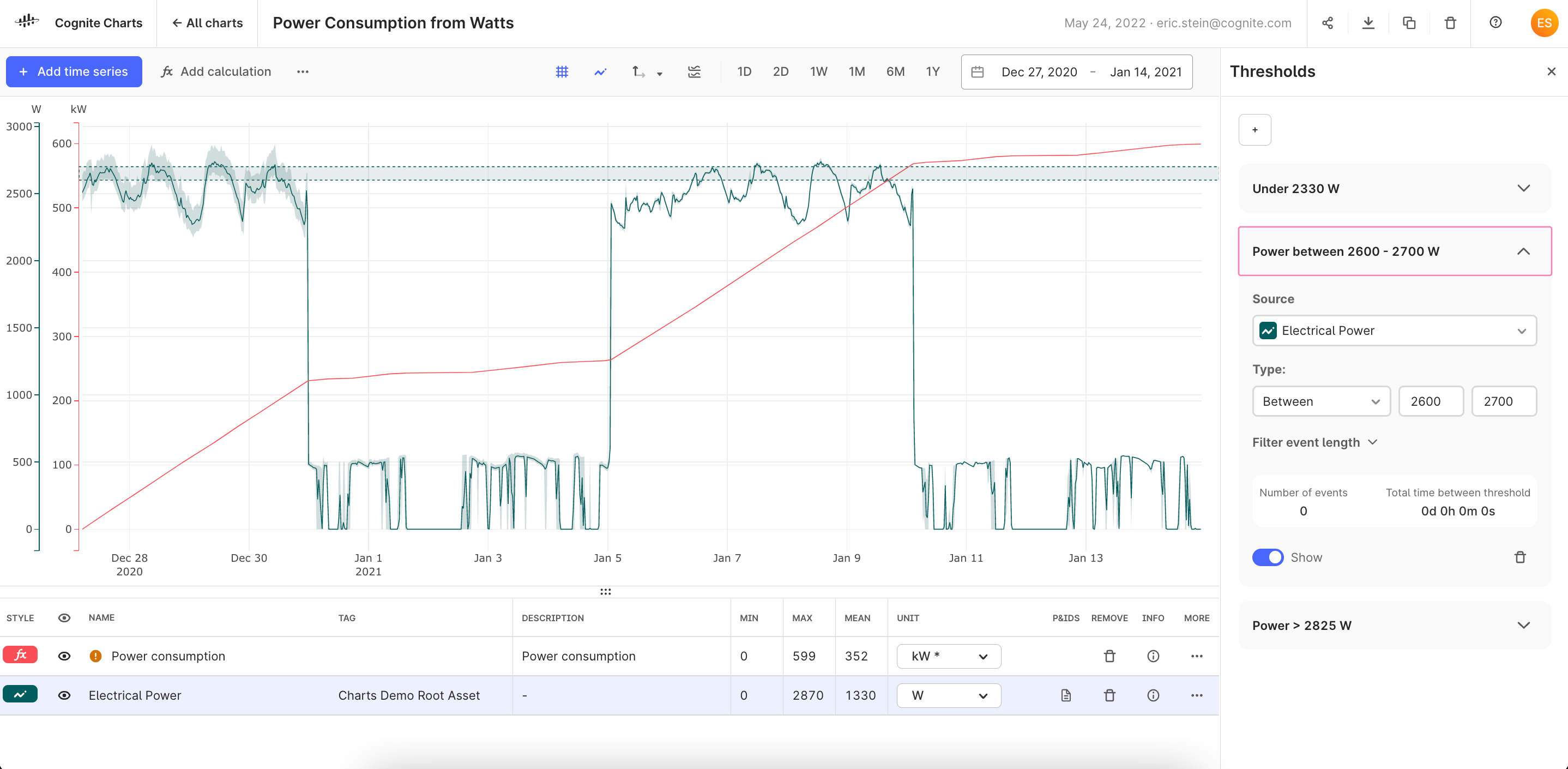
Thresholds on historical data
-
Thresholds provide a quick way to check whether a time series has crossed a given value while looking at historical data and for how long it was over this threshold. While the
Thresholdfunction is available in the no-code calculation builder (and InDSL), we received requests to build a more robust feature in the Charts UI. -
This first version of a thresholds experience in Charts enables you to set thresholds for checking whether a time series or calculation is Above, Below, and Between any given values.
-
Next, we will be adding the functionality to clearly visualize these events on the chart plot when a time series or calculation crosses a given threshold (this will be a part of our work to enable you to add and visualize CDF events in Charts).
-
This feature is only meant for analyzing historical data – it’s not possible to set up a monitoring task and receive alerts based on one of these thresholds yet. However, this is something we are working on now with other product teams to deliver this functionality in the future.
→ Please give us feedback, especially if these added functionalities are important for you and your team.
-
-
Custom unit input field
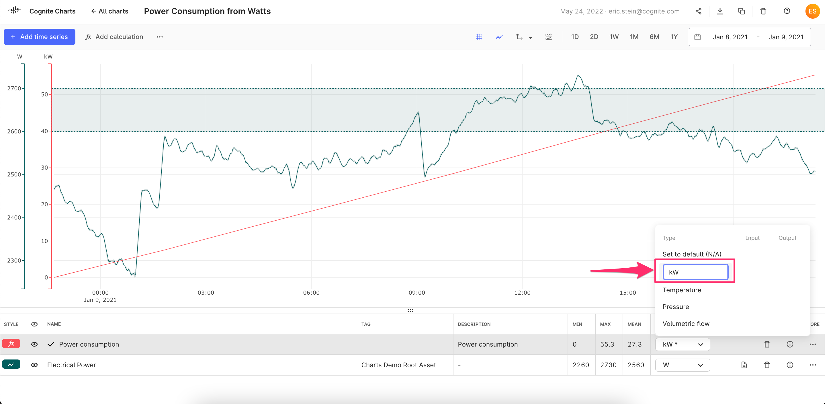
- We’ve received plenty of feedback requesting additional units to be added to the unit selection dropdown Charts UI.
- While we are working with other product teams to add support for numerous industrial units of measure and unit conversions as a part of the CDF SDK and API, this is a longer initiative. This simple and quick change will at least unblock those of you who need to specify units that we don’t yet support in order to, e.g. merge y-axes of time series and calculations with the same unit.
-
The Charts UI is now available in Japanese; ready for internationalization
-
The Charts frontend is now fully translated into Japanese. We’ll be translating the UI to other languages in the coming months, starting with Norwegian.
→ Have a specific language you’d like to request? Comment below and let us know. -
You will find the language settings by clicking your profile icon in the top right corner and choosing the
Profileoption.
→ Please note: InDSL documentation (including the information text that is viewed in the Charts UI) is only available in English for the time being.
-
-
Plenty of bug fixes + quality improvements
InDSL (Industrial Data Science Library)
-
New functions added to the ”Equipment/Pumps” toolbox:
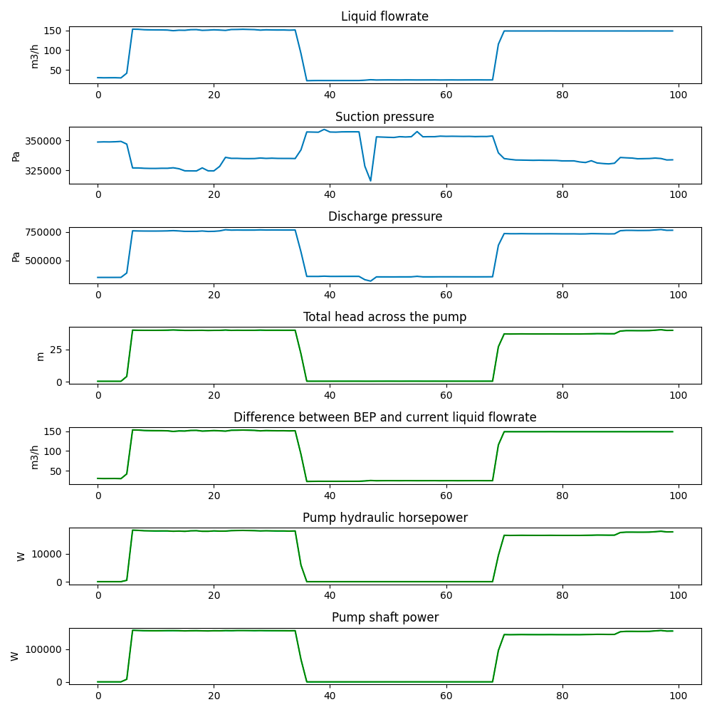
→ Thanks to@redzarosli and @morten.grønbech for creating these valuable functions for analyzing pump behavior based on the work they’re doing together with AkerBP.- Total head: Head is a measure of the potential of a liquid to reach a certain height. The head is essentially a unit of pressure. The total head is the difference in pressure of the discharge to the suction of the pump.
- BEP from flowrate: This function calculates the flowrate relative to BEP as a percentage. i.e. 100% means the current flowrate is at the BEP, 110% means the current flowrate is 10% above BEP.
- Pump Shaft Power: Pump shaft power is the input power delivered by the shaft. Pump shaft power can be calculated by dividing the pump hydraulic hp by the pump efficiency. Pump efficiency is a function of liquid flowrate. The pump efficiency curve is assumed to be a 2nd order polynomial. Therefore the input parameters of the curve are coefficients to x^2 and x and the y intercept of the curve.
- Pump Hydraulic Horsepower: Pump hydraulic horsepower is the amount of energy per unit time delivered to the liquid. Pump hydraulic horsepower can be calculated if the liquid flowrate, total head across the pump, and density of the fluid.
- **Recycle valve power loss: This calculation can be used where there is a recirculation line with a recycle valve whose purpose is to maintain a minimum flow through the pump. The calculation does not take into account the difference in pump efficiency at different flow rates. This is acceptable because pumps are usually sized to take into account extra flow due to recirculation.
- **Volumetric flow through valve: This calculation can be used when there is no flow meter, but the pressure difference over the valve is known. The calculated flow rate is only exactly applicable for ideal fluids (incompressible and with zero viscosity).
-
New functions added to the ”Data Quality” toolbox:
→ Thanks to@Cristina Ferrer Teixidor and@saliha.sajid for creating several valuable functions for analyzing data quality, based on the work they’re doing together with AkerBP.- **Rolling standard deviation of time delta: Rolling standard deviation computed for the time deltas of the observations. The purpose of this metric is to measure the amount of variation or dispersion in the frequency of time series data points.
-
New functions added to the ”Filters” toolbox:
-
Trend / De-trend signal: Robust method to determine the trend of any non-linear and non-stationary time series based on the `Hilbert-Huang Transform and empirical mode decomposition (EMD). This is a mathematically complex method and not easy to document in detail. If you are interested in knowing more about it see following the list of resources:
The EMD method decomposes a time series into a finite number of oscillatory components, each with a well defined frequency and amplitude. These are called intrinsic mode functions (IMFs). The process to identify IMFs is called sifting (i.e. filtering). The sift works by iteratively extracting oscillatory components from a signal. Starting from the fastest and through to the very slowest until the average envelope of the components is less than the sifting threshold.
The number of components selected for building the main trend are selected using the cross energy ration between IMFs using the Hilbert-Huang transform to estimate the spectra. If the ratio is below a given energy tolerance threshold, the process stops and the selected IMFs are added together. That is the resulting main trend.
As an output, it is possible to select either the trend of the main signal or the de-trended signal.
- EMD wiki
- Trend extraction based on the Hilbert-Huang transform and Empirical Mode Decomposition
- EMD Python package with useful examples and tutorials
- Article on EMD implementation and applied to global surface temperature anomalies data set
-
-
New examples in Gallery of Charts on InDSL documentation
-
Parameters of a centrifugal pump: Calculate pump parameters total head across the pump and difference from Best Efficiency Point (BEP) to current operating flowrate and power output of a centrifugal pump.
-
Relative uncertainty estimation: This example shows how to estimate the relative uncertainty of a non-linear, non-stationary signal using detrending. We generate a synthetic signal composed of:
To make the case more realistic, from an industrial perspective, the timestamps are modified to make them nonuniform and 35% of the data points are randomly removed. Finally, Gaussian noise with a signal-to-noise ratio of 10db and 20db is are added to the left and right half of the data, respectively.
The figure shows the synthetic signal with and without noise (top), and the estimated relative uncertainty (bottom). On the left half of the data, where the noise is large, the estimated relative uncertainty increases when the signal reaches close to 100%. On the right side half of the data, where the noise is small, the relative uncertainty remains closer to 0%.
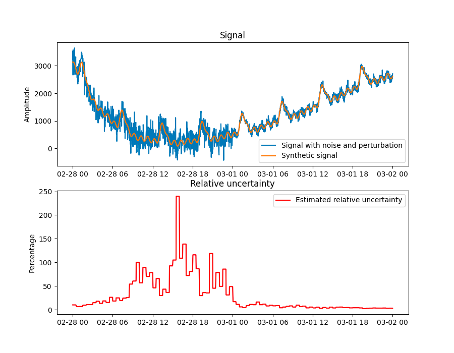
- Three oscillatory signals of different but significant amplitudes
- Two polynomial functions or trends
- Data drift
-
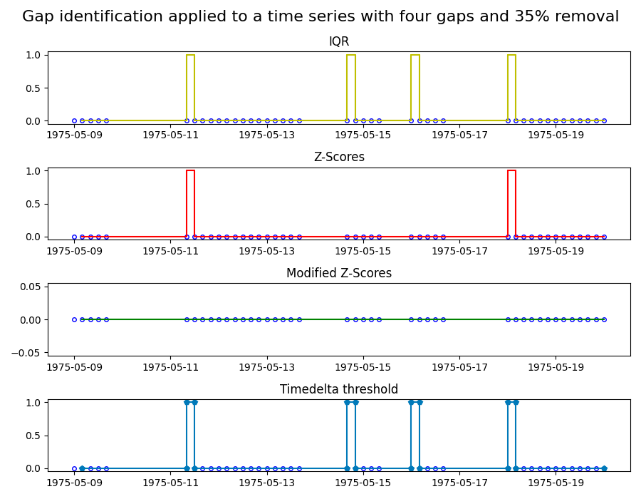
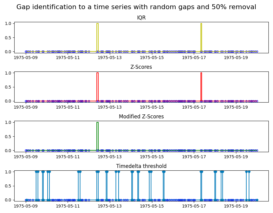
Identifying gaps in time series: Identifying gaps in data is critical when working with time series. Data gaps can be for instance, the result of an unreliable or defective sensor, and that part of the data might need to be excluded. The exact definition of what is considered a gap requires domain knowledge and is therefore hard to automate. However, mathematical tools can help us to identify potential gaps that the domain expert can then evaluate.
In this example, we apply four common gap identification methods to two time series. The four methods are:
- Z-scores: marks a gap if the time step size exceeds 3x the standard deviation of the time steps.
- Modified Z-scores: a modified version of the Z-score method, which uses the median absolute deviation instead of the standard deviation.
- Interquartile range (IQR): Uses IQR, a measure for the spread of the data, to identify gaps.
- Timedelta threshold: marks a gap of the timedelta between points exceeds the threshold.
-
-
 the most appropriate / required method for visualization will absolutely be a part of this focus.