
 Check the
documentation
Check the
documentation Ask the
Community
Ask the
Community Take a look
at
Academy
Take a look
at
Academy Cognite
Status
Page
Cognite
Status
Page Contact
Cognite Support
Contact
Cognite Support
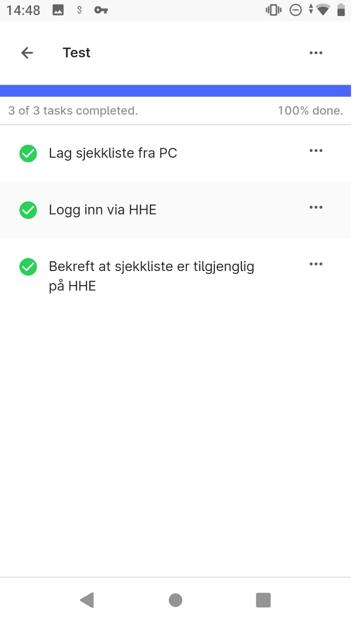
Feedback from customer:
The landing page for InField is hard to understand. Tag scan or search should be more visible as the landing page in the app. Check-lists get too much focus.
Importance: Should have.
Context: Landing page, after logging on inField for offshore workers.
User story: As an offshore user of inField I would like for tag scan or search to be more visible, and check-lists to get less focus, in the landing page after logging on, so that it is easier for me to access the features I want to use.
Picture:
Would like checklists to get less focus and tag scan to get more focus.