

 Check the
documentation
Check the
documentation Ask the
Community
Ask the
Community Take a look
at
Academy
Take a look
at
Academy Cognite
Status
Page
Cognite
Status
Page Contact
Cognite Support
Contact
Cognite Support
Hi,
When reviewing hours and days of high-sampling data the peaks are lost. But the high and low values are registered. It would be beneficial to “go to” the specific value shown, or at least have a time-reference for the peak - so I can zoom in and find the value in the graph.
Hi Kai and thanks for reaching out about this.
What you described is exactly something we’ve discussed in the team. We’ll add this item to our backlog and post any updates in this thread on Hub when we make progress.
In terms of a workaround to solve this issue using the features that we have in Charts today...
For this high sampling time series, you’re obviously seeing aggregated values represented by the time series line, rather than the raw data points itself. As you zoom in, the time series aggregates refresh and fetch more granular data until you finally start to see the individual data points.
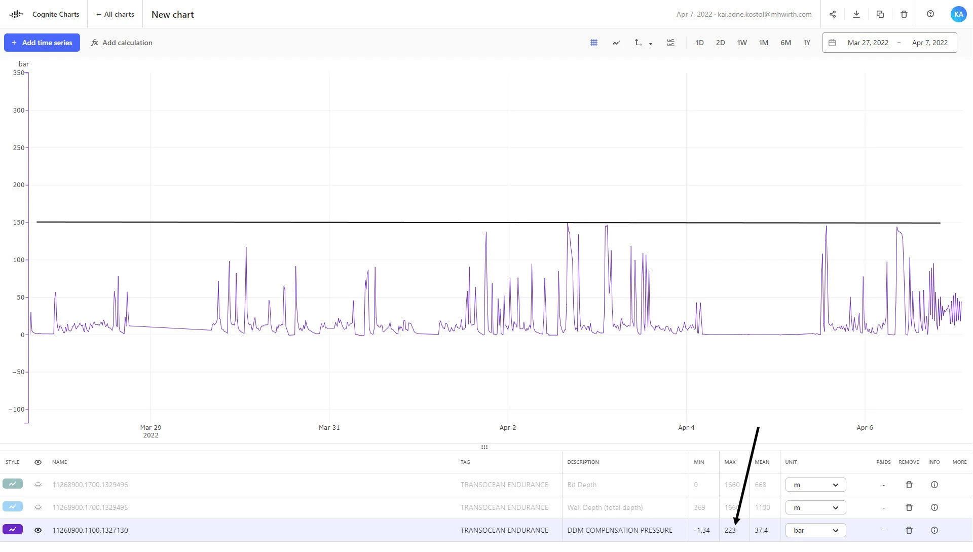
If you turn on the feature that shows the min/max range for the time series, you can see the minimum and maximum range for the time series versus the aggregates that are currently in view. This will help you to more easily locate that peak value. See the GIF below, where I am actually able to locate this max value:
In the GIF, I’m using
shift + click and dragto zoom into a specific range on the chart. I’ve also drawn the horizontal line on the chart at a value of223by connecting a constant node directly to the output, which helps make it easier to visualize where the max value is close to this upper bound:Another useful trick that helps to visualize aggregates is to change the line style parameter
Typetonone, and you will begin to see the individual data points. They represent the aggregate values when you’re zoomed out and the actual data points when zoomed in enough:I’ve created a chart on your team’s CDF project here where you can test and see for yourself (I zoomed in to the time range for this specific value).
Normally, you would be able to use the
Thresholdfunction in theOperatorscategory in the no-code calculation builder (which outputs a1if the input is between the bounds of the upper and lower threshold and0otherwise) to helps identify values above a particular threshold. However, because this particular time series has such a high sampling frequency, you’ll have to zoom to a relatively short range of time before the calculation picks up on this one individual data point. This is absolutely something we are going to be improving over time so that our calculations backend can handle even larger amounts of data to provide the most accurate and trustworthy results.Hope all of this is helpful and useful to help you immediately address this issue!
As I wrote above, we’ll keep you updated as we make progress and reach out if we have any follow up questions.