

 Check the
documentation
Check the
documentation Ask the
Community
Ask the
Community Take a look
at
Academy
Take a look
at
Academy Cognite
Status
Page
Cognite
Status
Page Contact
Cognite Support
Contact
Cognite Support
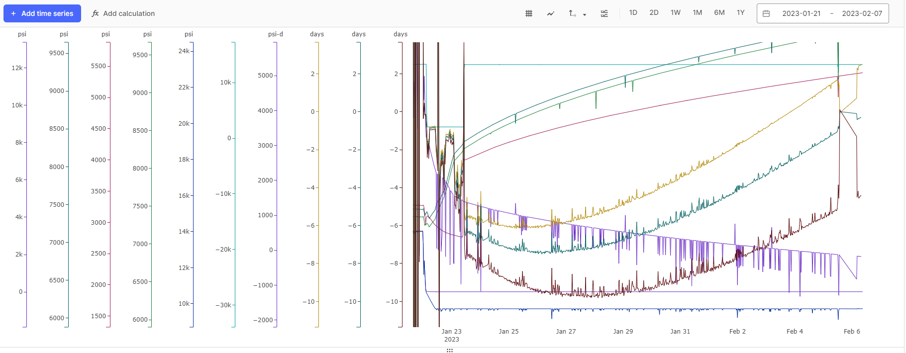
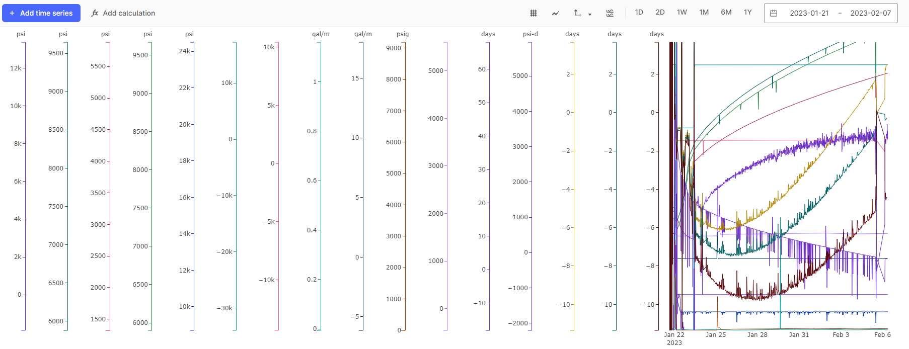
When looking at many time series (8+), the y-axis scales take up a lot of space on your screen horizontally, and adding more time series to the display continues reducing the x-axis space on the chart itself. Having the ability to compress the horizontal space occupied by the y-axis scales would be helpful, especially since there seems to be a lot of white space available to compress into. We have run into this challenge during real-time troubleshooting, and it becomes especially challenging when working off a smaller screen (e.g. using your laptop screen in a conference room). As you can see from the first image below, the white space around the y-axis scales/labels appears significant. The 2nd image below is a more aggressive shot of the same Chart.
Additionally, a feature where hovering your mouse above a particular y-axis would reveal the name of the time series that y-axis applies to would also be helpful when the y-axis units are not merged. This is really more useful when looking at many times series all at once. This is probably a complementary idea to another one already on this board about highlighting the time series in the chart when you hover the mouse over the y-axis.
Thank you!
Hi, Richard.
Firs of all, thank you for the feedback and the helpful screenshots. You also have a lot of great suggestions.
I can see from your chart, with both a high number of time series and a smaller resolution screen, we have some improvements to how tightly the axes are spaced, and how they behave for you.
For you, and other users who might read this post, I’ll highlight a few product features that is helpful in these situations:
As for your idea of showing the time series name when hovering over a y-axis is fantastic, and we will add it to “Gathering interest” on how we can be more helpful in these situations.
Best regards, Knut Vidvei
Hello Knut.
Thanks for your feedback on the question/idea. I 100% agree with you on this being an extreme case to display so many time series at once, and there are many more time series not displayed in those screenshots. During active troubleshooting of an operational issue, we add all the time series relevant to every potential failure mechanism as a starting point for analysis, but then we do hide time series as we narrow down root causes (or to just focus on certain root causes). Some of the time series are displayed to indicate a significant time event, so perhaps adding the capability to place timestamped milestones (e.g. when an event started, when a remediation test started, etc) would add value and allow for toggling off more time series.
And thanks for showing how to hide all the y-axes. I had not toggled that button before, so that is very useful to know about. Much appreciate the insights you’ve given in your response.
Kind regards,
Richard
That’s another excellent suggestion, and might deserve it’s own “Product Idea” here on hub.
You can add is as a new product idea, or I can create one for you if you’d like.
Best regards, Knut
Just created the new thread, titled “Cognite Charts: Feature to mark Milestones or add comments to Chart”