

 Check the
documentation
Check the
documentation Ask the
Community
Ask the
Community Take a look
at
Academy
Take a look
at
Academy Cognite
Status
Page
Cognite
Status
Page Contact
Cognite Support
Contact
Cognite Support
Hello @brendan Buckbee at Celanese has created a chart for the 12 month, but gets an error message. Is there any way that this can be created into a chart. I have attached a screenshot of the calcs.
cc:
Best answer by Simon Funke
View original
Hello @brendan Buckbee at Celanese has created a chart for the 12 month, but gets an error message. Is there any way that this can be created into a chart. I have attached a screenshot of the calcs.
cc:
Best answer by Simon Funke
View original
Thanks for the questions! I’ll break my answer down into a few parts…
Warning
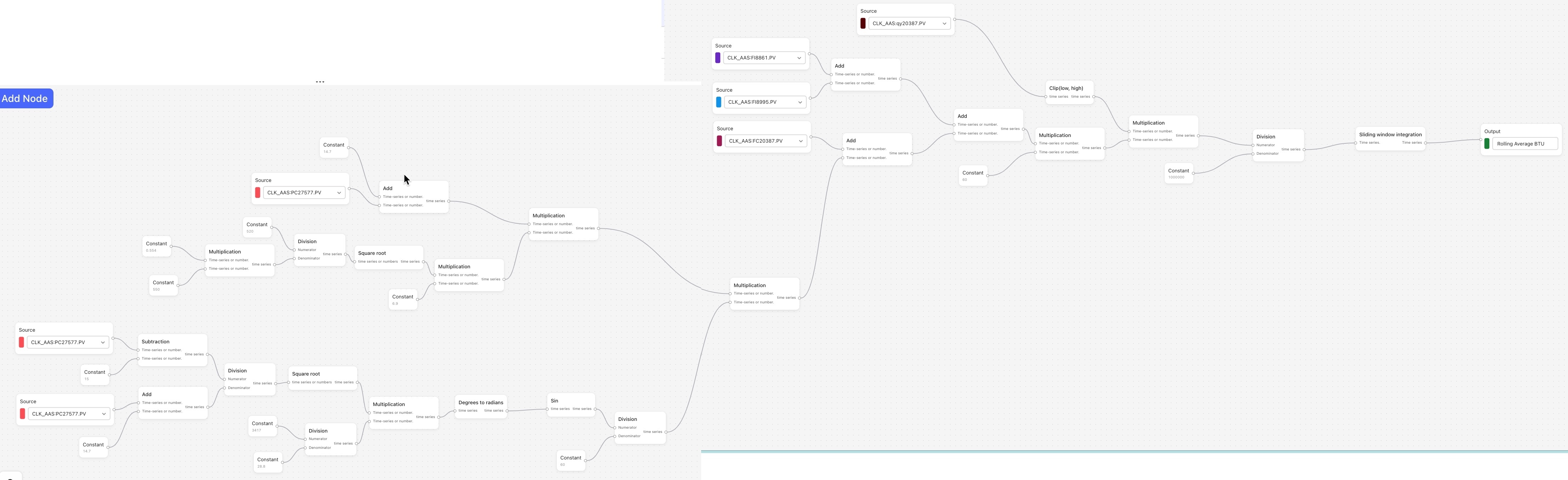
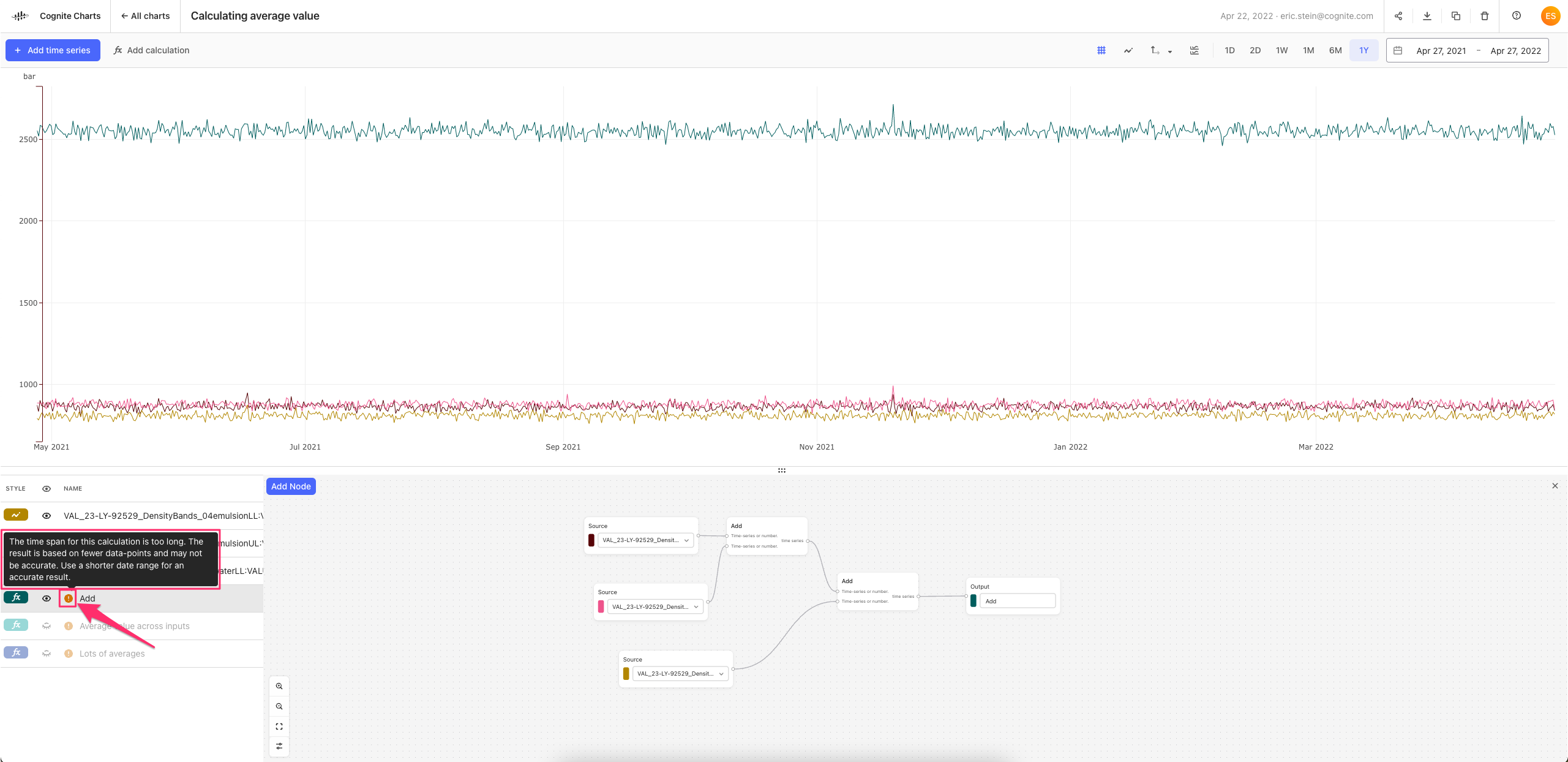
When it comes to the ❌ “error” icon that is appearing, this is usually due to a formatting or configuration error within a calculation. For example, as you can see in the screenshot below, my integration calculation fails to run since I wrote 10 days instead of 10d, which is the format the calculations backend requires in order to understand the parameter and run properly.
Looking at the functions you’ve used in the screenshot of the calculation, my guess is that the error is within the Sliding window integration function. On that note, I have suggestions for
How to calculate average value over a specific range of time
I would need to see the details about how the parameters of the Sliding window integration have been configured to know for sure (i.e. double click on the Sliding window integration node and screenshot the expanded contents), but I believe there may be a better way to calculate what you’re looking for.
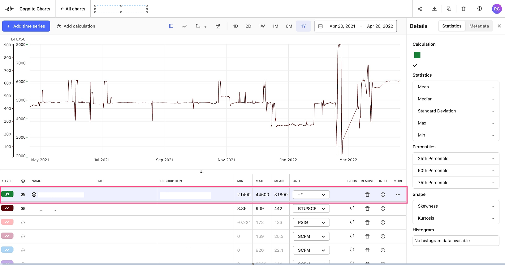
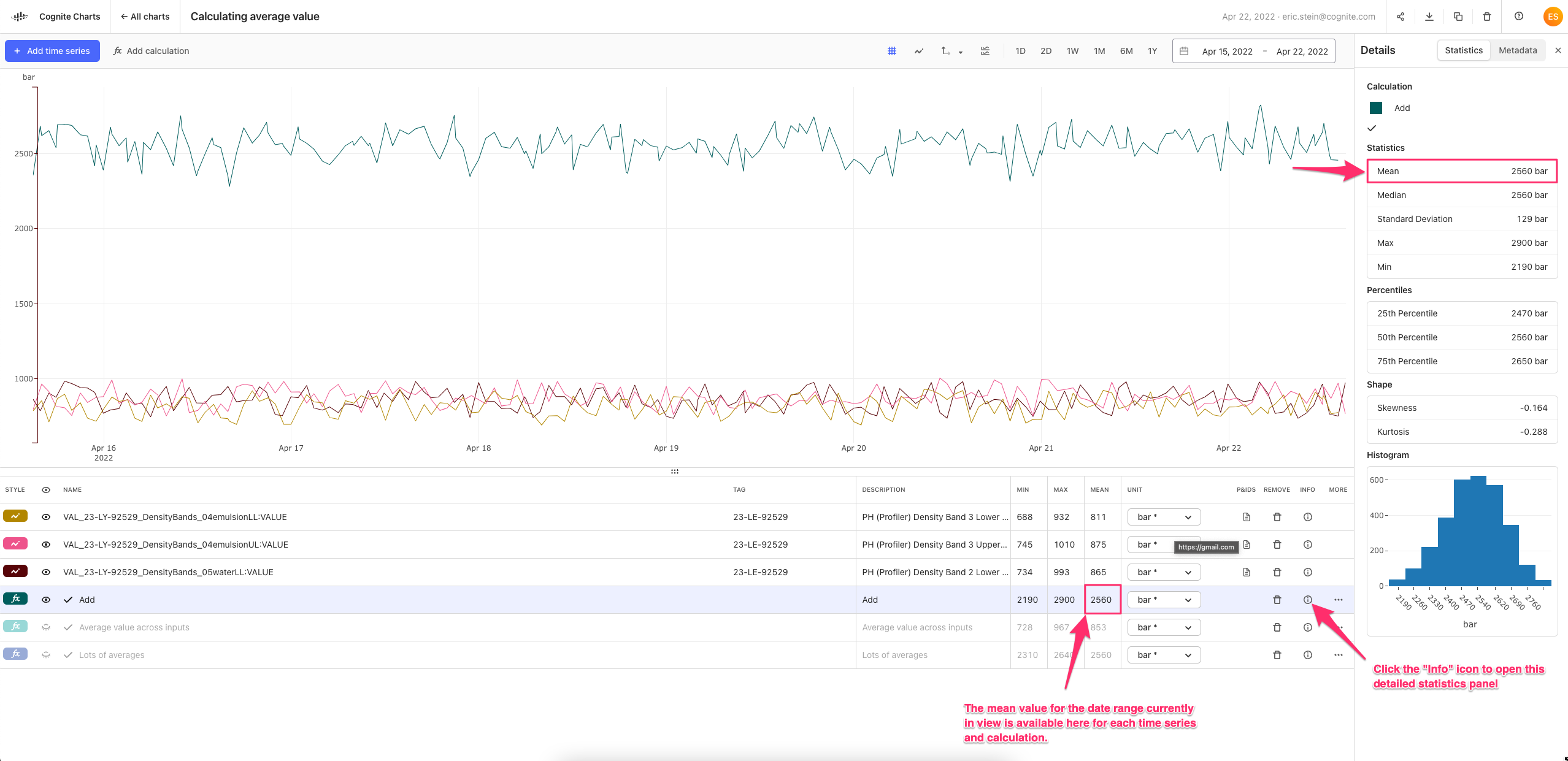
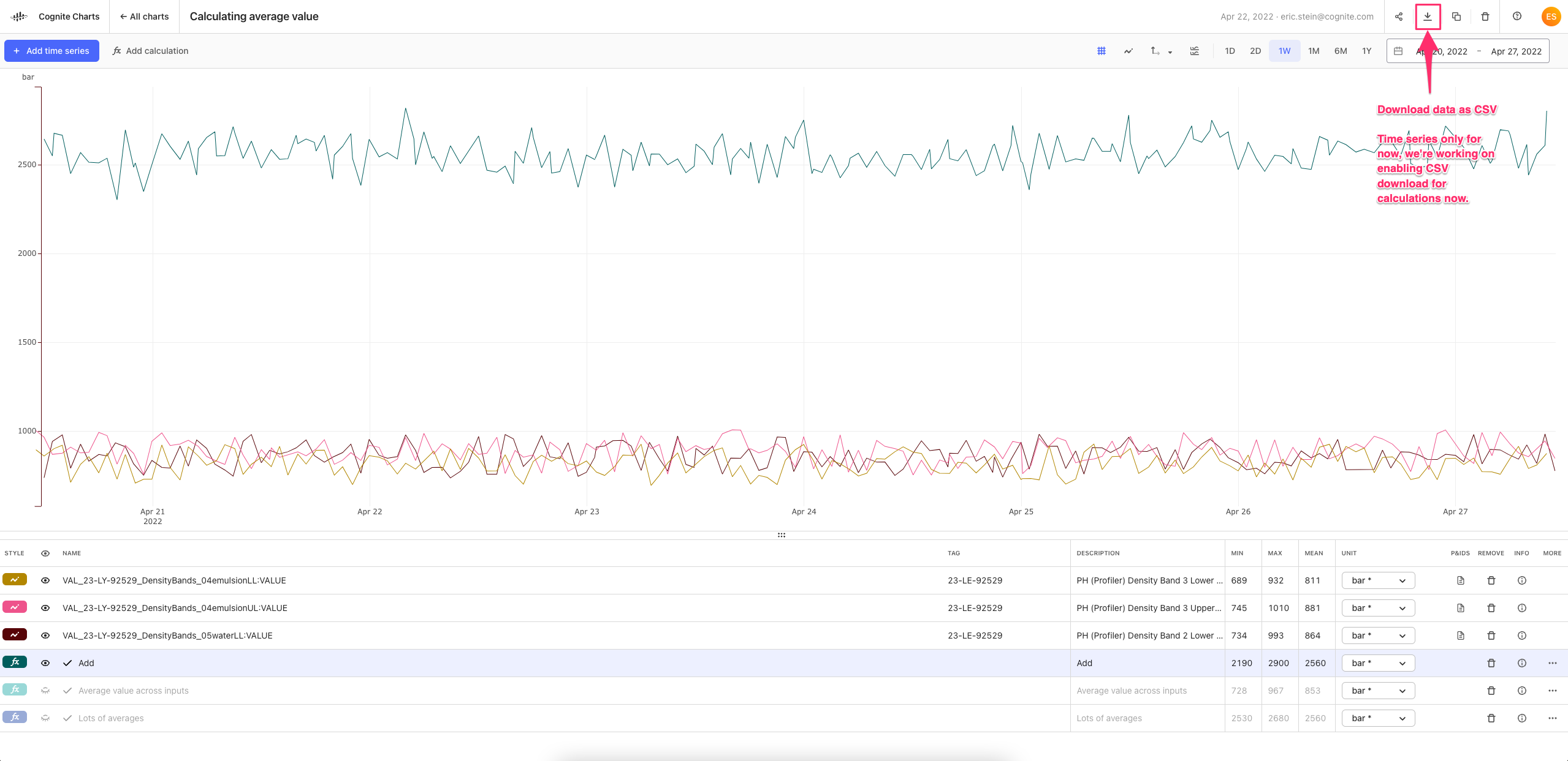
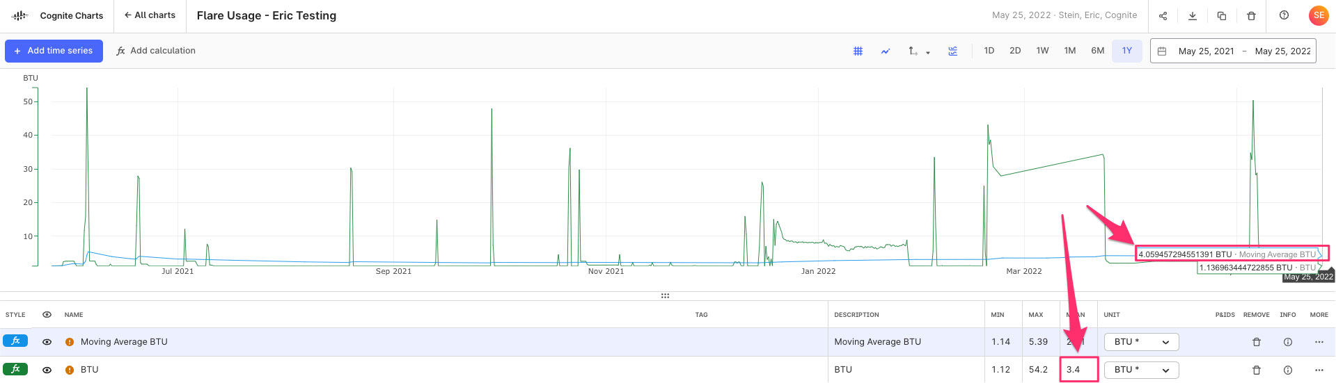
If you remove the Sliding window integration node and connect the Division node directly to the output, this calculation will run for the last 1 year of data. Once it runs, you can look at the Mean column in the table. This value will be the average value over this range of time. (You can see this same value and other statistics by clicking the “info” icon and opening the detailed statistics panel. See the first image below.
Of course, you may want or need to do some more advanced data science work (e.g. resampling) to get better fit your data and use case. If this is the case, then the data scientists on the Charts team can definitely discuss and help.
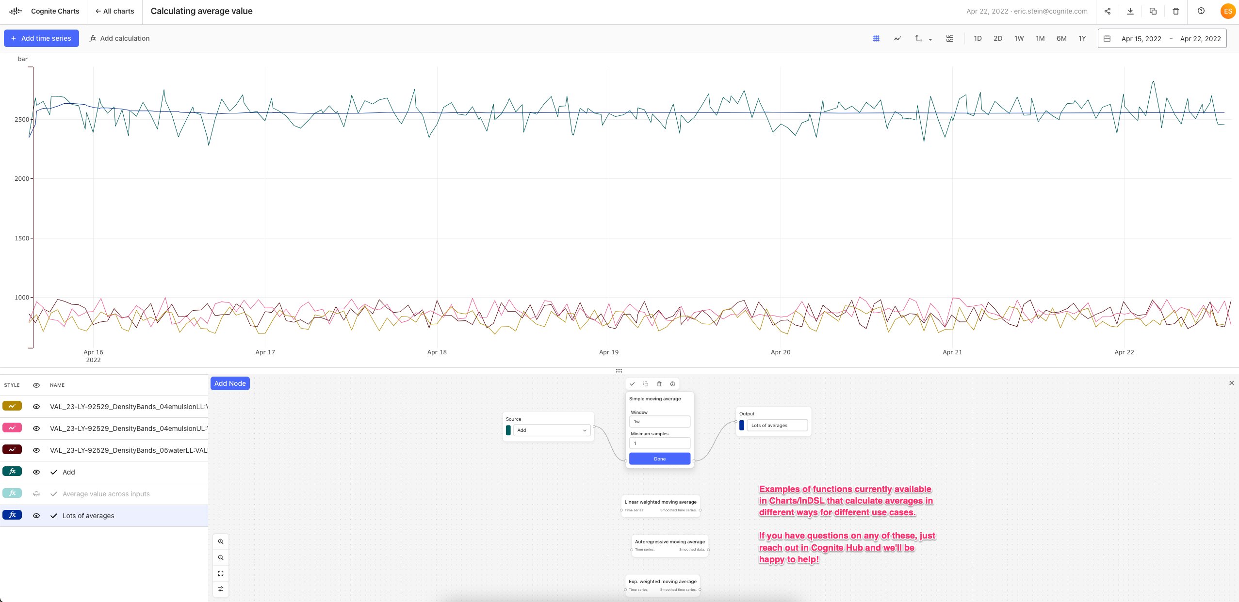
There are also several different functions in Charts/InDSL that can be used to calculate different types of averages for different use cases. To name a few, which are all available under the Smooth function category:
Warnings due to downsampling data
If you receive a warning that looks like this (see image, below), then it means that the results of the data has been downsampled to perform the calculation. The benefit of this approach is that calculation results are returned more quickly. It also helps us to ensure that our calculations backend will remain stable and not crash with, e.g. one person requesting trillions of data points for a calculation spanning over decades.
While downsampled calculation results are very good for quickly seeing trends and the overall shape of the data, it may not provide you with 100% accurate and precise results every time. If you zoom in to a shorter range of time (i.e. less data), then the warning will disappear once you are below the maximum threshold. If the warning does disappear, then it means you can trust the results of your calculation since it was performed on individual data points and not downsampled/aggregated data.
But, if you’re interested in a 1 year average with time series with a high sampling frequency data, then it’s quite certain that you’ll encounter this downsampling warning.
If it’s acceptable to report an approximate result when finding the average value over the past 1 year of data, then this should not be a problem. However, if precision and accuracy is very important for reporting this 1 year average, then please do let us know and we’ll schedule a time to speak — we set this maximum limit relatively low so we can gather feedback from the community on whether/how much we should increase this limit to solve a use case you may be facing.
I’ll be creating a post with an in-depth video walkthrough of this topic here on Cognite Hub. I’ll post a new comment in this thread with the link, just to make sure you all see it.
Using Excel with CDF data
Finally, since we talked about this together when we met last Friday, here’s a link to the Cognite Documentation pages where you can read about how to use CDF as a data source in Excel to retrieve data.
If you want to export data from Charts as a CSV, you can use the “Download” button in the top right navigation. For now, you can only download time series data, but we are working on adding support for downloading calculations too.
Hope all this helps! Let me know if you have any further questions or want to schedule a time to speak over a call to dig into something more specific.
Hi Eric,
I appreciate the information on the moving average types that are available. I have attempted to use the simple moving average, but again over the duration of interest (1 year) the chart still will not show any data. I do get the error message for down sampling but also never see an actual result on the chart. The chart should be public if you would like to take a look.
In general I would like down sampling to be configurable. Something as simple as it allowing down sampling by default but it can be toggled off for a specific chart or time series would be enough I think.
Thanks,
Brendan
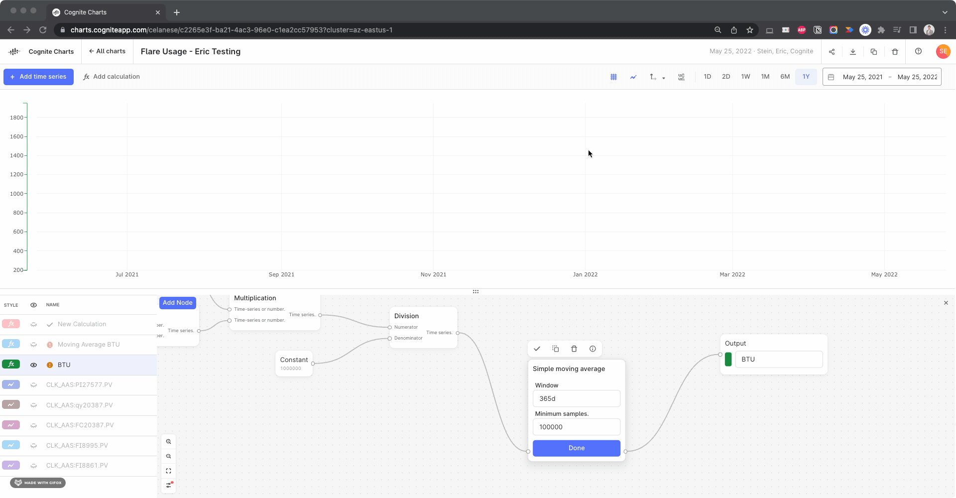
I spent some more time digging into your chart and found a few things…
The things that’s causing your BTU calculation to fail to run is actually due to the “Samples” parameter. You had set 100000, why did you do that? Was it to ensure that you always have at least 100,000 points in the simple moving average calculation?
By changing this to its default setting, 1, the calculation will successfully run:
I’m not certain whether this gives the intended and expected results, but it appears to be a reasonable result, based on comparing to the calculation w/o the simple moving average:
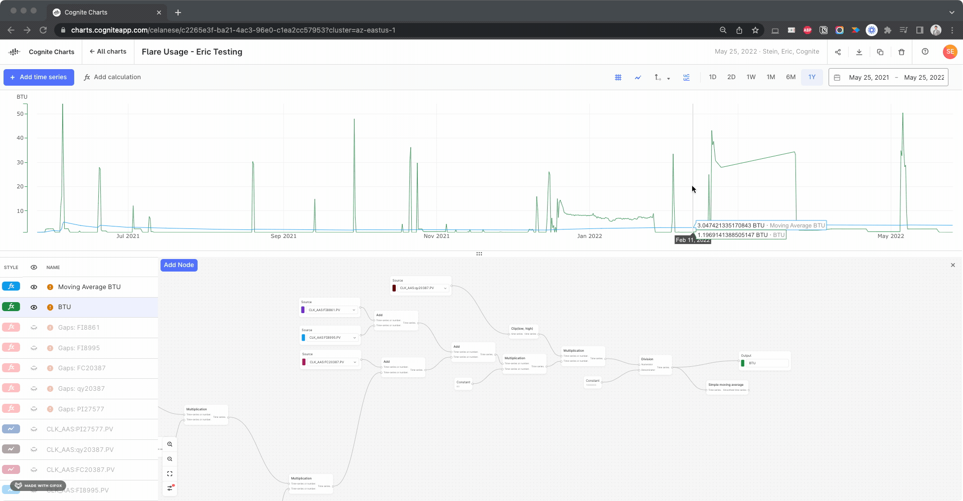
In theory, the last value of the simple moving average calculation should be the average over the past 365 days of data, since the function is run on the data currently in view in the chart. So, for example, if you change the date range to the past 2 years of data, the calculated result at 365 days will be the average for the previous 365 days and the final data point in that same calculation will be the last 365 days.
This final value for the simple moving average calculation should be the same as the mean value of the BTU calculation (w/o the simple moving average) IF the date range is set to the last 1 year of data, however there’s obviously disconnect:
We need to dig into why this is happening, but we have a theory…
We noticed there appears to be a gap several of the time series used in your BTU calculation:
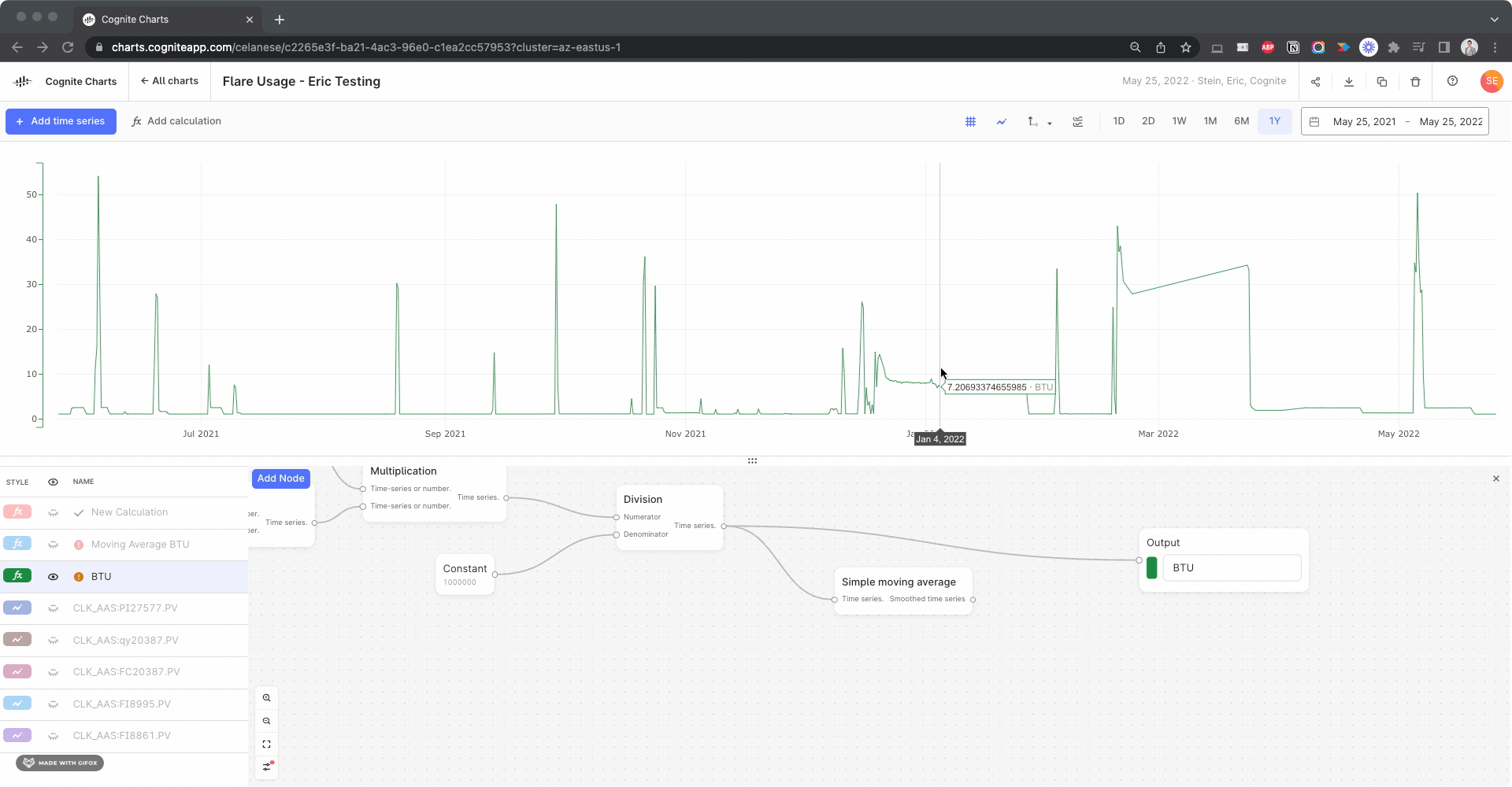
I created calculations using the Gaps Detection, Threshold function to check for this in each input time series, looking for gaps > 1 day:
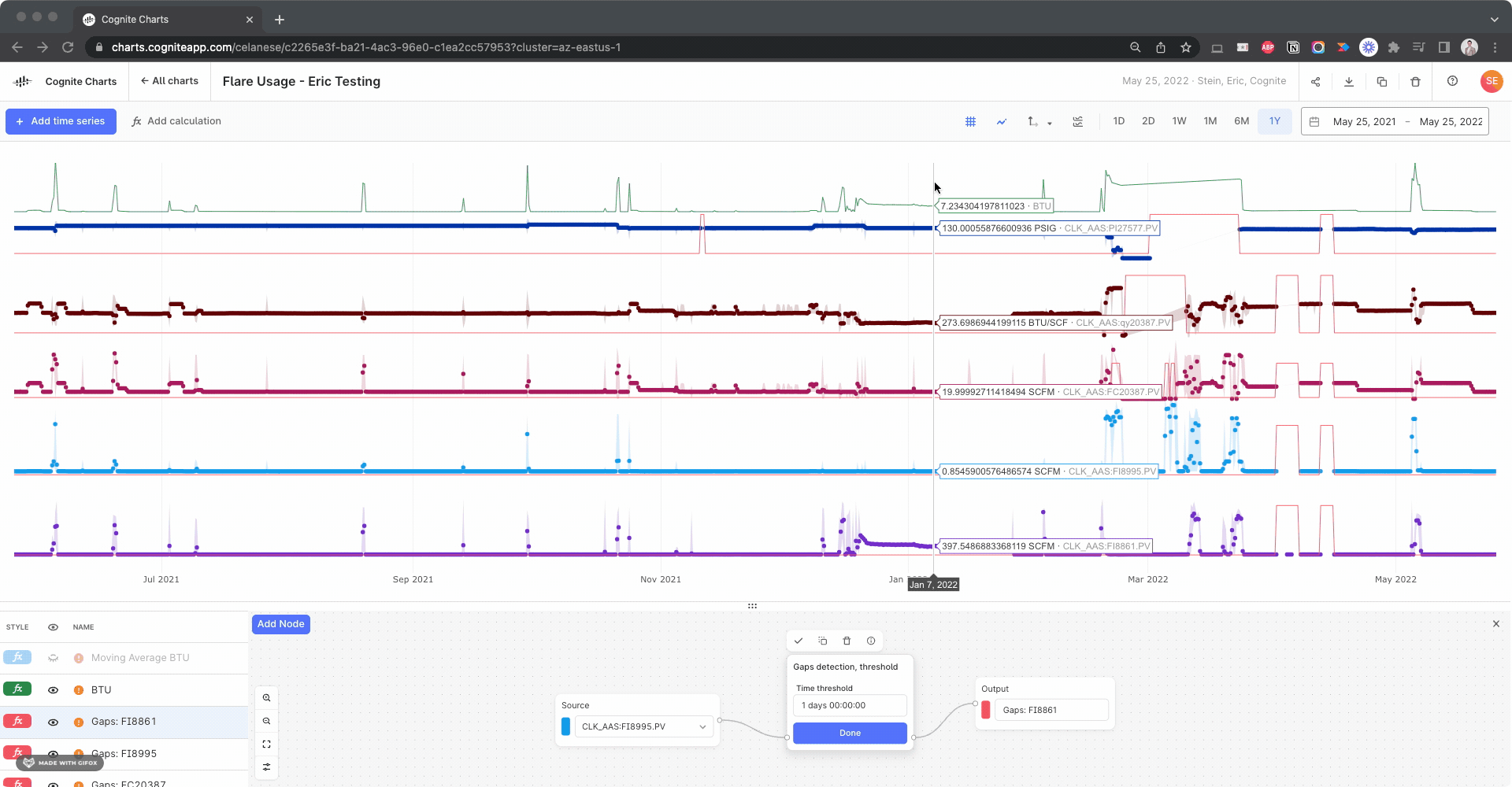
Side note: This actually helped us discover a bug with the gaps detection function, since it fails to identify this large gap in the BTU calculation itself. We’re looking into it.
Based on the automatic data alignment we have in built-into Charts (resampling and reindexing), it might produce unwanted gaps in your calculations if your underlying time series have overlapping gaps – which appears to be the case.
As we discussed when we last spoke over Teams, this is something you can manually correct for by creating a calculation using these gaps detection functions as your “if this then that” operator, since it returns 1 if there’s a gap and 0 otherwise.
We need to spend some time digging deeper into this discrepancy between how the underlying calculation for the mean in the table is being performed vs. the behavior of the automatic data alignment in the simple moving average calculation. E.g. One might be ignoring the data point values during the gap periods entirely, while the other is interpolating / resampling to fill these gaps, taking these data point values into account.
You can take a look at my chart here to test for yourself.
I know this is a very long and complex reply, but happy to schedule a call sometime soon (Friday morning, Texas time, perhaps?) to dig into this together over Teams.
Eric,
I had set the minimum samples high because I was hoping that would ensure limited downsampling of the data. 100000 data points for a year of data means I’ll be getting 5 min quality data for the calculation. Unfortunately I can’t seem to get the calculation to work with any number greater than 100 and I’m curious as to why that is.
I have started to use the gap detection in the calculations and have run in to some unexpected issues. The gap detection seems to work okay to replace bad values on the pressure transmitter, and the results on rolling average BTU and Yearly BTU calculations both look good. However, the source of those two calculations (BTUs to Flare) looks like it only has two data points.
Thanks,
Brendan
I’m not sure why that calculation is failing when you have >100 samples, we’ll have to dig into it to figure out why. My first hypothesis is that it might be due to the combination of the automatic data alignment (resampling and reindexing) + downsampling + the gaps in the original time series. We’ll keep you updated as we know more.
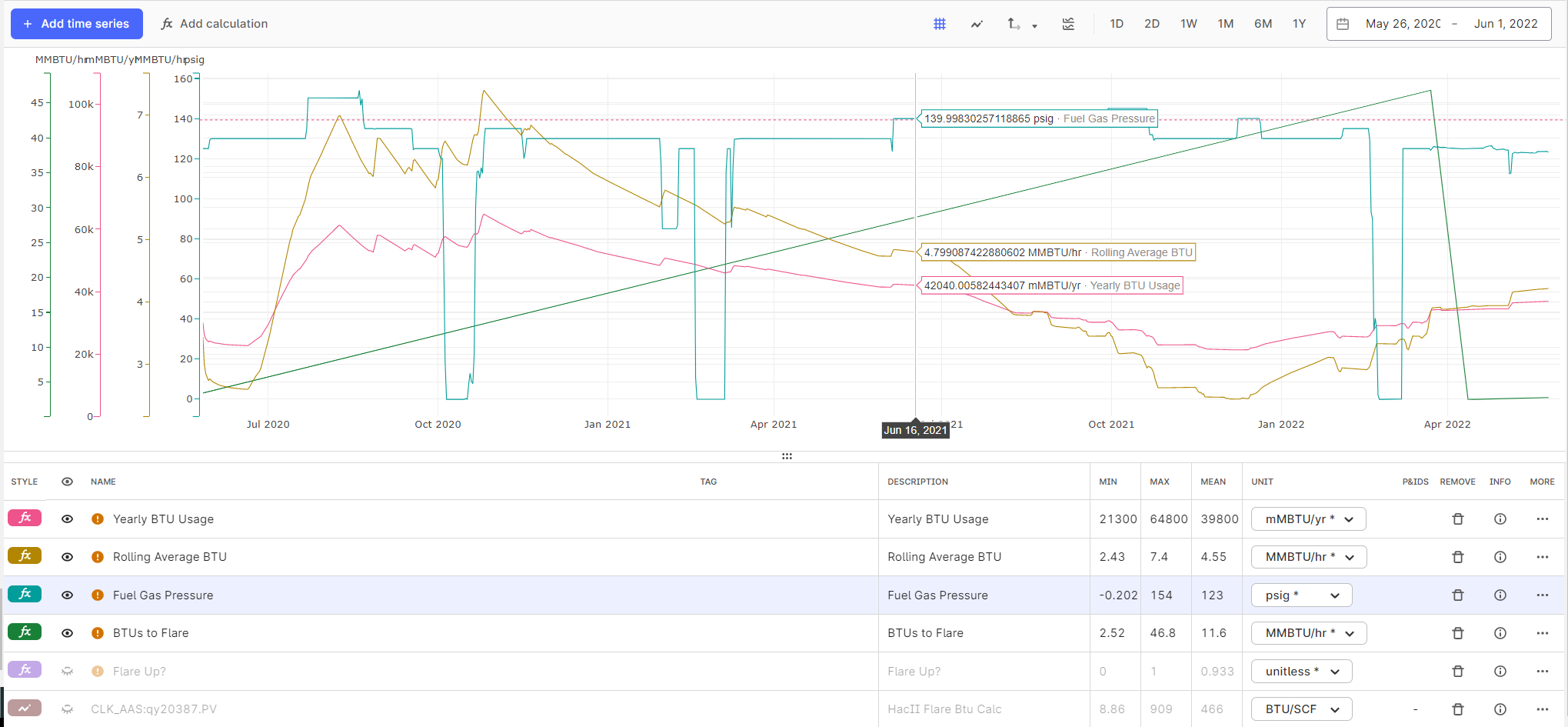
When it comes to the BTUs to Flare (green) calculation failing to produce more than a few data points, I figured out this is due to the automatic data alignment feature being toggled Off in your calculation. If you turn it On, then it will produce much more reasonable results:
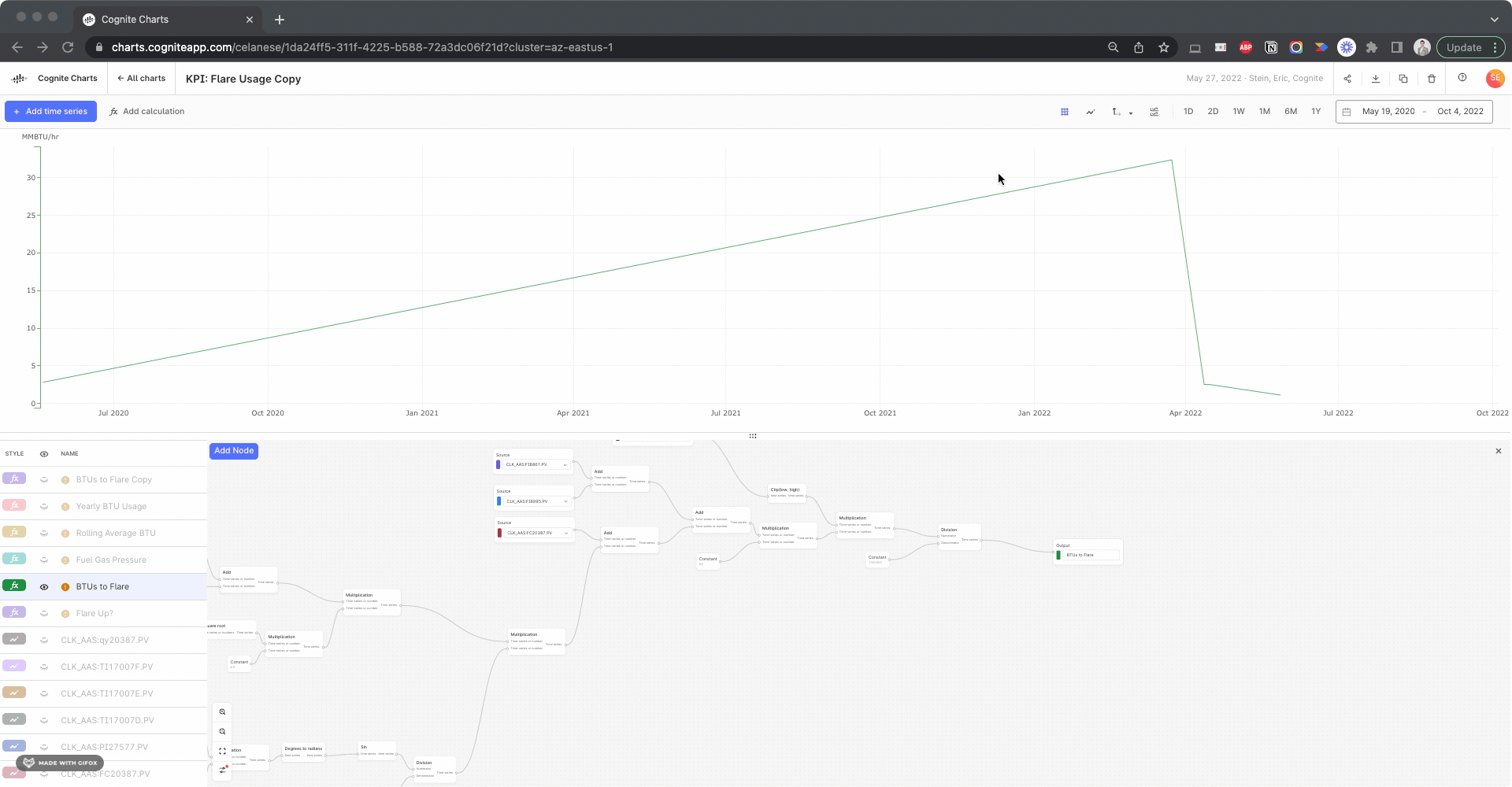
It’s quite interesting to compare this BTU to Flare calculation using the inputs with gap filling compared to the previous results without gap filling. But this looks like it resolves the issue.
In general, this is a good example of why and how data alignment (resampling and reindexing) is always important when working with time series data. If the built-in automatic data alignment feature in Charts doesn’t work properly for a given calculation, then you’ll have to use the various Resample functions for one or all of the inputs in the calculation. Of course, it all depends on your data and your use case.
Also, I noticed you started using the new threshold functionality, which is great!
However, I noticed you are using the Below type with a value of 95000, which is significantly greater than the calculated values. Perhaps you had meant to use the Above type of threshold in this scenario?
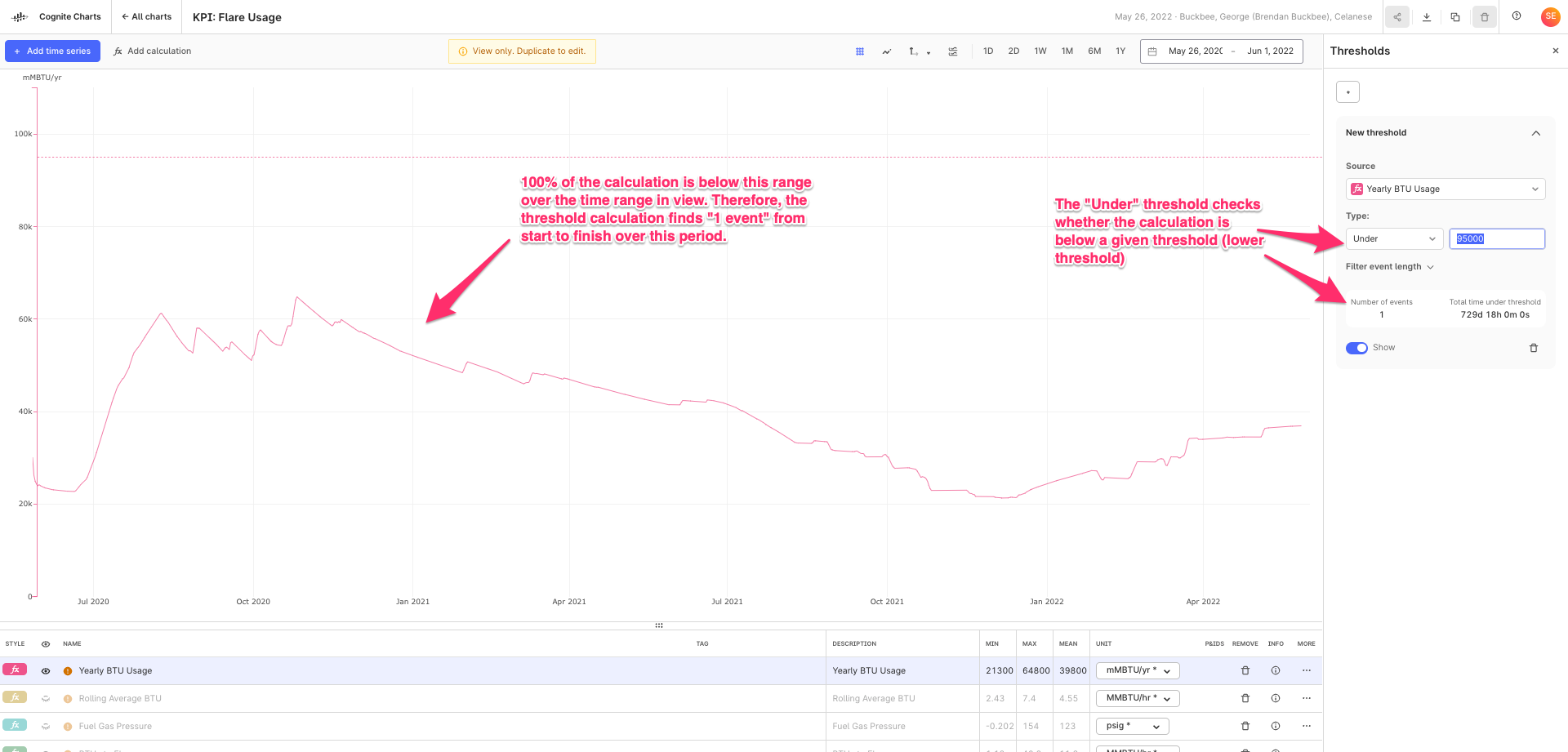
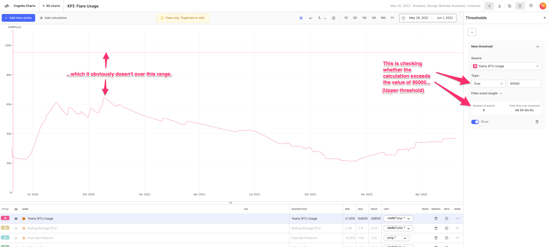
If yes, this is a good indicator that we can possibly improve the wording we use to explain this feature in the UI and/or need to add supplementary information somewhere in this panel. FYI
I’m not sure why that calculation is failing when you have >100 samples, we’ll have to dig into it to figure out why. My first hypothesis is that it might be due to the combination of the automatic data alignment (resampling and reindexing) + downsampling + the gaps in the original time series. We’ll keep you updated as we know more.
When it comes to the BTUs to Flare (green) calculation failing to produce more than a few data points, I figured out this is due to the automatic data alignment feature being toggled Off in your calculation. If you turn it On, then it will produce much more reasonable results:
It’s quite interesting to compare this BTU to Flare calculation using the inputs with gap filling compared to the previous results without gap filling. But this looks like it resolves the issue.
In general, this is a good example of why and how data alignment (resampling and reindexing) is always important when working with time series data. If the built-in automatic data alignment feature in Charts doesn’t work properly for a given calculation, then you’ll have to use the various Resample functions for one or all of the inputs in the calculation. Of course, it all depends on your data and your use case.
Eric,
Can you explain to me what exactly the Automatic Data Alignment function does?
Yes I used the Threshold feature for this chart. It is configured properly. We have a high limit on the Yearly BTUs to our flare that we can’t exceed. We don’t have a low limit yearly. This just gives a good visual indication of how close we are to our yearly limit to know if we have room for certain operations.

I think there might be a misunderstanding about the sample parameter. The simple moving average has a “Minimum sample” parameter - if a window has < this number of data points, the result of this window will be “Not a Number” (which in practice means that the result for this window is not shown in CHARTS).
In other words: setting “Minimum samples” to a high value means that you will see fewer results (and maybe no results at all depending on the window size and the density of the data points).
This was why I was attempting to use a fairly large number for this calculation. I would like to ensure data quality since it’s not a simple calculation where I will visually see something being off. The points in PI typically have 30s or 1m scan time, so I assume the data should be available in Charts. However, if I try something like 8760 (24*365), I don’t get any results. This concerns me a bit because if it doesn’t have that many points it can do calculations on, it may not be very accurate.
I understand.
Keep also in mind that the moving average function (as it is implemented today) computes the pointwise average in each window, e.g.
(sum_x f(x)) / N,
where N is the number of data points x with values f(x) in the window - and not the integral average, i.e.
(integral t0..t1 f(x)) / (t1 - t0),
where t0 and t1 are the start and endtime of the window.
Is it the pointwise average that you are looking for?
Regarding your question on automatic resampling: with automatic resampling, data points of two or more time series are automatically aligned to a common timestamps if needed (by interpolation). The simplest example is adding two time series with non-matching timestamps. Without automatic reindexing the sum output will be empty (because none of the timestamps match), while with automatic reindexing, the sum output will have a value at the timestamps of both inputs.
Finally: I am working on reducing the amount of downsampling that we do by a significant amount (hopefully 10x). We are currently testing the robustness of the solution, but if things go well we can roll this out in the next 1-2 weeks.
Quick update: we have now removed downsampling for time series with less than 100K data points (before 10K).
Enter your E-mail address. We'll send you an e-mail with instructions to reset your password.
